Basics of ggplot
As part of the tidyverse, ggplot is based on simple tidyverse style and layered grammar.
You can find a ggplot cheatsheet here. This cheatsheet, covers all of the basics required to form a solid foundation of visualization knowledge and techniques.
Fundamentals of ggplot
As layered graphics, ggplot graph are created through layering information and R code in order to create graphs of varying complexity. As such there is a basic formula to any ggplot graphic, which can be altered depending on the complexity or design appropriate for the situation.
The basic formula of a ggplot graphic is:
ggplot(data = [data.frame],             # Specify the data you want to use
       mapping = aes()) +               # Specify the elements you will be using
       geom_[function]                  # Specify the way in which these elements will be displayed/plotted
This formula can then be adapted to suit the needs of you (the data analyst). Through specifying the parameters you wish to visualize (x & y), as well as their size, shape, colour as well as layout.
What is important when you structure a ggplot function, is that it is laid out correctly, within the examples you will see within this help-tab and the sessions practical, they will be structured line-by-line, however typically they can be structured like this:
ggplot(data = [data.frame], mapping = aes()) +
    geom_[function]
This as valid as the previous template, however when you are constructing graphs with multiple/extensive variable, ensuring they are layered line-by-line allows you (and anyone else reviewing your code) to understand what is what, especially with annotations also.
But what about errors!!
When constructing your first (or one thousandth), finding errors (or bugs) within your code is common. So if in doubt check the following:
- Do I have my base
ggplotfunction correctly laid out. This can be blank, or filled in depending on how you have structured your function. However Ensure there are the correct number of brackets, that if you start a new line that it ends in a comma (,) and the function itself ends with the+operator. - Do I have a
geom function, and if I do, is it correct for my data type? This might sound silly, however even the most experienced of us forget this sometimes. This function allows the correct expression of the information provided in the baseggplotfunction. For more details on this, see below. - Check the bug report (provided when an error occurs) and see where your issues may be. The team at
Rstudio,Rand thetidyverseprovide some really positive bug reports which can help identify the problem at hand. - If all else fails, start over. This might sound unproductive, however starting with an empty function and layering it up layer by layer, one variable and layer at a time, allows you to understand where and when an error is occurring.
Data Types
Data provides the true foundation of all work completed within ggplot as without it, there is nothing that the structure provided through ggplot functions to work with. As such it is important to understand the type of data which is to be visualized. As depending on the data type present, influences which visualization method is most appropriate.
Typically within visualization, data can be classified as being continuous or discrete data, although at times this can be a little blurry, there are some general ‘rules of thumb’ which can be used to understand if your data is continuous or discrete.
Simply put, continuous data is data which can take any value within a range. This includes age, height or time.
Simply put, discrete data (or categorical data) is data which falls into a specific category or can only take a certain value.
Within statistics, there is a fine line between discrete and continuous data. Data is typically considered continuous if the data is on a scale of more than 7. For example on a likert scale between Strongly Disagree to Strongly Agree.
When considering the impact of the type of data upon the graphs produced, the following table can be considered. This lists some of the most common interactions and graphs which can be produced, and is not exhaustive as to the potential plots which can be produced through data, rather provides some of the most commonly seen.
| Continuous | Discrete | |
|---|---|---|
| N/A | Density Plot, Dot Plot, Frequency Polygon, Histogram, Area fill | Bar Chart |
| Continuous | Scatter Plot, Quantile Line Graph, Rug Graph, Text Plot, Smoothed Line Plot | Bar Chart, Boxplot Graph, Dot plot, Violin Plot |
| Discrete | NA | Jitter Plot |
There are plenty of other forms of graphics which can be produced in ggplot, which will be covered during this practical and others in the future. And can seen on the cheat sheet.
geom functions in ggplot
The geom functions within ggplot are what is vital to the plotting of the data, with any graph, needing at least one geom function in order to present the data desired. This section will give a short highlight of some of the core geom functions which you will find useful within this course, as well as others which might be useful in the future.
These sections are highlighted in the type of plot you wish to produce with your data, as well as some of the more advanced features they can have. Please note this list is not exhaustive, for more please visit the ggplot site.
Scatter Plots
geom_point() could be considered one of the most fundamental and basic of the ggplot geom functions. Since it requires nothing more than specification of an x & y variable, and is extremely useful within basic observation and evaluation settings. But is often considered too simplistic for more complex and advanced visualization projects.
ggplot(data = diamonds,
      mapping = aes(x = price, y = carat)) +
      geom_point()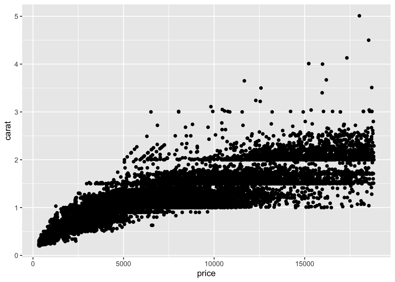
Within the function geom_point() it is possible to use the following aesthetic mapping:
- x & y
- alpha (transparency)
- colour
- fill
- shape
- group
- size
- stroke
Jittered plots, present an alternative to scatter plots formed using geom_points(), and is especially useful for dealing with datasets which experience over-plotting in areas, through adding a small amount of random variation into the location of the plotting of each point, spacing them out. Through adding this random variation, it can make a plot like that displayed on the left, easier to understand and interpret.
jplot <- ggplot(data = mpg,
       mapping = aes(cyl, hwy)) +
       geom_jitter() +
       labs(title = "Jitter Plot")

scplot <- ggplot(data = mpg,
       mapping = aes(cyl, hwy)) +
       geom_point() +
       labs(title = "Scatter Plot")

grid.arrange(scplot, jplot, ncol = 2)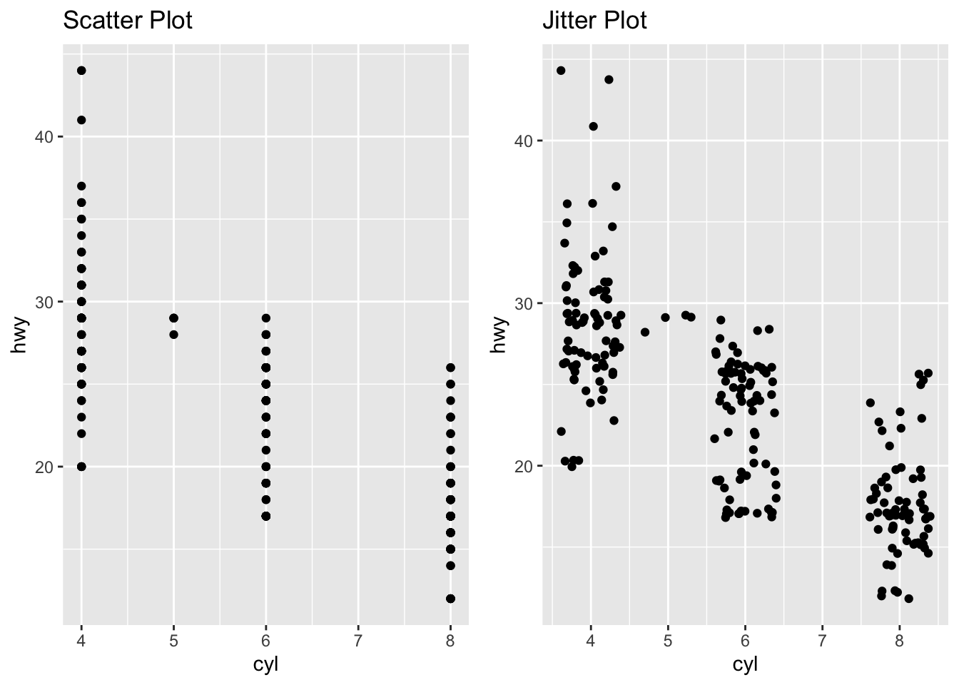
Within the function geom_point() it is possible to use the following aesthetic mapping:
x & y
alpha (transparency)
colour
fill
shape
group
size
stroke
Bar Charts
Although simple in nature, bar charts are generally useful within the world of business and beyond, as they can help display counts of data, although typically discrete data is best, continuous data can also be used. This unlike many of the other plots discussed here requires only one specified parameter (x or y - which indicates the direction) with the alternative axis indicating the count frequency of the data.
ggplot(data = diamonds,
       mapping = aes(x = cut)) +
       geom_bar()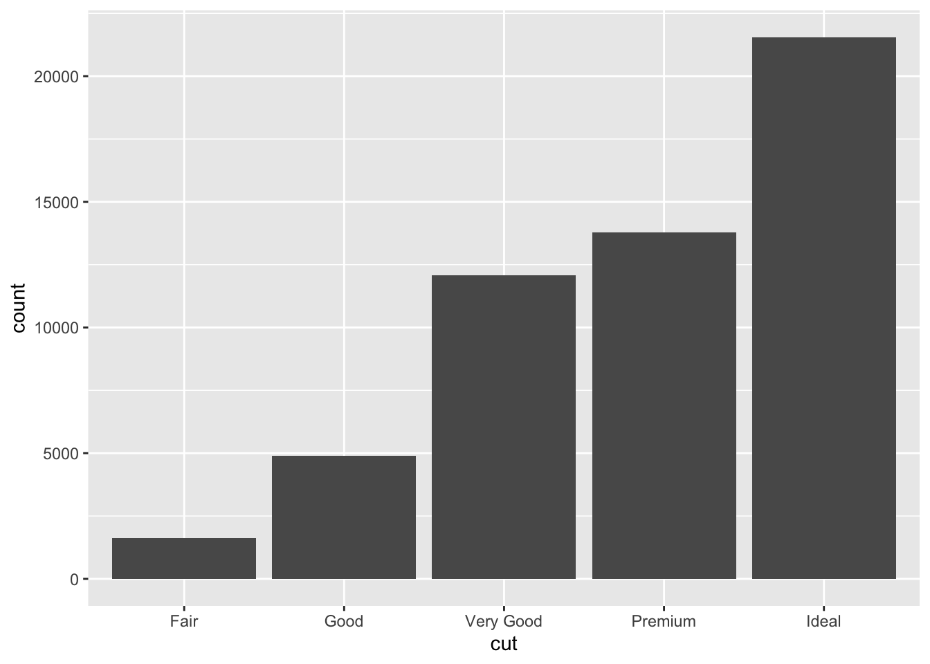
Within the function geom_bar() it is possible to use the following aesthetic mapping:
- x
- alpha (transparency)
- colour
- fill
- group
- size
- linetype
Importantly, it is possible to go further with Bar Charts, so they can display multiple layers of information within a single chart, through specifying their fill colour.
ggplot(data = diamonds,
       mapping = aes(x = cut)) +
       geom_bar(
         mapping = aes(fill = color))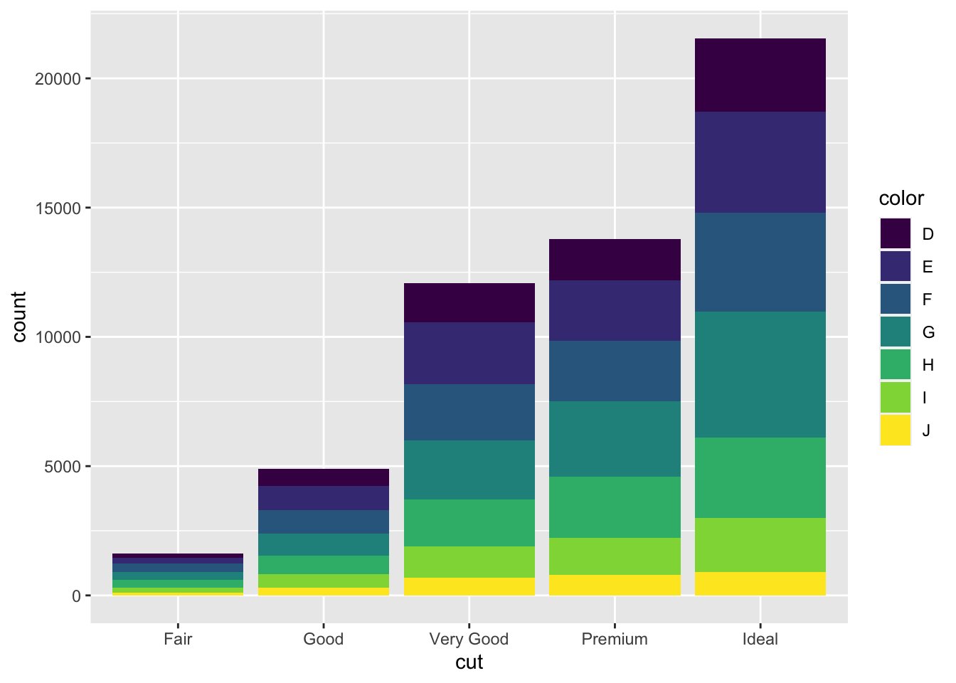
In contrast to geom_bar(), geom_col(), allows the heights of the data to be represented by specific values within the data rather than a count of them. For example:
df.col <- data.frame(outcome = c("A", "B", "C", "D", "E"), input = c(1.1, 3, 2.1, 0.8, 0.1))

ggplot(data = df.col,
       mapping = aes(x = outcome, y = input)) +
       geom_col()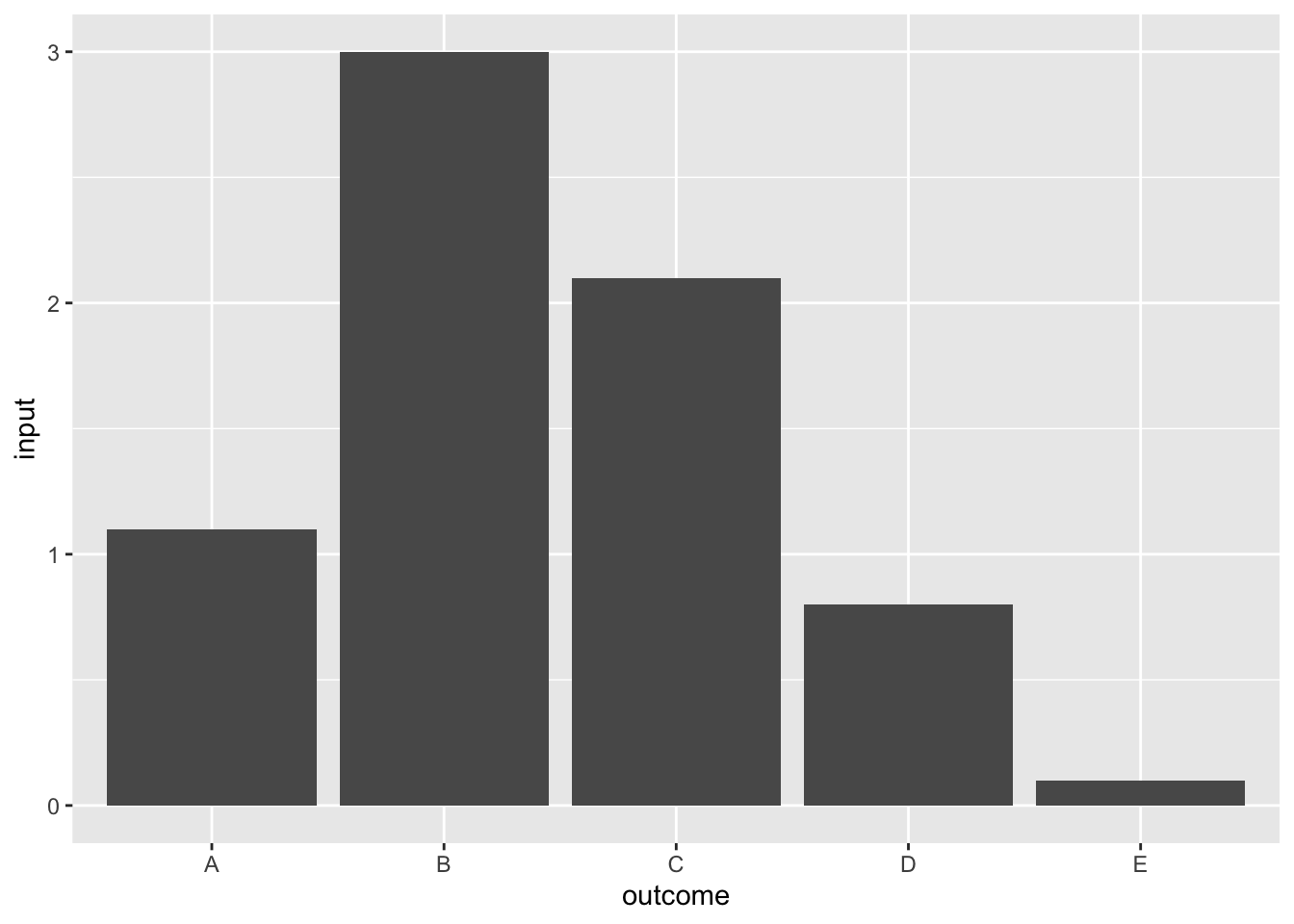
This similar to the function geom_bar(), it is possible to use the following aesthetic mapping in geom_col():
x
alpha (transparency)
colour
fill
group
size
linetype
Histograms & Density Plots
Producing histograms of your data is one of the most useful tools at a data analysts disposal, especially for checking the crucial assumptions when checking and investigations assumptions for regression and other statistical analysis techniques. Similar to Bar Charts, these use only a single parameter and produce a count based examination, in the form of bars.
ggplot(data = diamonds,
       mapping = aes(x = price)) +
       geom_histogram()
## `stat_bin()` using `bins = 30`. Pick better value with `binwidth`.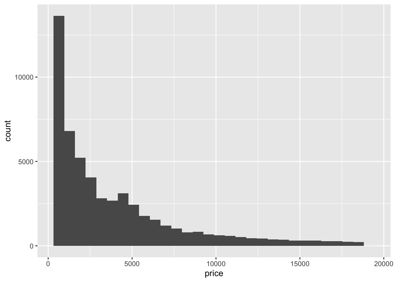
Due to the continuous nature of the data typically used within histograms, it is often not feasible to use a bin-width (how wide the bars are) of 1 unit, therefore within this plotting function, it is possible to specify the bin-width so that it is appropriate. For example, in the previous case a bin width of 1, would probably not be appropriate, alongside a bin-width of 20000, as in both the graph would not be able to provide a useful insight into the data. However a bin-width of 100 may be more appropriate. The bin-width can be specified directly within the geom_histogram() function.
ggplot(data = diamonds,
       mapping = aes(x = price)) +
       geom_histogram(binwidth = 100)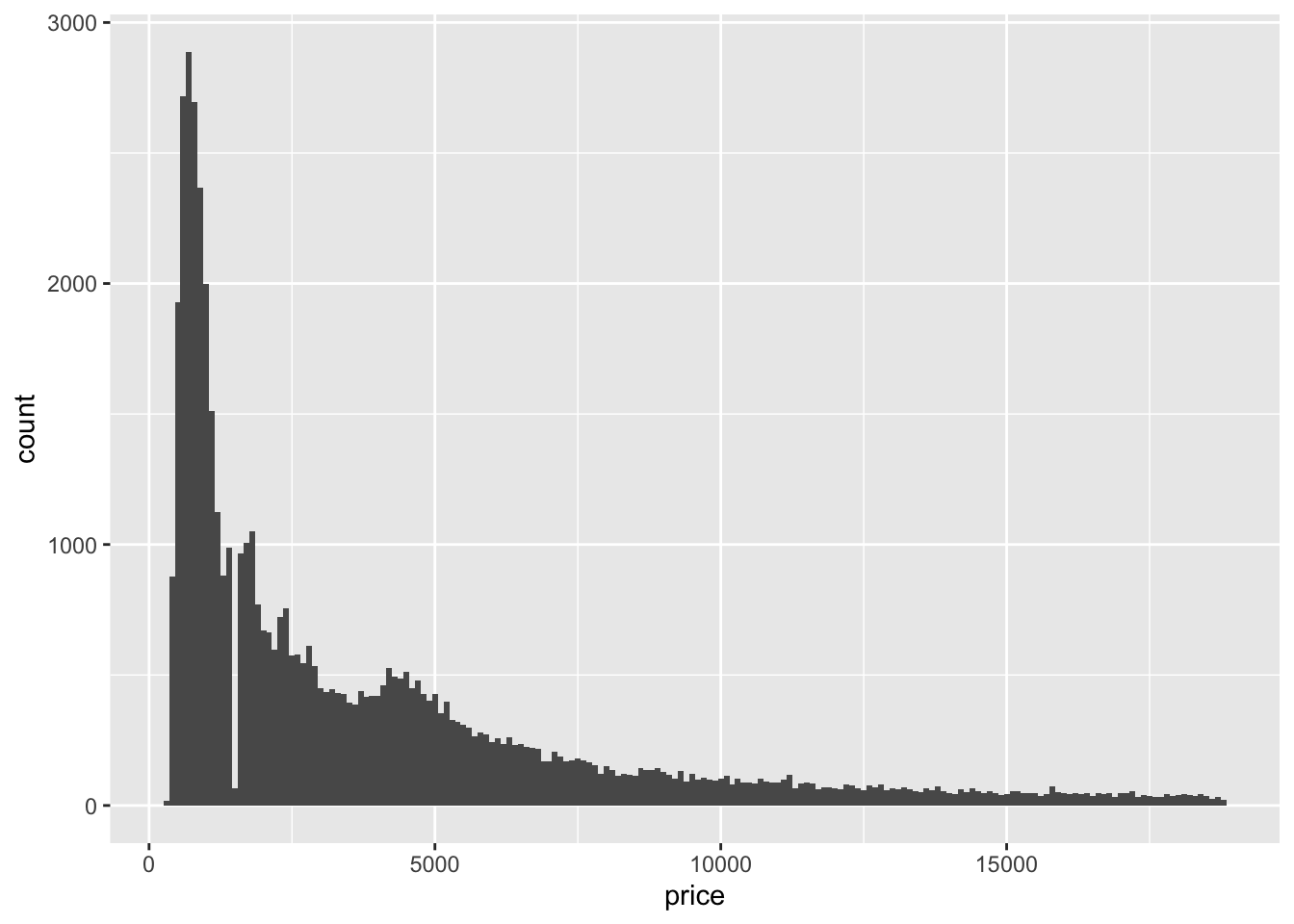
Similar to the geom_bar() function, it is possible to add additional information layers through the fill parameter.
ggplot(data = diamonds,
       mapping = aes(x = price, fill = cut)) +
       geom_histogram(binwidth = 100)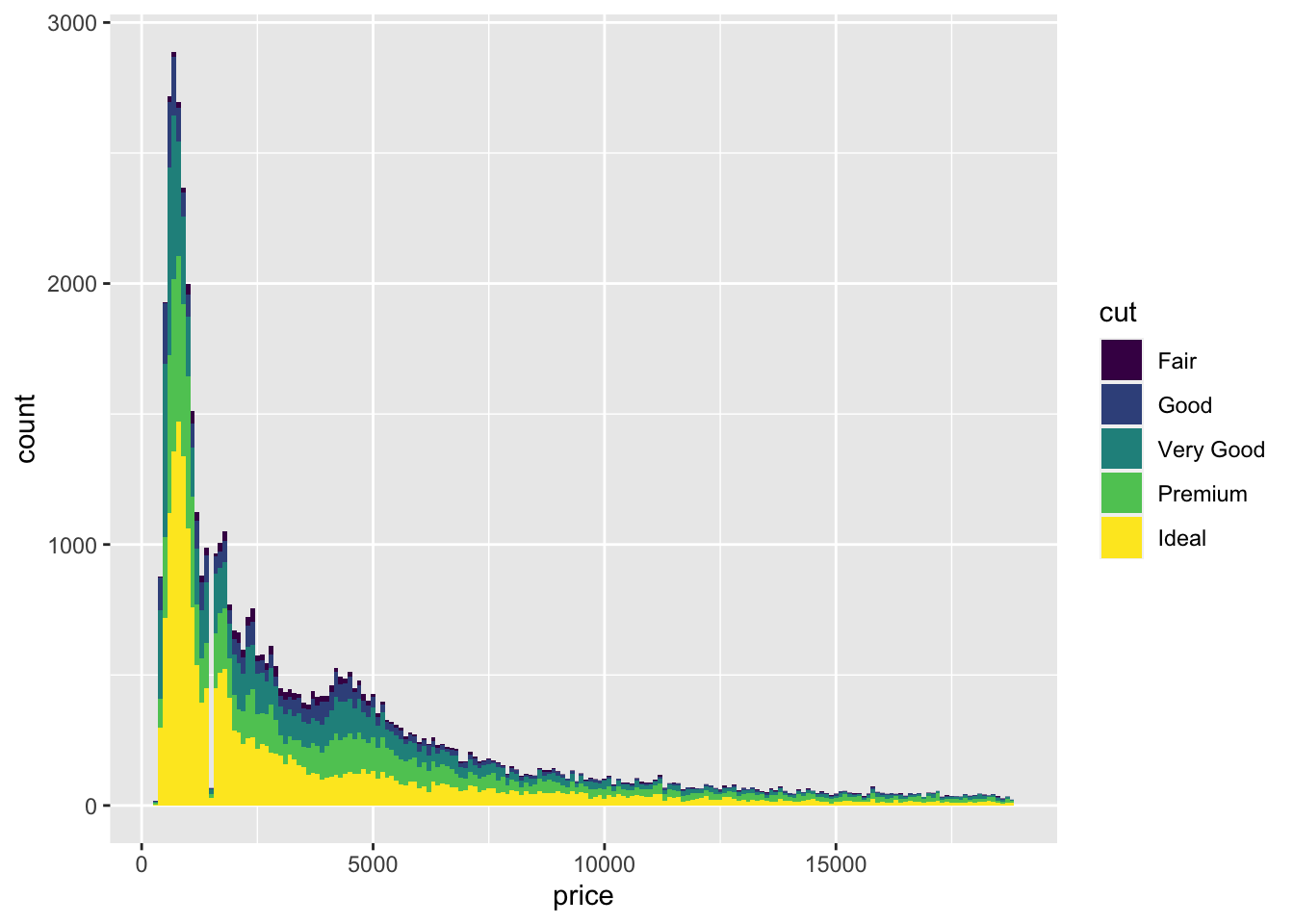
Although histograms can be incredibly useful in displaying data, at times understanding the quantity of multiple layers of information like this is not appropriate, as such having layered frequency polygons through the geom_freqpoly() can produce more intuitive plots. All whilst working within the same or similar parameters as traditional histogram plots.
ggplot(data = diamonds,
       mapping = aes(x = price, colour = cut)) +
       geom_freqpoly(binwidth = 100)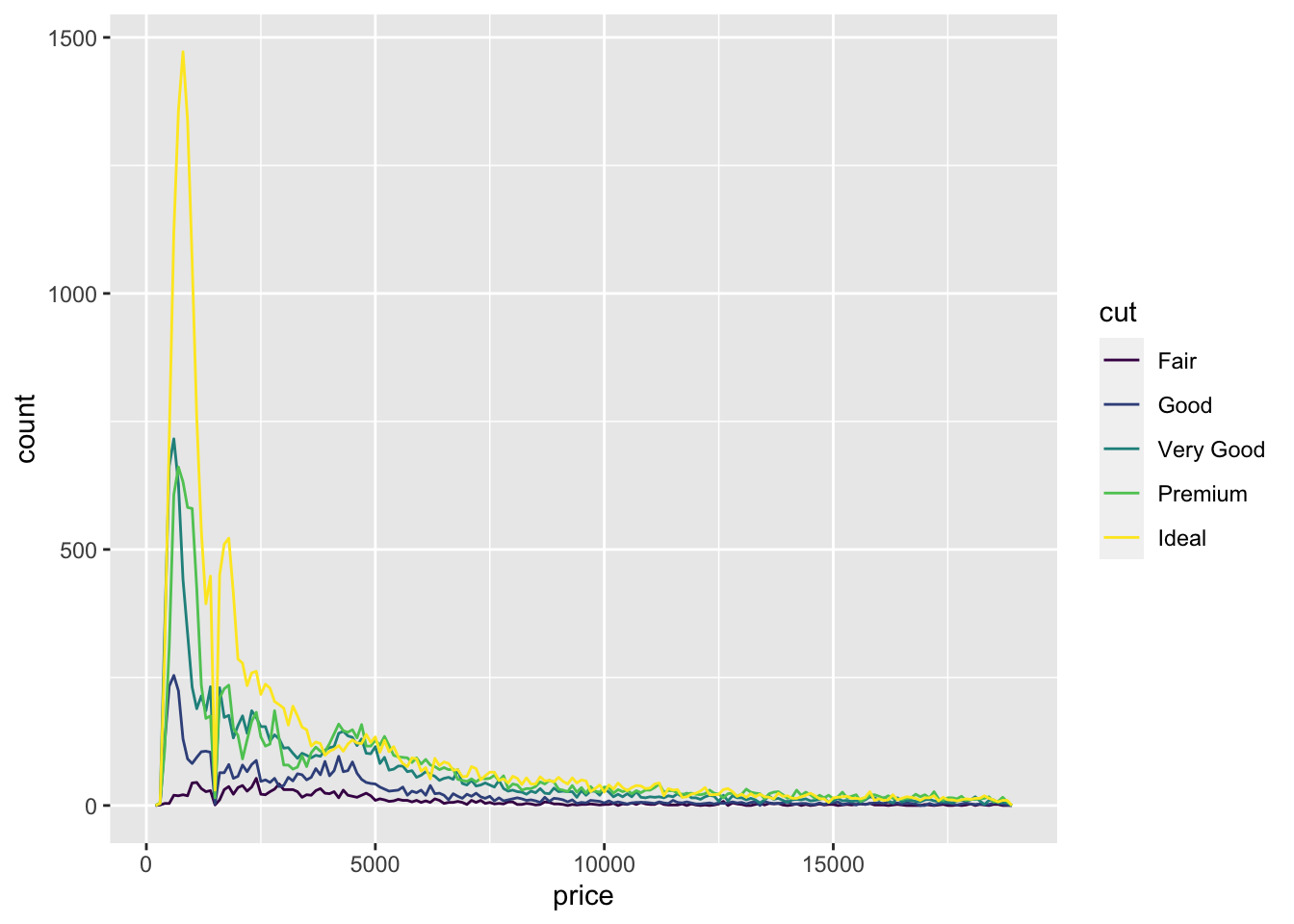
Dot plots, present a strange and different way to present data, in that they use stacked dots to convey quantity. Wherein the width of a single dot corresponds to the designated bin-width, with each dot indicating one observation at that location. This can be a complex chart to interpret and use effectively however can be useful in situations with small or diverse datasets.
ggplot(data = mpg,
       mapping = aes(x = cty)) +
       geom_dotplot(binwidth = 0.5)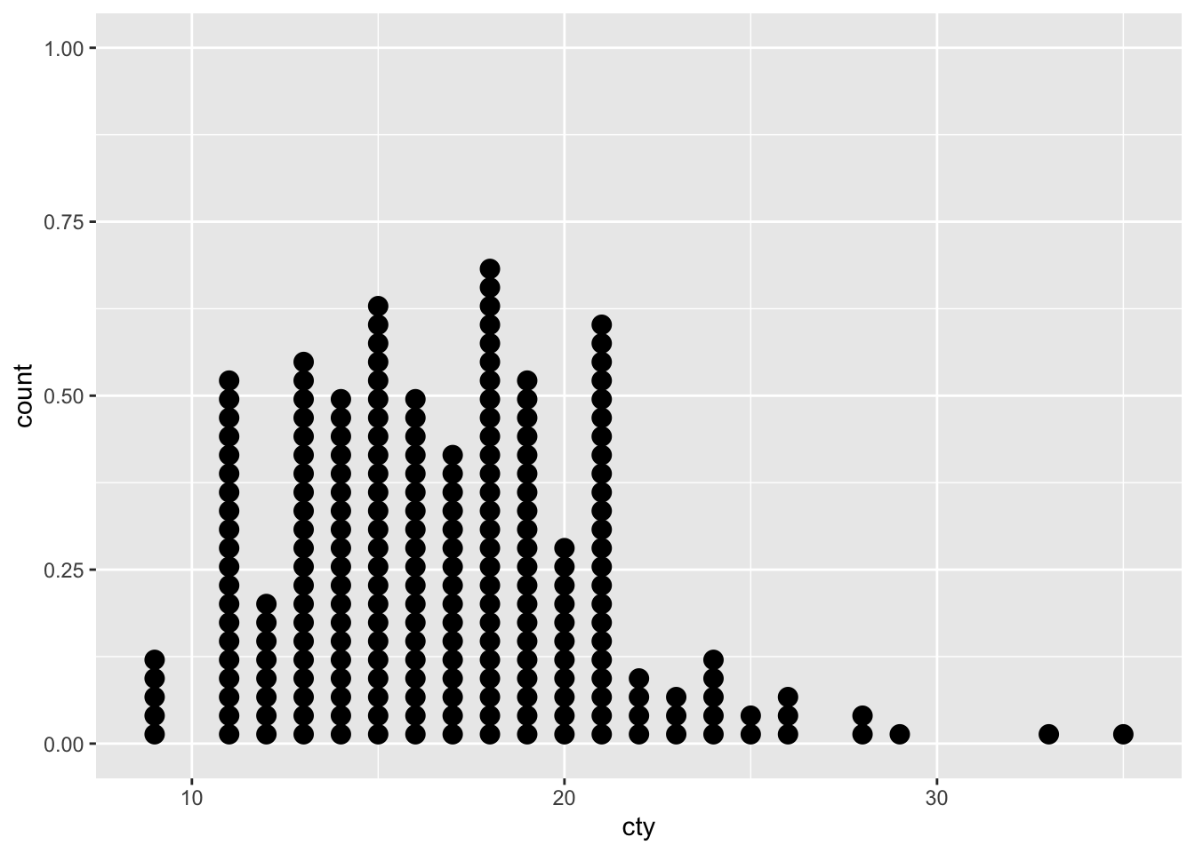
The function geom_dotplot() is able to use the following aesthetics
- x & y
- alpha (transparency)
- colour
- fill
- group
- stroke
- linetype
And can be expanded through specifying dot colour, axis information and more, to indicate additional layers of information.
ggplot(data = mpg,
       mapping = aes(x = factor(cyl), y = cty)) +
       geom_dotplot(binaxis = "y", binwidth = 0.5,
mapping = aes(fill = factor(year))) 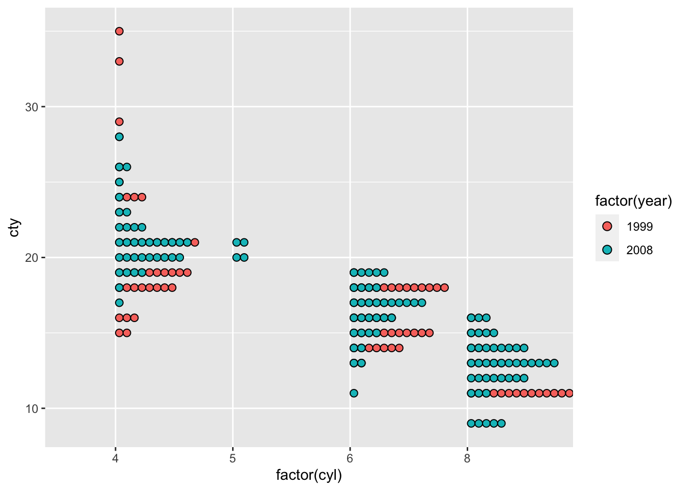
Density plots, are similar to histograms in that they present the distribution of the data. However, the geom_density() function within ggplot presents a smoothed version of the data. And can, similar to frequency polygons help to understand the underlying distribution within the data once smoothed. Density plots, similar to histograms are at risk of both over and under smoothing of the data, and so can be adjusted accordingly using the adjust parameter within the function.
  # Unspecificed Density Adjustment
ggplot(data = diamonds,
       mapping = aes(x = price)) +
       geom_density()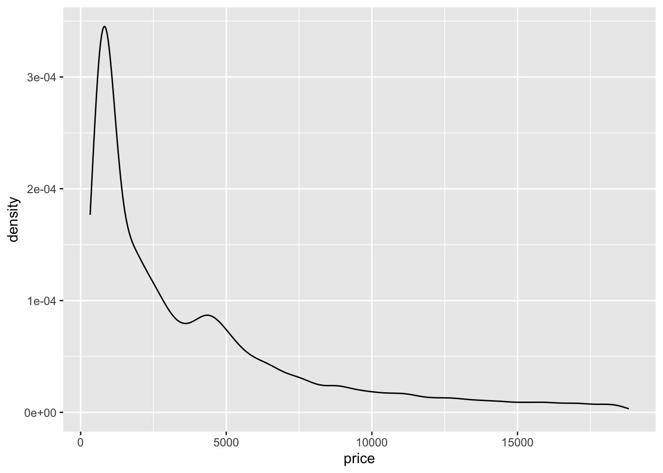
  # Density Adjustment at 0.5

ggplot(data = diamonds,
       mapping = aes(x = price)) +
       geom_density(adjust = 0.5)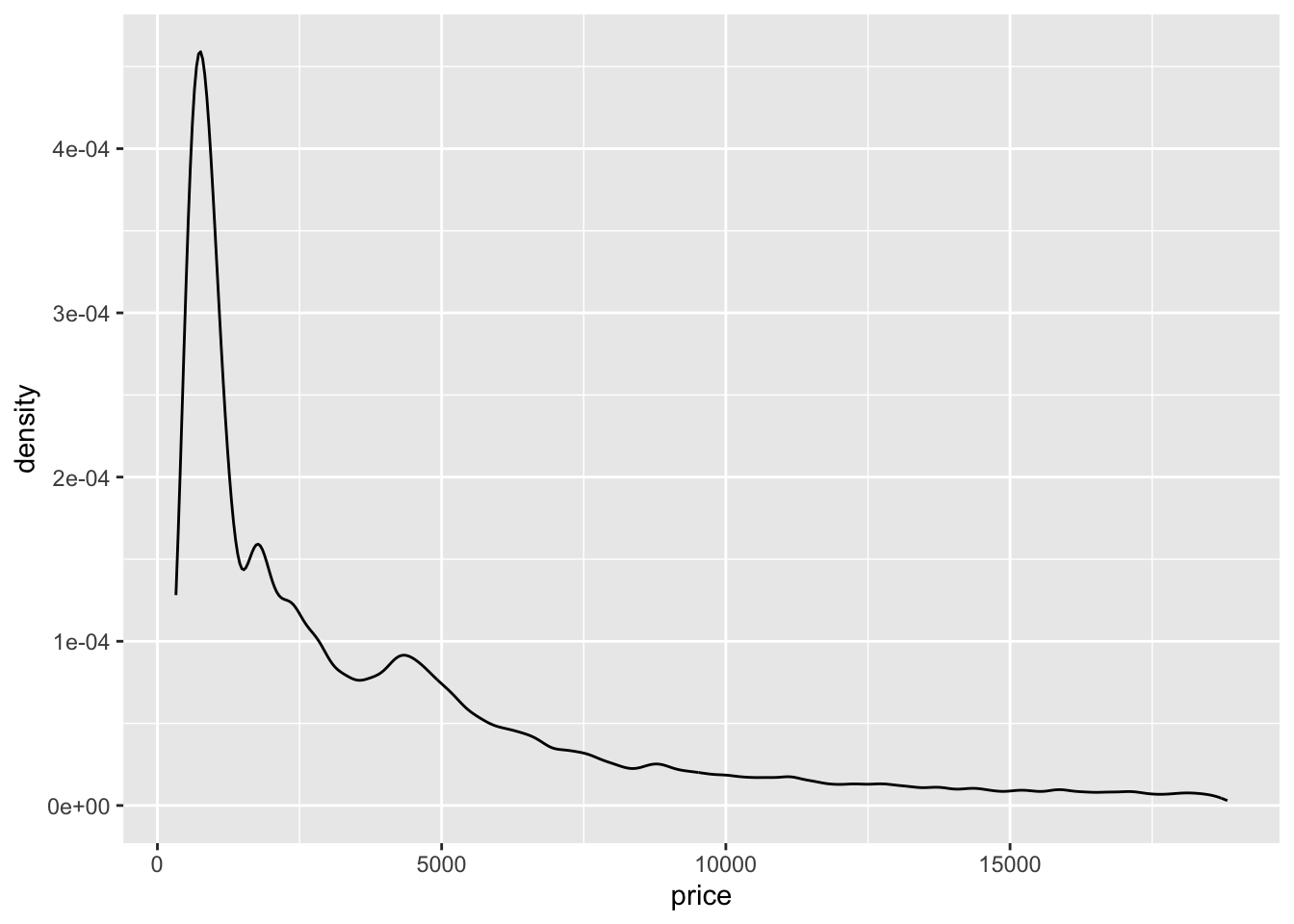
  # Density Adjustment at 10

ggplot(data = diamonds,
       mapping = aes(x = price)) +
       geom_density(adjust = 10)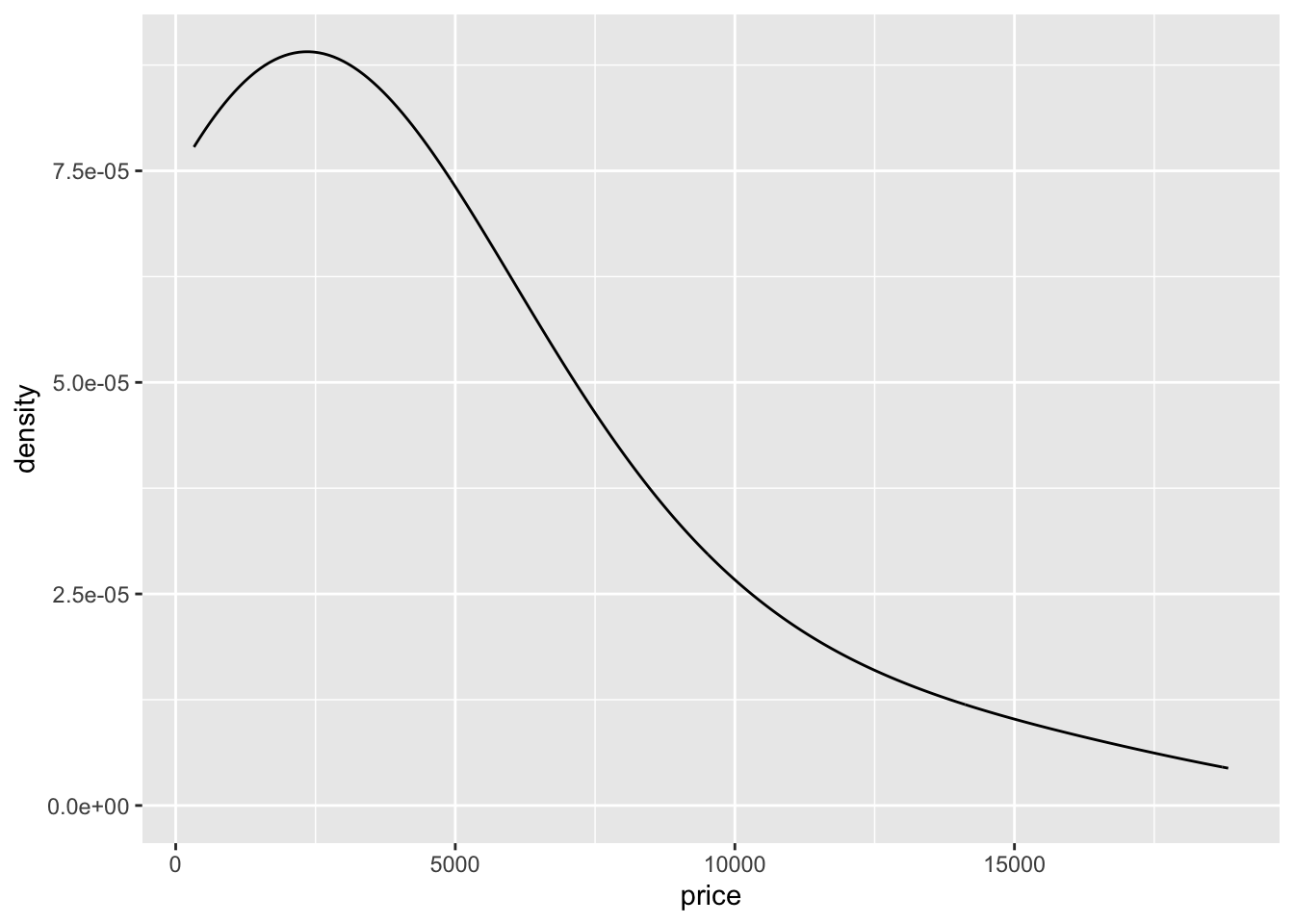
And similar to traditional histograms and frequency polygons, these can also be divided and specified by other information to allow comparison between groups.
  # Unspecificed Density Adjustment
ggplot(data = diamonds,
       mapping = aes(x = price, colour = cut)) +
       geom_density()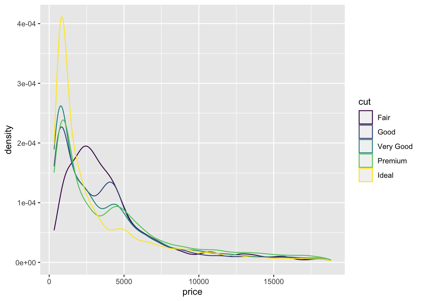
The function geom_density() is able to use the following aesthetics
x & y
alpha (transparency)
colour
fill
group
size
linetype
weight
Violin plots, present a different way to present data distributions, through blending box plots, with density plots. And as such can be used to observe how data is distributed around specific points and areas within your data. Although not widely used, these can present a novel way to present and display the distributions of your data.
ggplot(data = mpg,
       mapping = aes(x = factor(cyl), y = cty)) +
       geom_violin()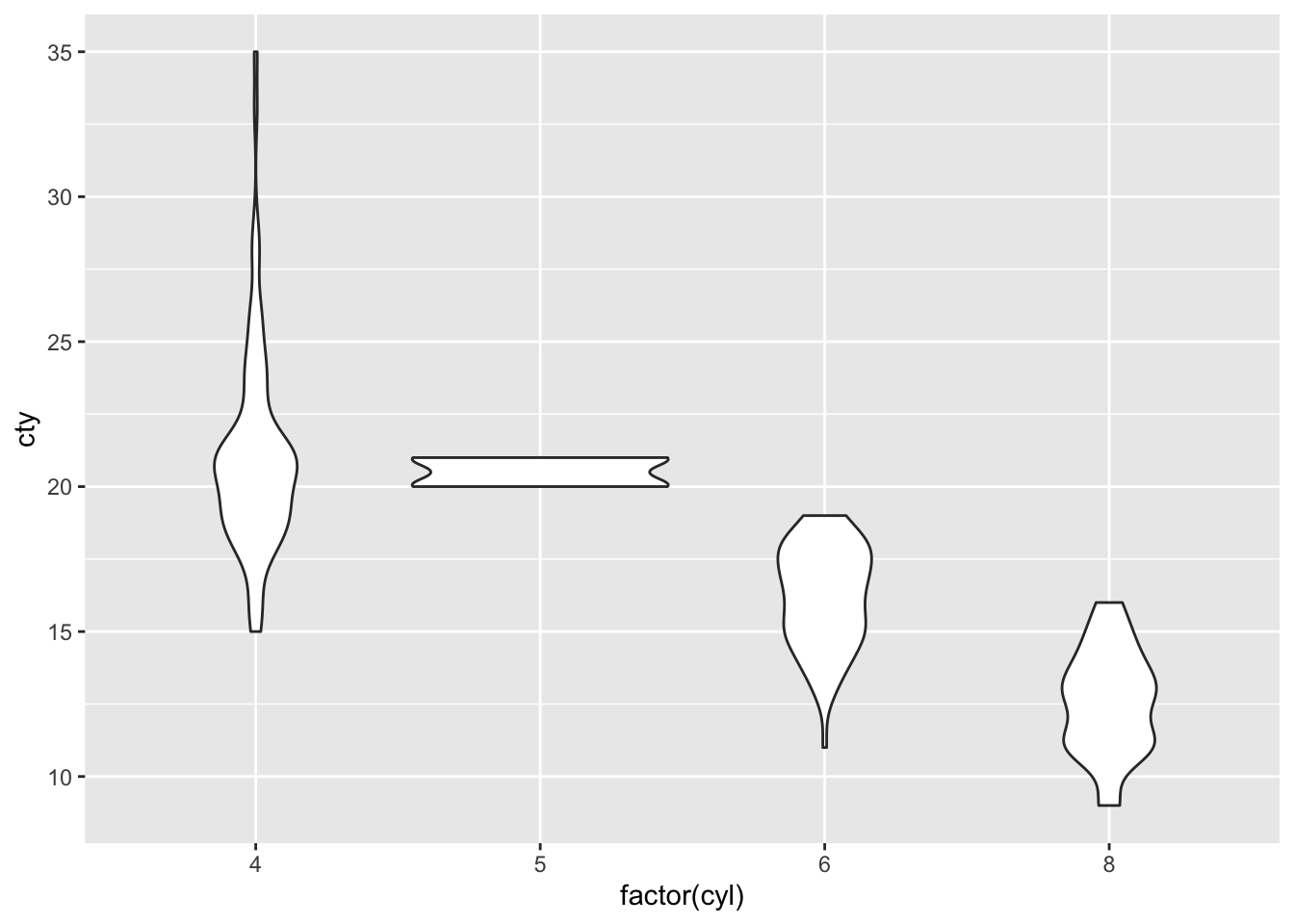
The function geom_violin() is able to use the following aesthetics
x & y
alpha (transparency)
colour
fill
group
size
linetype
weight
Line Graphs
Alongside the annotation functions covered within the practical, adding Reference lines to any given plot or graphic, can be useful to provide insight or guidance to those looking at the plot. A classical example is highlighting the baseline or desired boundary and those which fall above and below a specific point.
As such, three types of reference lines exist:
geom_abline()- This produces a diagonal linegeom_hline()- This produces a horizontal linegeom_vline()- This produces a vertical line
An example of this could be seen through stating that we wish to observe all those diamonds which are above a specific price, say for example the mean price and $1,000. As well as above a specific carat, for example 2.
ggplot(data = diamonds,
       mapping = aes(x = price, y = carat)) +
       geom_point() +
       geom_vline(mapping = aes(xintercept = mean(diamonds$price)), colour = "Blue") +
       geom_vline(mapping = aes(xintercept = 1000), colour = "Purple") +
       geom_hline(mapping = aes(yintercept = 2), colour = "Orange")
## Warning: Use of `diamonds$price` is discouraged.
## ℹ Use `price` instead.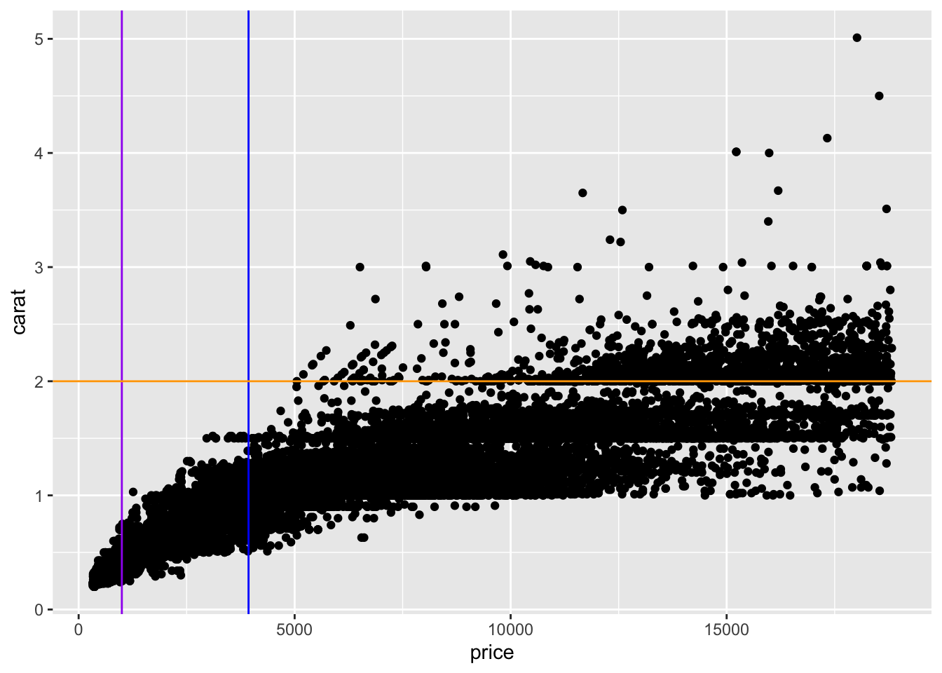
This therefore allows you to still present your data as a whole, to demonstrate any trends (for example) whilst still being able to highlight specific areas or points of interest, such as thresholds.
Additionally, these reference lines are particularly useful in the displaying of trend lines, as a result of linear regressions. These can be produced using the geom_abline() function which plots the slope parameter and the intercept parameter to provide this line.
As you can see from the example, each function can take all those aesthetics which are available in the geom_line() function, but require the following unique mapping parameters:
geom_abline()- requiresmapping = aes(slope, intercept)geom_vline()- requiresmapping = aes(xintercept)geom_hline()- requiresmapping = aes(yintercept)
When plotting some forms of data, such as time series data, it is required that the data be plotted together, drawing connective lines from point to point. Which unlike the reference lines should be directly reflective of the data. Within ggplot there are several methods to do this:
geom_line(): This connects data points in the order of the x-axis variablegeom_path(): This connects data points in the order of the datasetgeom_step(): This creates a stairstep plot, which highlights when changes occurs and groups them together to determine which cases are connected.
As demonstrated within the practical, the most commonly used of these methods is the geom_line() function, and especially for the plotting of time series data, such as stock prices, economic rates as well as other demographic continuous variables, present over long periods of time.
As these are covered within the practical, these will not be further examined here, but more can be found online in the ggplot reference webpage.
Heat Maps
Heat mapping, or multiple variable density plotting, works in a similar way to density plotting through dividing a graphic plane into multiple areas of interest and simply counting the number of cases within each area to produce a map. These are rather novel, in checking data assumptions and rather help present the density of multiple variables simultaneously. With the function geom_bin2d() being encouraged in situations where there is over-plotting when using geom_point().
ggplot(data = diamonds,
       mapping = aes(x = price, y = carat)) +
       geom_bin2d()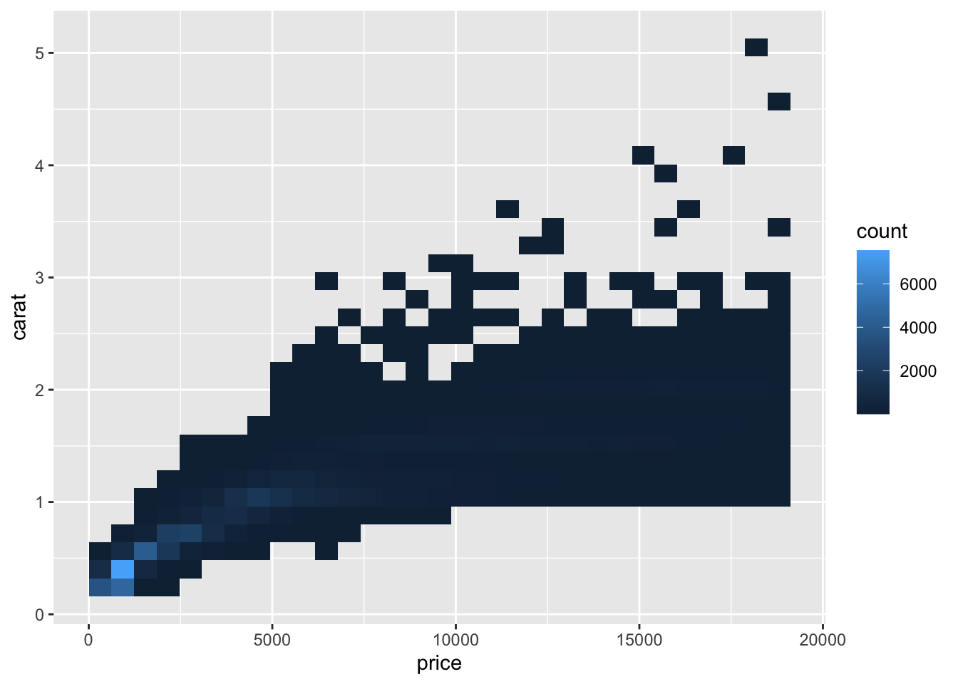
This similar to other histograms and density plots can have its bins specified within this function to ensure it presents the data most appropriately, and if specified precisely enough can overcome the over-dispersion problem further.
ggplot(data = diamonds,
       mapping = aes(x = price, y = carat)) +
       geom_bin2d(bins = 100)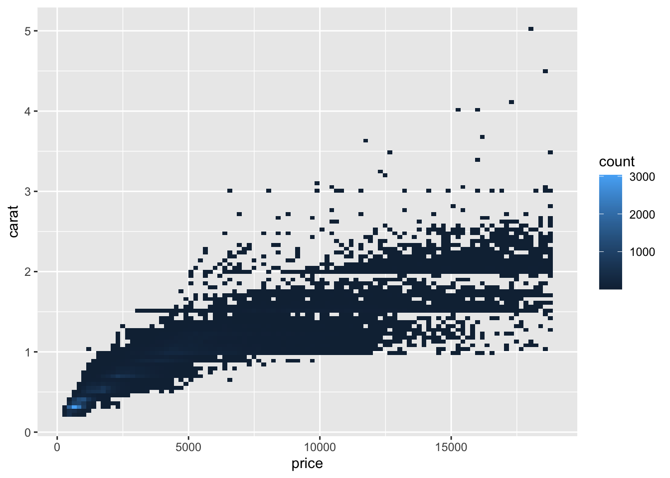
Within the function, only a limited number of aesthetic parameters can be specified:
- x & y
- fill
- group
Creating a heat map using geom_hex() works in a similar way to that of geom_bin2d(), rather instead of dividing a graphical area into rectangles, it divides it into hexagons.
ggplot(data = diamonds,
       mapping = aes(x = price, y = carat)) +
       geom_hex()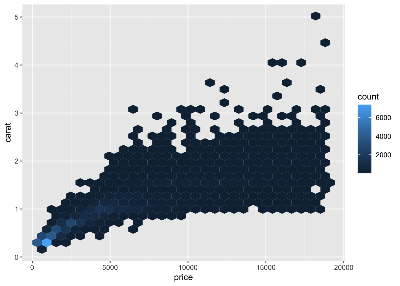
Unlike geom_bin2d() however, geom_hex() has a larger number of aesthetic parameters:
x & y
alpha
colour
fill
group
linetype
size
Error & Confidence Interval Graphs
Through using the function geom_box(), you are able to display a Tukey style box and whisker plot. This illustrates the distribution of continuous data, visualizing five core summary statistics (the median, the 25% & 75% quartiles and two whiskers (no greater than 1.5 times the interquartile range), in addition to any outliers within the data.
Due to the complexity of this type of plot, more mapping aesthetics are required: Required:
- x or y
- lower or xlower
- upper or xupper
- middle or xmiddle
- ymin or xmin
- ymax or xmax
Alongside the typical optional parameters:
- Alpha
- Colour
- Fill
- Group
- Linetype
- Shape
- Size
- Weight
As such the following example can be produced:
ggplot(data = diamonds,
       mapping = aes(x = cut, y = price)) +
       geom_boxplot()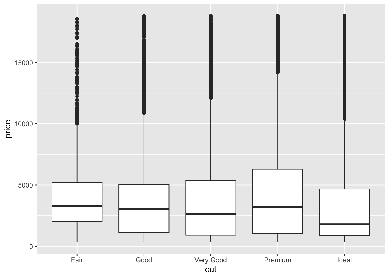
Similar to geom_boxplot(), geom_error() allows the visual representation of a vertical interval defined through the parameters x, ymin & ymax. Which can be added to data rather than a full Tukey style boxplot to demonstrate the normal/expected boundary of data.
This similar to geom_boxplot() requires:
- x or y
- ymin or xmin
- ymax or xmax
With additional parameters being:
- Alpha
- Colour
- Group
- Linetype
- Size
Due to their diversity and complexity, examples of how these are used, can be specifically seen on the geom_error reference page
When plotting certain types of data, such as time series data, it can be often useful to present a surrounding range of values, whether this be a potential error range or other potential values, this can be visually displayed using the function geom_ribbon(). This like geom_errorbar(), provides a visual representation of the specified upper and lower bound point to the provided values.
This like previous examples requires:
- x or y
- ymin or xmin
- ymax or xmax
With additional parameters being:
- Alpha
- Colour
- Fill
- Group
- Linetype
- Size
ggplot(data = economics,
       mapping = aes(x = date, y = unemploy)) +
       geom_line() +
       geom_ribbon(mapping = aes(
         ymax = (economics$unemploy + (economics$unemploy*0.10)),
         ymin = (economics$unemploy - (economics$unemploy*0.10))),
         alpha = 0.2, fill = "Blue")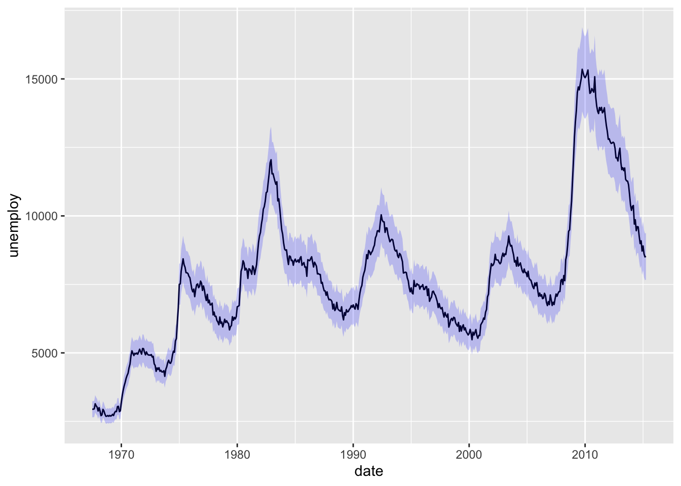
When conducting any form of traditional statistical analysis (linear regression, logistic regression etc), you may want to add a specific regression line to your data, alongside indicating specific conditional parameters, such as 95% Confidence interval (which will be covered more in Practical 3). One method of doing this, is through the function geom_smooth(), which uses one of these regression styles (specified through the commands method, or through indicating the formula presented), and plots this line and associated parameters accordingly.
For this function, it is possible to use the following statistical built in methods:
- “lm” - linear model
- “glm” - generalized linear model
- “gam” - Generalized additive model
- “loess” - Local Polynomial Regression Fitting
ggplot(data = txhousing,
       mapping = aes(x = txhousing$date, y = median)) +
       geom_point() +
       geom_smooth(fill = 'orange', se = T)
## `geom_smooth()` using method = 'gam' and formula = 'y ~ s(x, bs = "cs")'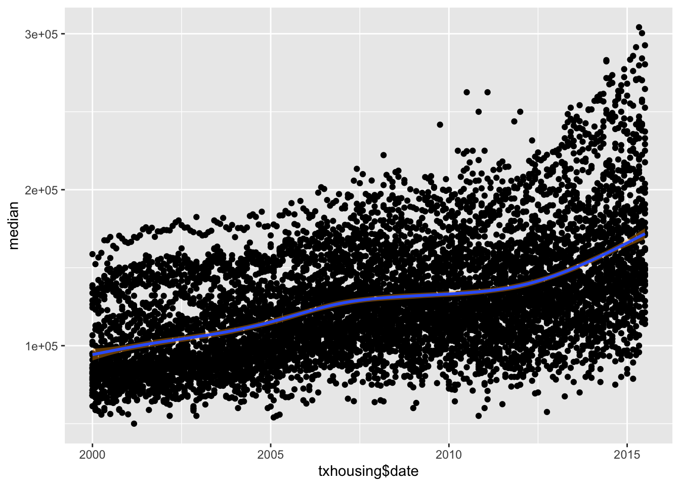
As a complex graphical function, and one which will be covered in more depth in practical 3. More information on this can be found on the ggplot reference site.
Colours
Colours will be discussed at greater length in the practical, however some basic understand of their properties and usage can be helpful! Since in theory anything within ggplot can have its colour altered or properties altered so that they can take on one or more colours. This can be both incredibly helpful in helping a reader differentiate data within a complex plot, or help those with specific sight difficulties access your data efficiently. However, it can also be a large hindrance, introducing needless complexity into your plot. So only use it when there is a valid point to its use.
As covered in the practical, colours can be accessed in multiple different ways, from pre-defined palettes to specific user-defined colours. In this brief section, the later will be specified, with commonly used links between hex codes and the colours defined here in R. It should be noted, that when using pre-defined palettes, many will also define their hex code also so you can use that specific colour at a future point.
Luckily however, you do not have to remember huge lists of hex codes in order to add colour to your graphs, R itself has over 600 colours built in, and can be viewed through running the command below.
colors()To add any of these pre-determined colours to your plots, you simply specify them within your aes() parameter within ggplot like so:
ggplot(data = [data.frame],
       mapping = aes(x, y)) +
    geom_[function](mapping = aes(colour = "COLOUR"))
It is important to remember the following when following this route
- Firstly, ensure the
geomfunction of your choice can have a colour mapping aesthetic command. - Secondly, ensure to have
" "around your colour name. - If you prefer to use Hex Codes, ensure to have both
" "and the#prefixing your code.
When you are considering the use of Hex codes, there are many generators online such as Colour-Hex, HTML Colour Codes and Hex Colour Tools; the list is endless can simply googling Hex Colour Code Generator will provide a huge amount of options, which allow you to find the colour you would like and the hex code associated with it. To implement this into your ggplot function, rather than specifying the colour by name, use the following format “#000000” which will indicate you want to use a hex code colour.
The final way to specify colour, which will only be discussed in a limited way, is using any of the parameter functions, provided within ggplot itself. These can be fully found on the ggplot reference site, and help define in more depth how you would like colour to be detailed, including the gradient scale_colour_gradient() & scale_fill_gradient(). As well as discrete colour scaling scale_colour_hue(). However for more information on these and examples please see the ggplot reference site.
Exporting and Saving your Graphs
Although being able to produce impressive and useful plots for your studies, research or other projects is extremely useful, ensuring they are deployed correctly and efficiently is just as useful. Within R, Rstudio and ggplot there are multiple ways to save, export and insert your graphs within your working documents.
Option 1: Manual Export via Rstudio
One of the easiest ways to export your graphics made using ggplot (or any plotting function within R), is using the Rstudio interface itself. When you have produced a plot using a plain R script (not Rmarkdown), it will typically be displayed within the Plots tab (generically in the bottom right corner - but this may be different depending on your version/layout of Rstudio). From here, through simply clicking the Export button and specifying how you would like to export the image (Image vs PDF) will allow the image to be exported accordingly. It is commonly recommended when exporting any image to do so at the highest quality possible, which for most purposes is PNG, as this allows easy scaling and sizing of the image with limited distortion.
Option 2: Inbuilt ggplot save function
A more convenient way within Rmarkdown files, is through using the ggplot function ggsave(). This function operates in much the same way as the manual export, requiring the following setup.
ggsave(
  filename = [filename],
  plot = [either call the item you have saved it too, or use last_plot()],
  device = [image type: png(), jpeg(), pdf() etc],
  path = [typically NULL, however this is the save file path],
  scale = [scaling factor, typically 1],
  width = [plot size width, typically NA],
  height = [plot size height, typically NA],
  units = [indicate what unit size you want - "in", "cm", "mm"],
  dpi = [detail level, typically 300],
  limitsize = [should the size be limited T/F],
  ...
)
From this, this will export and save you graph accordingly to the specifications you have used. For further ways to interact with graphics and Rmarkdown please see Chapter 6 in R Markdown: The Definative Guide.
Conclusions and Take-away
Through having a basic understanding of some of the core properties and functions of ggplot it allows you to being to really explore the world of data visualization, through experimentation and self-guided exploration. As once these basic techniques and skills have been mastered, it truly allows you to begin to have a better grasp and understanding of the data you are presented with and how you can go about analyzing and interacting with it.
For more information on ggplot please visit their website.