Data Visualization using ggplot
Part 1: to be completed at home before the lab
In this practical, we will learn how to visualize data, we will be using a package which implements the grammar of graphics: ggplot2. Both of these packages exist within the tidyverse.
It is advised to review both the lecture slides for this week as well as the tab labelled Basics of ggplot as this will review some fundamentals of ggplot.
You can download the student zip including all needed files for practical 2 here. You can work from the Rmd file practical_2_worksheet.Rmd (as the Rmarkdown code used to create this specific lab html file is very extensive, you will not work from it direclty).
Note: the completed homework has to be handed in on Black Board and will be graded (pass/fail, counting towards your grade for individual assignment). The deadline is two hours before the start of your lab.
Hand-in should be a PDF file. If you know how to knit pdf files, you can hand in the knitted pdf file. However, if you have not done this before, you are advised to knit to a html file as specified below, and within the html browser, ‘print’ your file as a pdf file.
This practical includes one bonus question (Question 10) that counts for one point for your homeworks. You should work with your group for this final question. The deadline for submission is Friday May 10th, 23:59pm.
For this lab you will require the following packages:
library(ISLR)
library(tidyverse)
1.1 - Graphics without and with ggplot
Plots within R can be created without the use of ggplot using plot(), hist() or barplot() and related functions.
For examples of how to construct graphics without ggplot expand the section below.
Here, we can create examples of each using the dataset Hitters, from ISLR.
Firstly, using the function head() it is possible to get an idea of what the dataset looks like:
head(Hitters)## AtBat Hits HmRun Runs RBI Walks Years CAtBat CHits CHmRun
## -Andy Allanson 293 66 1 30 29 14 1 293 66 1
## -Alan Ashby 315 81 7 24 38 39 14 3449 835 69
## -Alvin Davis 479 130 18 66 72 76 3 1624 457 63
## -Andre Dawson 496 141 20 65 78 37 11 5628 1575 225
## -Andres Galarraga 321 87 10 39 42 30 2 396 101 12
## -Alfredo Griffin 594 169 4 74 51 35 11 4408 1133 19
## CRuns CRBI CWalks League Division PutOuts Assists Errors
## -Andy Allanson 30 29 14 A E 446 33 20
## -Alan Ashby 321 414 375 N W 632 43 10
## -Alvin Davis 224 266 263 A W 880 82 14
## -Andre Dawson 828 838 354 N E 200 11 3
## -Andres Galarraga 48 46 33 N E 805 40 4
## -Alfredo Griffin 501 336 194 A W 282 421 25
## Salary NewLeague
## -Andy Allanson NA A
## -Alan Ashby 475.0 N
## -Alvin Davis 480.0 A
## -Andre Dawson 500.0 N
## -Andres Galarraga 91.5 N
## -Alfredo Griffin 750.0 A
Using the function hist(), it is possible to examine the distribution of salary of different hitters.
hist(Hitters$Salary, xlab = "Salary in thousands of dollars")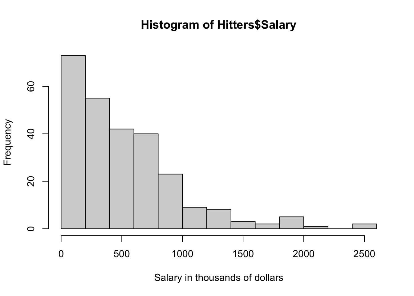
Using the function barplot() it is possible to plot how many members in each league.
barplot(table(Hitters$League))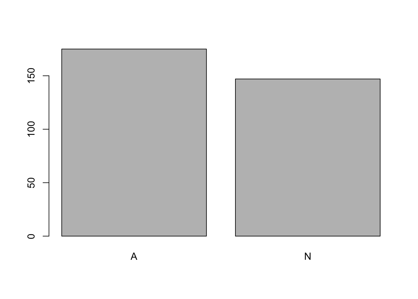
Using the function plot() it is possible to plot the number of career home runs vs the number of hits in 1986.
plot(x = Hitters$Hits, y = Hitters$HmRun,
     xlab = "Hits", ylab = "Home Runs")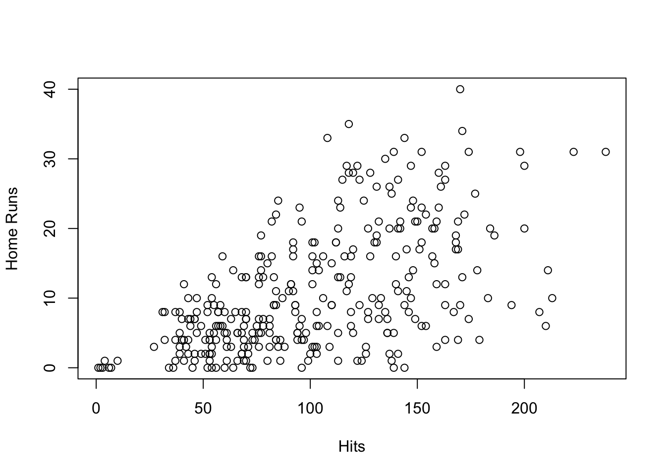
Overall, these plots are extremely informative and useful for visually inspecting the dataset, relatively easily, as they have specific syntax associated with each of them. By contrast, ggplot has a more unified approach to plotting, where layers can be built up using the + operator.
For example, the graphs created using the function plot() can be created in ggplot with relative ease.
plot vs ggplot
homeruns_plot <-
  ggplot(Hitters, aes(x = Hits, y = HmRun)) +
  geom_point() +
  labs(x = "Hits", y = "Home runs")

homeruns_plot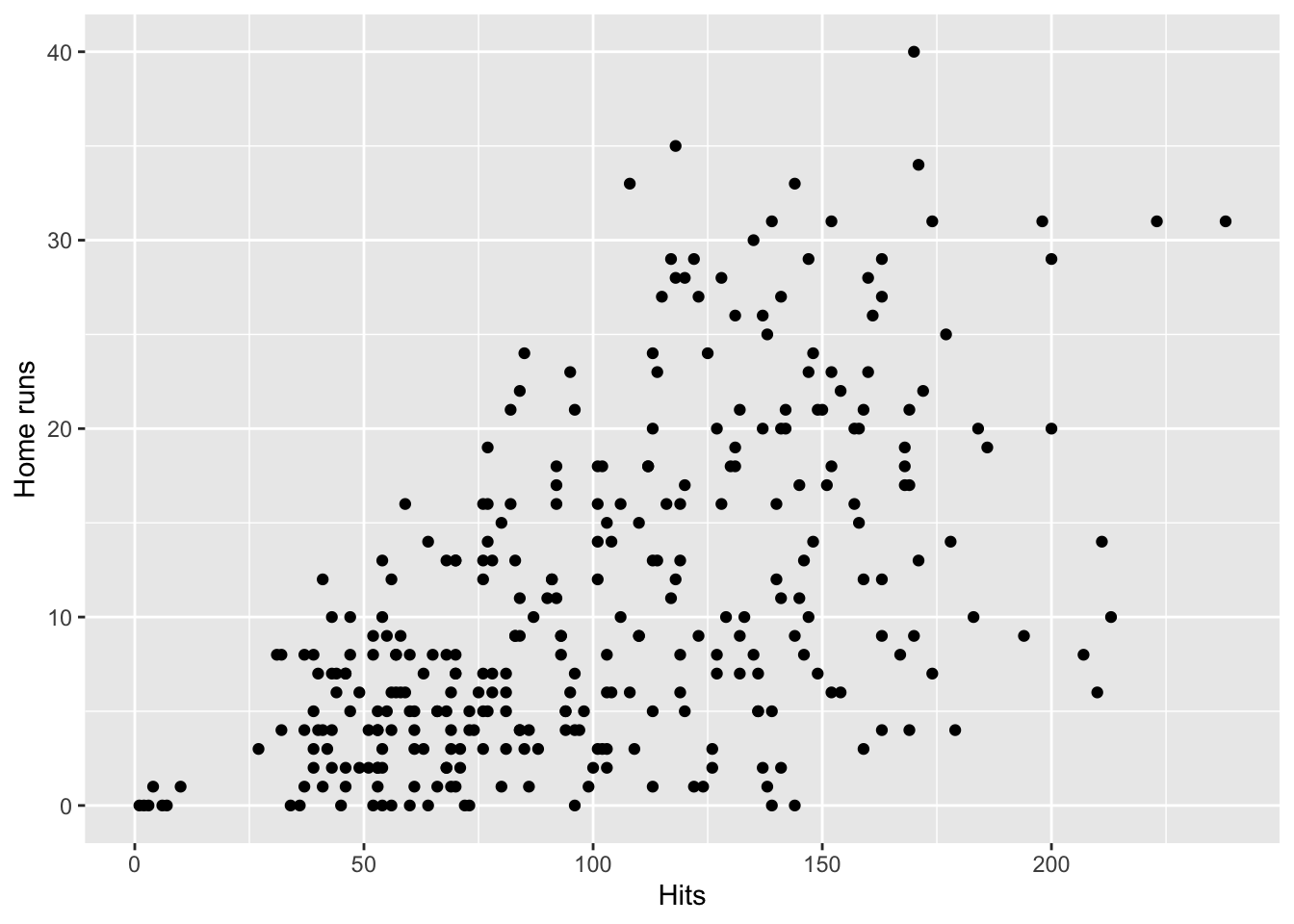
homeruns_plot +
  geom_density_2d() +
  labs(title = "Cool density and scatter plot of baseball data") +
  theme_minimal()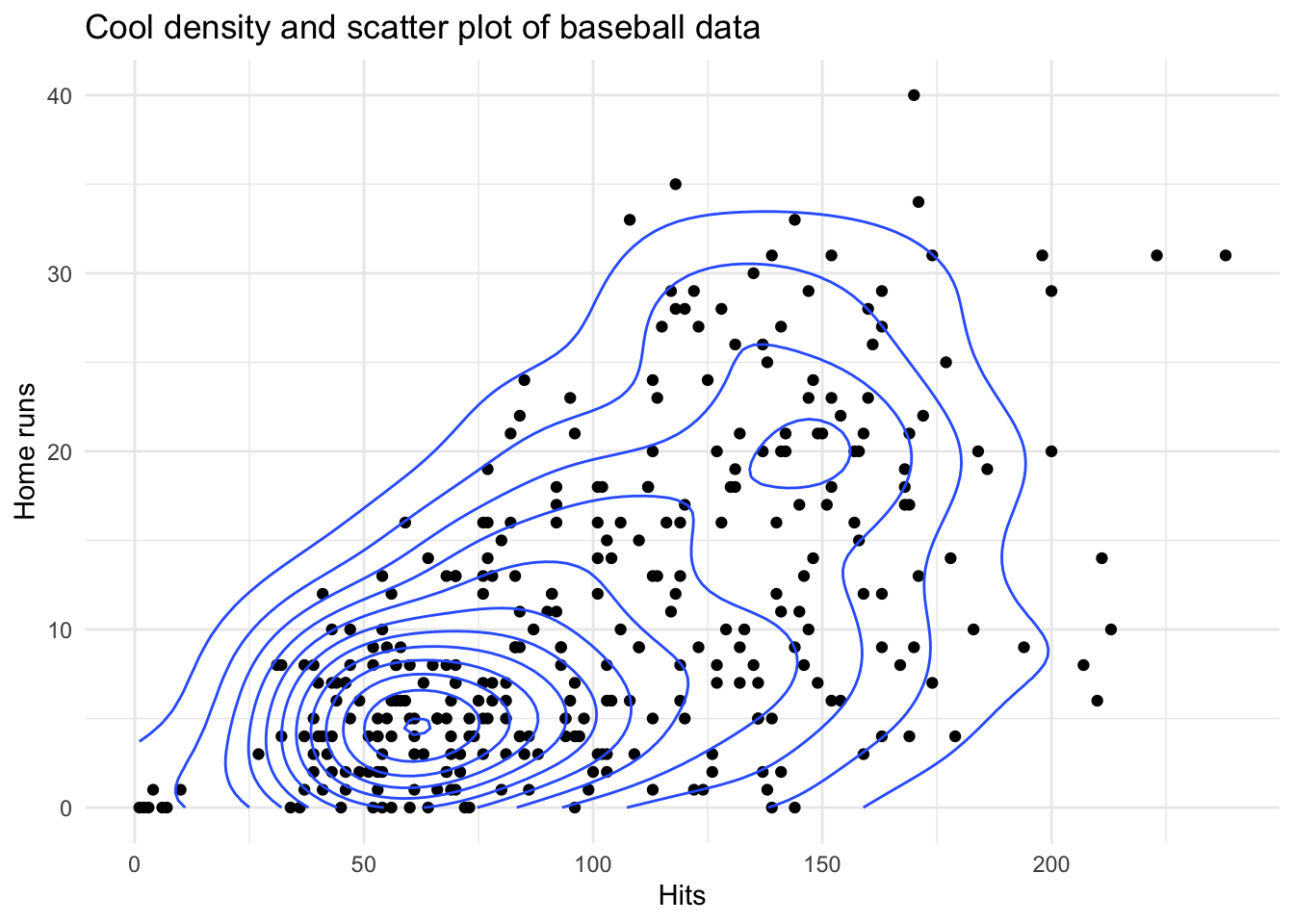
As introduced within the lectures a ggplot object is built up using different layers, as seen within the examples above.
- Input the dataset to a
ggplot()function call
- Construct aesthetic mappings
- Add (geometric) components to your plots which use these mappings
- Add Labels, themes and other visuals.
Due to this layered syntax it is easy to then add elements over time, as seen within the Complex Scatter plot tab, such as density lines, a title and a different theme.
Therefore in conclusion, ggplot objects are easy to manipulate and they force a principled approach to data visualization. Within this practical, we will learn how to construct them. This practical will be built upon a basic understanding of ggplot grammar, which is covered both in the lecture and can be refreshed under the Basics of ggplot tab on the course website.
1.2 - Aesthetics and Good Practice As discussed within the lecture, having clear graphs is critical to ensure easy interpretation of the information presented. If the data is not clearly presented, correctly labelled or overly complex then the information can be either incorrectly interpreted or not understood.
Let’s start with the diamonds dataset part of the ggplot package. It contains the prices and other attributes of over 50,000 diamonds (e.g. the carat, the quality of the cut, the color or the clarity). Check the dataset using ?diamonds.
Question 1: We are trying to understand the factors that may affect the price of the diamonds. Run the following code examples, and identify which graph represents the best visualization of the data. You can mention theories from the lecture on principles of design (i.e., Contrast, Alignment, Repetition and Proximity).
Note: Ensure to remove the # when running the code yourself.
dia.ex1 <- ggplot(data = diamonds, mapping = aes(x = carat, y = price)) +
  geom_point() +
  labs(y = "Price in USD", x = "Carat", title = "Price of Diamond by Carat") +
  theme_classic()

# dia.ex1
dia.ex2 <- ggplot(data = diamonds, mapping = aes(x = carat, y = price,
                                                            colour = color)) +
  geom_point(size=0.5, alpha=0.5) +
  labs(y = "Price in USD", x = "Carat", title = "Price of Diamond by Carat") +
  theme_minimal()

# dia.ex2
dia.ex3 <- dia.ex2 + facet_wrap(~ color)
# dia.ex3
After discussing which graph is the best, consider which is the worst.
Question 2a: Using your knowledge and understanding of what makes a good, clear graph, improve one of the two graphs (if you improve the worst graph, change it differently than the ‘best’ graph given!).
Question 2b: Now using your knowledge and understanding, worsen one of the two graphs (if you worsen the best graph, change it differently than the ‘worse’ graph given! Note that the graph still needs to make sense).
Part 2: to be completed during the lab
2.1 - The layers of ggplot
As previously discussed, the beauty of ggplot is its unified approach to making graphs, as such understanding the core layers of a ggplot command, enables the construction of extremely professional looking graphs which are extremely adaptive.
For example, take the graph below created for the Finanical Times, this was created by John Burn-Murdoch an analyst for the company. This graph although complex in nature, began life within ggplot before being further developed with specialist layers, from different R packages. Although within this course we will not be producing anything this complex, this demonstrates that using a foundation within ggplot allows the development of much more professional plots.
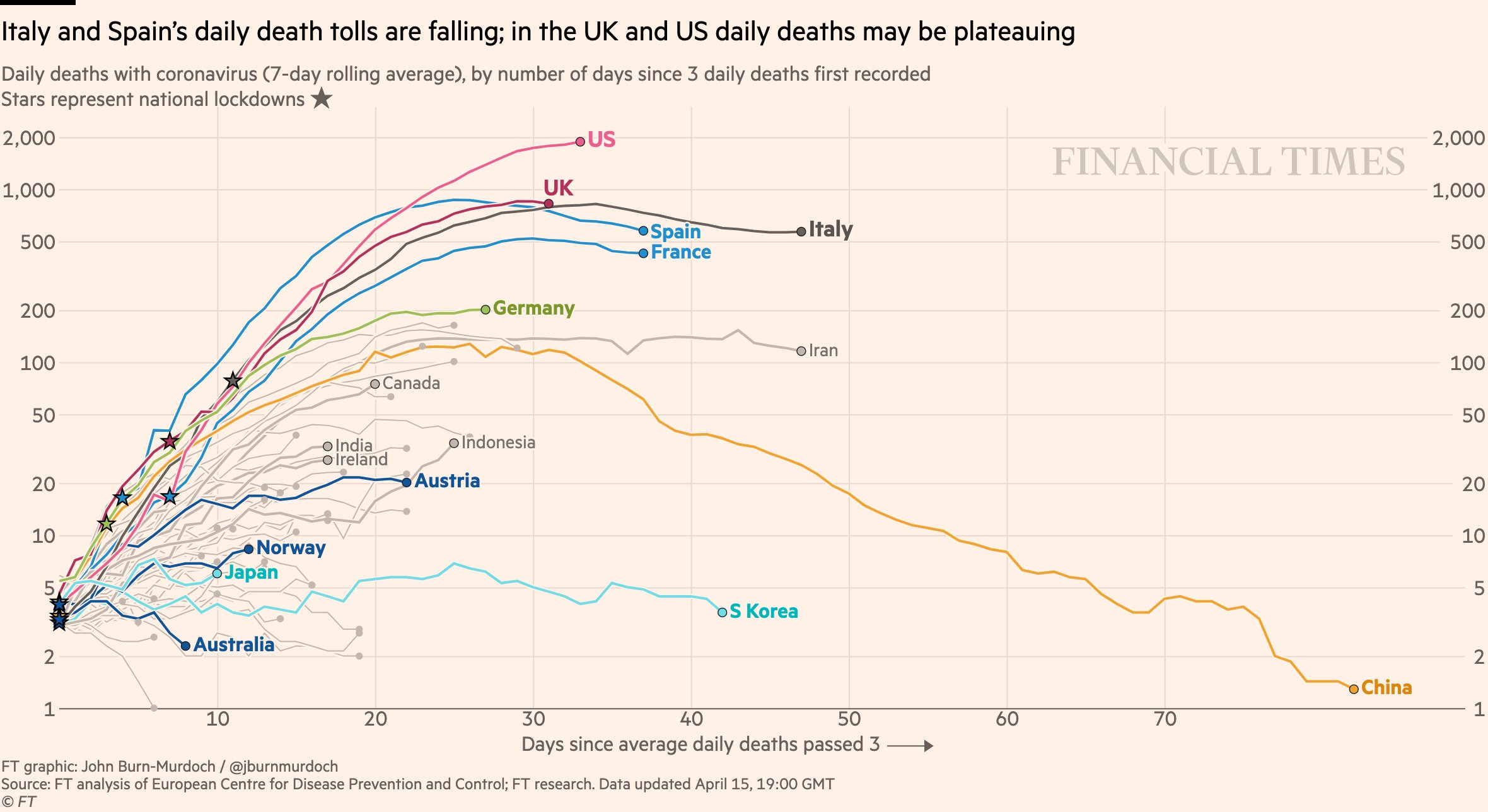
At this point, you may be wondering, what layers, should, can and need to be added to a ggplot graph in order to make this style of graphs. The next sections will cover some of the potential layers in more depth.
Question 3a: Within each of the following code examples, identify what each layer does within the graph
Using # label what each line does within the code blocks.
ggplot(data = diamonds,
       mapping = aes(
         x = price,
         y = carat)) +
  geom_point() +
  labs(
    x = "Price in USD",
    y = "Carat of Diamond",
title = "Price of Diamond per Carat") 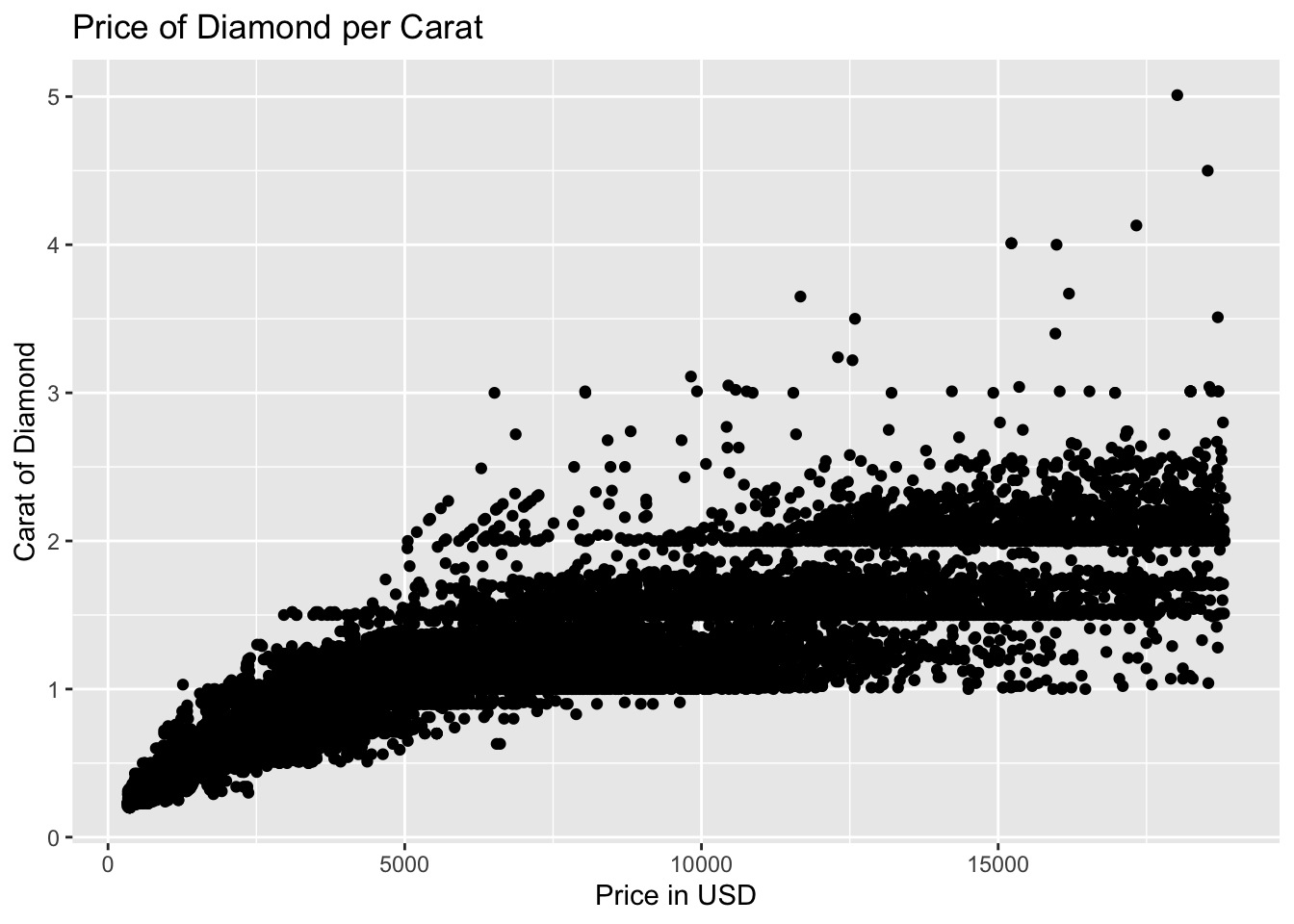
ggplot(data = diamonds,
       mapping = aes(
         x = price,
         y = carat,
         colour = clarity,
         shape = cut)) +
  geom_point() +
  labs(
    x = "Price in USD",
    y = "Carat of Diamond",
    title = "Price of Diamond per Carat",
    colour = "Diamond Clarity",
    shape = "Diamond Cut") +
  theme_minimal()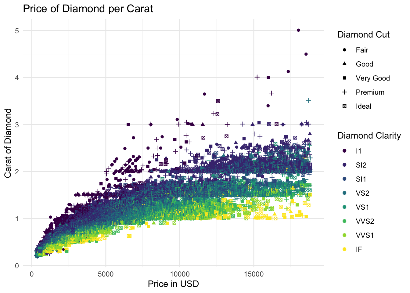
Run the code block, and systematically remove a singular line of code before reproducing the graph to see what has been changed or is different. Remember the following:
- Ensure to have the
+operator at the end of each line where more code follows - The more you interact and explore the different layers through changing parts the easier it will be.
- If in doubt return to the base code and start again!
Question 3b: Using the previous examples as a basis, attempt to reproduce the following plot
Using the previous example(s) as a template, use the mpg dataset (part of ggplot), to plot the following graph.
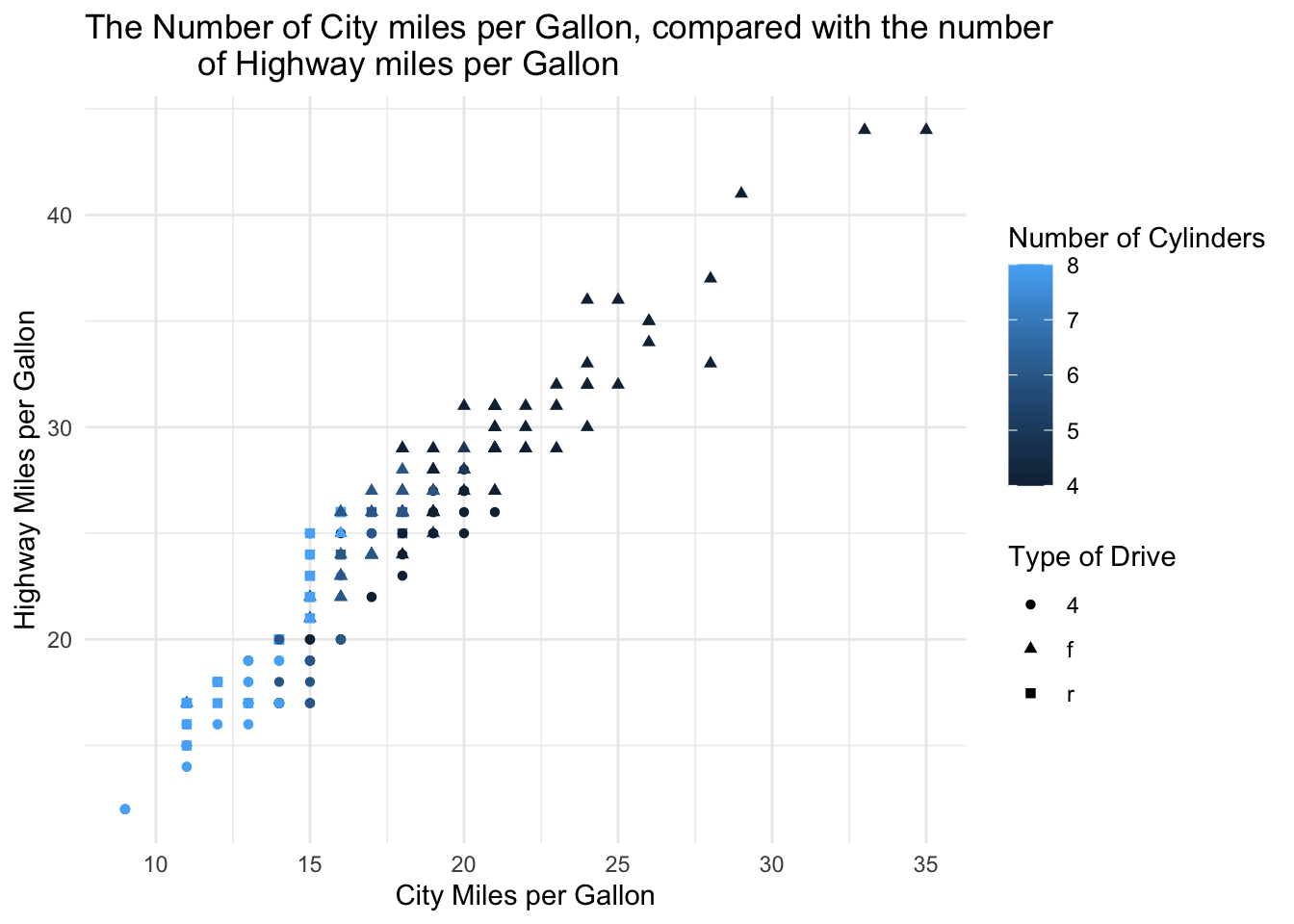
The following template can be used:
ggplot(data = mpg,
       mapping = aes(x = ??, y = ??, colour = ??, shape = ??)) +
  geom_??() +
  labs(
    x = ??,
    y = ??,
    title = ??,
    colour = ??,
    shape = ??) +
  theme_minimal()
From these examples it is clear that although trends and insights can be gained from this style of plotting. In some cases there is simply too much data or information being expressed in one plot, meaning that the more subtle trends or implications are lost. As such, faceting (as exampled earlier), can be used to break down major plots into smaller sections by specified conditions or values, making the data more easily digestible.
In practice as faceting is part of ggplot, it is possible to simply add this in to display plots as panels within a grid.
Question 4: Using your knowledge of faceting, change the following code example so that it converts it from a (complex) scatter plot to a series of faceted plots. In this way, we can asses whether the general pattern observed between REM sleep and time spent awake holds for each type of mammel.
This question will use the msleep dataset from ggplot. Using this example plot, facet this data by the Diet of the mammals (vore). Be sure to make a personal judgement call as to whether it is most appropriate in columns (cols) or rows (rows).
ggplot(data = msleep,
       mapping = aes(x = sleep_rem, y = awake, colour = vore, size = brainwt)) +
  geom_point() +
  labs(x = "Amount of REM Sleep", y = "Amount of Time Spent Awake",
       title = "Amount of REM Sleep compared to the Time Spent Awake",
       colour = "Diet", size = "Brain Weight") +
  theme_minimal()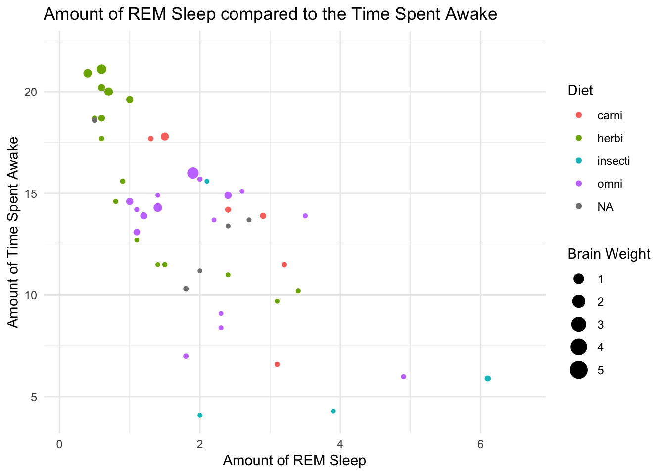
2.2 - Types of graphs in ggplot
So far within this practical, we have used be producing scatter plots, these although undoubtedly one of the most useful tools within an analysts toolkit, may not always be appropriate for the data at hand. During this subsection, several different types of plots will be examined, with more information on other types being found under the basics of ggplot tab.
As a component of ggplot you designate the way you would like your data to be expressed visually through adding geom layers to your dataset. In their simplest form these can simply stack onto your ggplot base allowing this to explain how the data should be displayed. Within our previous examples, this can be seen through the adding of geom_point() which indicates that data should be displayed as points. However these, like the base ggplot function can have specific mapping components allowing multiple different datasets to be expressed within one graph.
Firstly however, we can review what data is best expressed as different types of geom.
Question 5: Under each tab, examine the different graphs produced using the same information, which best displays the information present. Explain why you think the graph best displays the information.
Note: Remember to always check the type of variables which are being plotted, this can be checked under the help tab in Rstudio.
## We are interested in understanding the number of diamonds for each carat/price combination
q5a.gph1a <- ggplot(data = diamonds,
                    mapping = aes(y = price, x = carat)) +
  geom_point() +
  labs (y = "Price in USD", x = "Carat", title = "1. Scatter Plot")

q5a.gph2a <- ggplot(data = diamonds,
                    mapping = aes(x = carat)) +
  geom_bar() +
  labs (x = "Carat", title = "2. Bar Graph")

q5a.gph3a <- ggplot(data = diamonds,
                    mapping = aes(y = price, x = carat)) +
  geom_line() +
  labs (y = "Price in USD", x = "Carat", title = "3. Line Graph")

q5a.gph4a <- ggplot(data = diamonds,
                    mapping = aes(y = price, x = carat)) +
  geom_hex() +
  scale_fill_gradient(trans = "log10", low = "yellow", high = "black") +
  labs (y = "Price in USD", x = "Carat", title = "4. Heat Map Graph")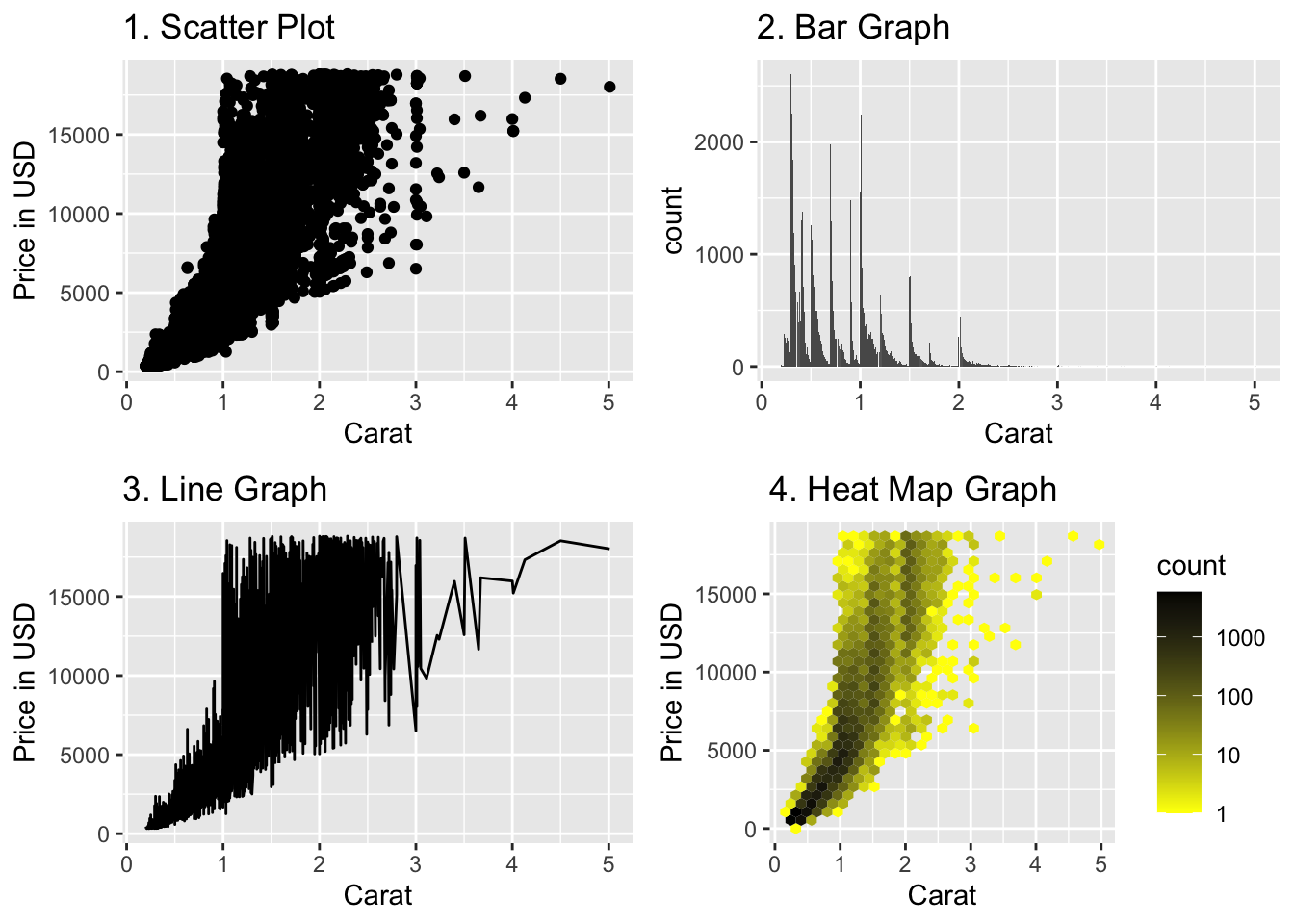
## We are interested in understanding the distribution of gas efficiency for different types of cars
q5a.gph1b <- ggplot(data = mpg,
                    mapping = aes(x = class, y = hwy)) +
  geom_jitter(width = 0.15, size = 0.5, alpha = 0.8) +
  labs (x = "Type of Car", y = "Highway Miles per Gallon", title = "1. Scatter Plot") +
  theme(axis.text.x = element_text(angle = 45, hjust = 1))

q5a.gph2b <- ggplot(data = mpg,
                    mapping = aes(x = class)) +
  geom_bar() +
  labs (x = "Type of Car", title = "2. Bar Graph") +
  theme(axis.text.x = element_text(angle = 45, hjust = 1))

q5a.gph3b <- ggplot(data = mpg,
                    mapping = aes(x = class, y = hwy)) +
  geom_line() +
  labs (x = "Type of Car", y = "Highway Miles per Gallon", title = "3. Line Graph") +
  theme(axis.text.x = element_text(angle = 45, hjust = 1))

q5a.gph4b <- ggplot(data = mpg,
                    mapping = aes(x = class, y = hwy)) +
  geom_bin2d() +
  labs (x = "Type of Car", y = "Highway Miles per Gallon", title = "4. Heat Map Graph") +
  theme(axis.text.x = element_text(angle = 45, hjust = 1))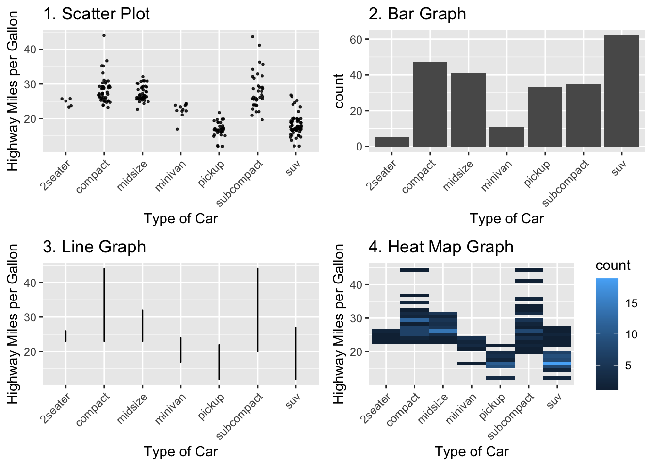
## We are interested in understanding the relationship between body weight and brain weight
q5a.gph1c <- ggplot(data = msleep,
                    mapping = aes(x = bodywt, y = brainwt)) +
  geom_point() +
  scale_x_log10() +
  scale_y_log10() +
  labs (x = "Body Weight", y = "Brain Weight", title = "1. Scatter Plot")

q5a.gph2c <- ggplot(data = msleep,
                    mapping = aes(x = bodywt, y = brainwt)) +
  geom_text(label = msleep$name) +
  scale_x_log10() +
  scale_y_log10() +
  labs (x = "Body Weight", y = "Brain Weight", title = "2. Text Graph")

q5a.gph3c <- ggplot(data = msleep,
                    mapping = aes(x = bodywt, y = brainwt)) +
  geom_line() +
  scale_x_log10() +
  scale_y_log10() +
  labs (x = "Body Weight", y = "Brain Weight", title = "3. Line Graph")

q5a.gph4c <- ggplot(data = msleep,
                    mapping = aes(x = bodywt, y = brainwt)) +
  geom_hex() +
  scale_x_log10() +
  scale_y_log10() +
  labs (x = "Body Weight", y = "Brain Weight", title = "4. Heat Map Graph")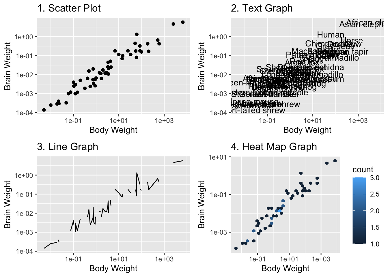
2.3 - Building a more complex graph in four steps
Although an extremely useful component of ggplot is the ability to simply layer on these plotting parameters, such as geom_point(), this can be limited when individuals are working with multiple datasets, multiple variables (such as conditions or time variables). As such a useful part of the functions, is that they themselves can specify the content to be displayed.
An example of this arises from the observation of time-series data such as stock prices, or other comparison driven information (Results of something over time). For example, we can compare the price of three stocks over the course of a 6 month period, such as Apple, Microsoft and Facebook. Although this can be done in multiple ways it can be in the following way:
Question 6: Follow the steps to plot the course of these stock prices over six months
Step Zero: Access the Data
For this example, data will be used from the website Nasdaq, a market trading site which has historical stock information for a large variety of different stocks. In this case we will examine Apple (APPL), Microsoft (MSFT) and Facebook (FB),
appl_stk <- read_csv(file = "data/HistoricalData_AAPI_6m.csv")
msft_stk <- read_csv(file = "data/HistoricalData_MSFT_6m.csv")
fb_stk <- read_csv(file = "data/HistoricalData_FB_6m.csv")
Step One: Evaluate & Examine the data.
As these datasets have been imported as dataframes, using the summary() function will allow you to better understand the data.
As you will see, all the data on currency values is prefixed with $ which will often cause issues with R not interpreting our data in the way in which we would like it too. As such the following code should be run.
Additionally the variable Date, is not in the correct format either, meaning this will also have to be manipulated using the following code. Since the dates are specified in the dataset as “%m/%d/%Y”, we will use the function mdy (month-date-year) from the lubridate package:
library(lubridate)

appl_stk <- appl_stk %>% mutate(`Close/Last` = as.numeric(str_replace(`Close/Last`,"\\$", "")),
                                `Date`       = mdy(Date))
msft_stk <- msft_stk %>% mutate(`Close/Last` = as.numeric(str_replace(`Close/Last`,"\\$", "")),
                                `Date`       = mdy(Date))
fb_stk <- fb_stk %>% mutate(`Close/Last` = as.numeric(str_replace(`Close/Last`,"\\$", "")),
                            `Date`       = mdy(Date))
Step Two: Initial Plotting
After ensuring the data is suitable for use, initial plots can be made before combining them together to observe the differences and trends within the data.
For this, it is recommended you produce individual plots for each stock using the skills we have previously discussed.
Step Three: Plotting together
Now that you have three separate plots, to combine them, we first make one data frame including all data sets and a variable that indicates stock type, using:
stk <- bind_rows(appl = appl_stk, msft = msft_stk, fb = fb_stk, .id = "type")
 stk$type <- as.factor(stk$type)
Now, to make the combined plot, simply use the following format:
ggplot(data = ??, mapping = aes(x = ??, y = ??, group = ??)) +
  geom_line()
As you can see from this code, you simply indicate to ggplot that we want to plot three separate lines, indicated by the parameter group.
Step Four: Tidying up
Now that all three layers are included, further details should be added to tidy up the plot, this includes identification of each of the three lines, and nice x- and y-axis labels. One of the most useful ways to identify data is through colour. In this case the parameter colour = ... can be added inside of aes(...), which will then use the default ggplot color scheme for categorical input. A legend will be added automatically.
Once this is completed, you can also add a nicer title and labels to the automatically generated legend by adding an additional line of code which details the information:
levels(stk$type)
scale_color_discrete(name = [name of legend],
                      labels = c([legend labels, in SAME order as the levels of the factor stk$type]))
Finally, make a new folder in your project called figures, and save the plot you made in this folder using the function ggsave. Save it as a PDF:
Now you are all set to be able to build some good graphs yourself. Below, we provide information to even further extend or improve your graph using colours and colour palattes, setting the size and shapes of points, and adding labels and (semi transparant) coloured boxes to your plot. The below part is, however, optional and you can also opt to review the below part at a later point in the course. For example, when you are working on your first graded assingment for which you will also have to produce a graph.
2.4 - (OPTIONAL) Shapes, colours and other details
Applying additional visual information to a graph, can both be positive and negative. As previously discussed too much information becomes overwhelming but achieving the correct balance allows beautiful professional looking graphics. As such colours, shapes, sizes, labels and even icons can be applied in a variety of different ways to achieve the best desired result.
Colours
There are a large variety of different ways to include colours within a plot, as well as a huge variety of different colours to choose from. Let’s first discuss ways in which to select colours. As a whole, using colours within R whether in graphics or not, can be specificed individually (using hexcode, or simply colour labels: red) or in the form of pre-determined palattes. Pre-build palattes are incredibly useful as they are define sets of colours which are applied to the information or data used, and saves you (as the coder) from having to specify each individual colour you would like to call.
The amount of palattes available for use, is huge. Simply check out the CRAN Packages Site and using your internet search finder explore for those packages with colour/color in their title. On CRAN there is a huge amount from palattes inspired by fandom’s and popular culture like Studio Ghibli, Pokemon, Harry Potter and many, many more. However not all colour palattes are so linked with popular culture, and rather some are specifically designed for certain scientific groups Oceanography, biologists, those who are Colour Blind and scientific journals generally. Although there is a huge variety of different packages available one of the most commonly used is R-Colour-Brewer. This provides a huge variety of different options and colour schemes for graphs and other visualizations.
These like any package from CRAN, to access and explore your palatte options, you can use the following steps:
## Step 1: Install the package straight from CRAN
install.packages("[PACKAGE]")
## Step 2: Call into your library
library([PACKAGE])
## Step 3: To access your palatte options
## Be sure to check the packages manual, however some examples are included here:

## For the `ghibli` package call:
library(ghibli)
ghibli_palettes
## For the `palettetown` package (Pokemon) call:
library(palettetown)
pokedex()
From here within ggplot the colour can then be added as part of the ggplot function. For example:
## To add a 'Scale Continuous' object from the ghibli colour scheme to the ggplot object
+ scale_color_ghibli_c(name =..., direction =...)

## To add a 'Scale Discrete' object from the ghibli colour scheme to the ggplot object
+ scale_color_ghibli_d(name =..., direction =...)
With an example of these being included being seen below:
ggplot(iris, aes(x = Sepal.Length, y = Sepal.Width, colour = Petal.Length)) +
  geom_point() +
  theme_minimal() +
  scale_colour_ghibli_c("PonyoMedium")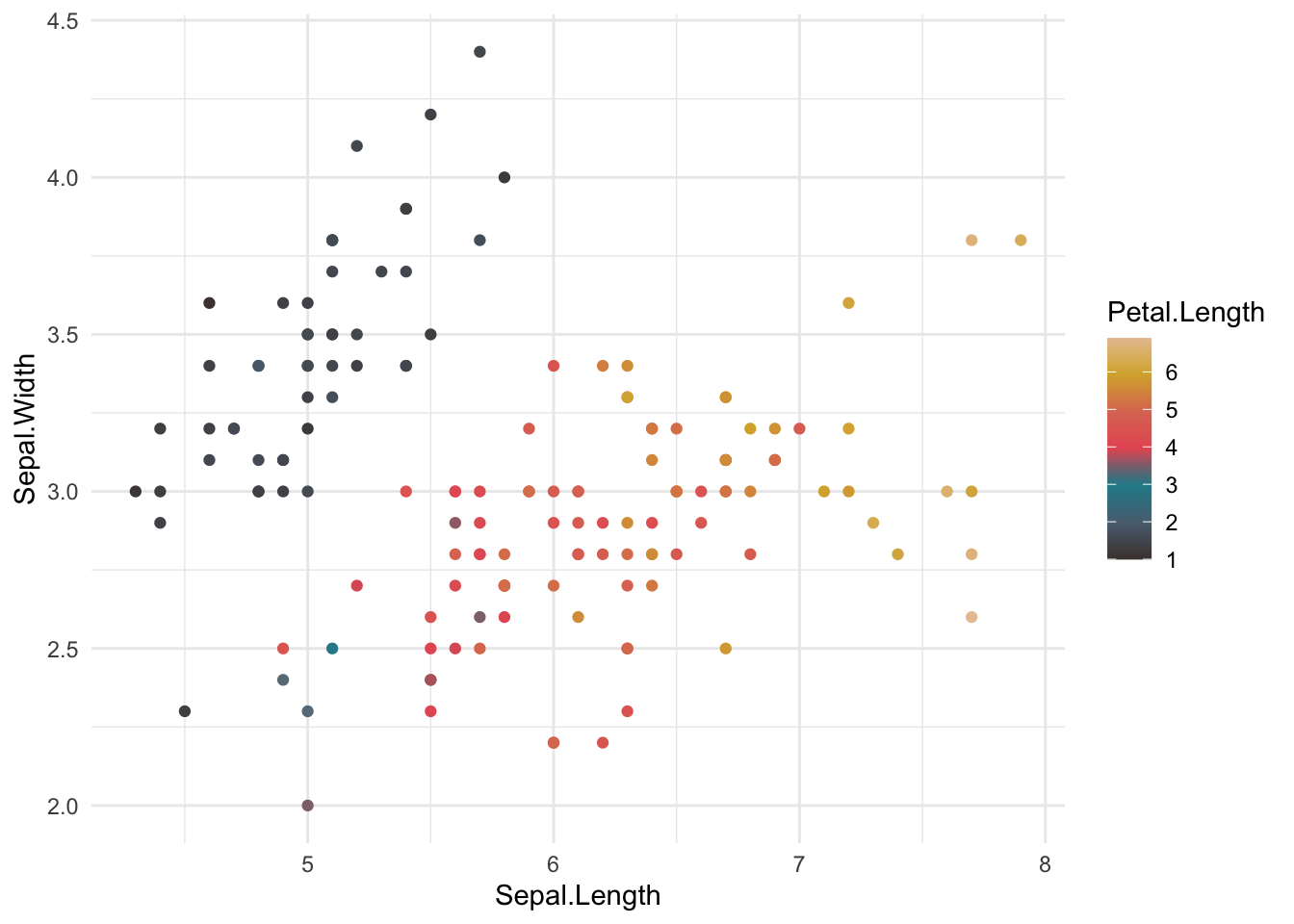
ggplot(data = diamonds, mapping = aes(x = price, y = carat, colour = cut)) +
  geom_point() +
  labs(x = "Price in USD", y = "Carat", title = "Price of Diamond by Carat") +
  theme_minimal() +
  scale_color_ghibli_d(name = "SpiritedMedium")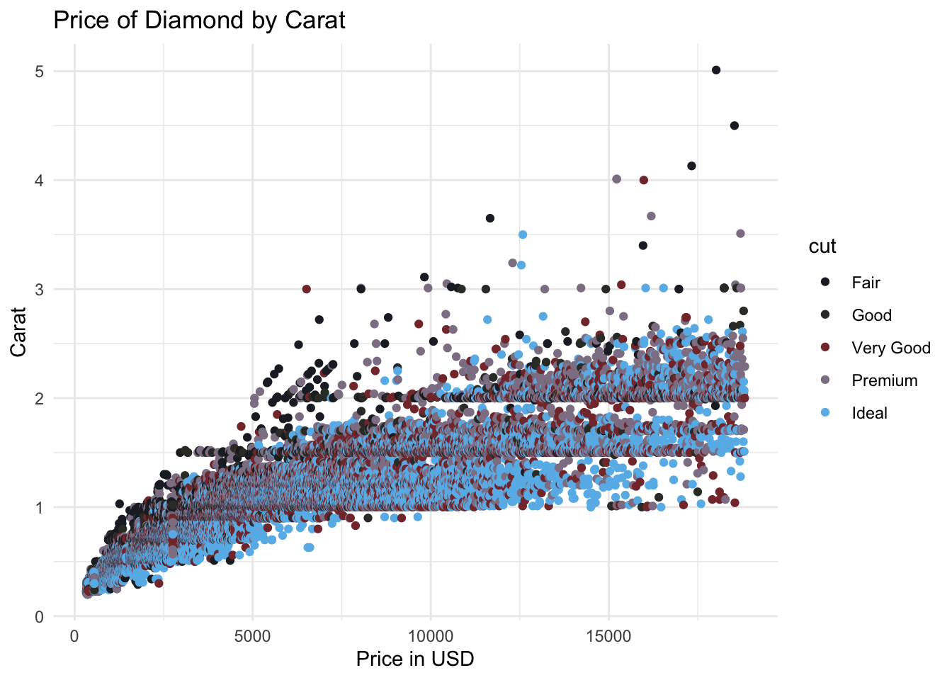
Question 7a: After exploring the huge amount of colour platettes available, use the provided template and change the scale colour.
Remember: this is continuous data so ensure to use a function which is continuous.
ggplot(data = airquality, mapping = aes(x = Wind, y = Solar.R, colour = Temp)) +
  geom_point() +
  [colour function]
This however is not the only way to call in colours, as mentioned, these can also be called as hex code values. These values are a universal code to designate the colour used. These can be used in replacement of when you call singular colours (for example: red).
Singular colours are typically called for individual lines, groups or items, and are specified similar to the example regarding stock price. More information on this can be found within the basics tab.
Another use of colour, it through the defining areas to fill. One example of how this is used is during density plots. These typically examine the density distrubtion of a specific dataset. A density plot example can be seen below:
ggplot(data = diamonds, aes(x = carat)) +
  geom_density() +
  theme_minimal()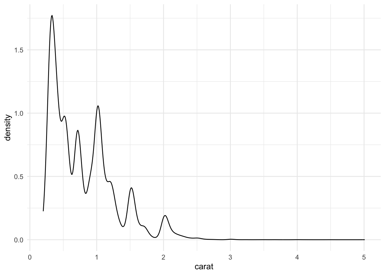
Question 7b: using the dataset midwest (from ggplot); produce a density plot which examines the density of a specific variable of your choosing, grouped by another variable from the dataset, using this information regarding colours for density plots.
Shapes and Sizes
Using shapes and sizes within ggplot, can be done in much the same way as colour, through defining them within the aes() parameter. Both size and shape can either be singularly defined (uniform across all data) or variable specific. Examples of these can be seen below:
Through specifying a single number this sets the size to a static value.
ggplot(data = diamonds, mapping = aes(x = price, y = carat, size = 2)) +
  geom_point() +
  theme_minimal()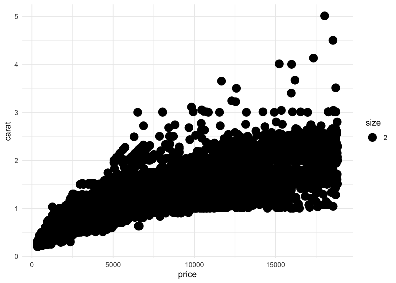
When using static shapes, these can be defined within geom_point(), using a specfic number, which corresponds to a shape within R. This figure from: STHDA illustrates the different shapes which can be applied within graph points.

ggplot(data = diamonds, mapping = aes(x = price, y = carat)) +
  geom_point(shape = 13) +
  theme_minimal()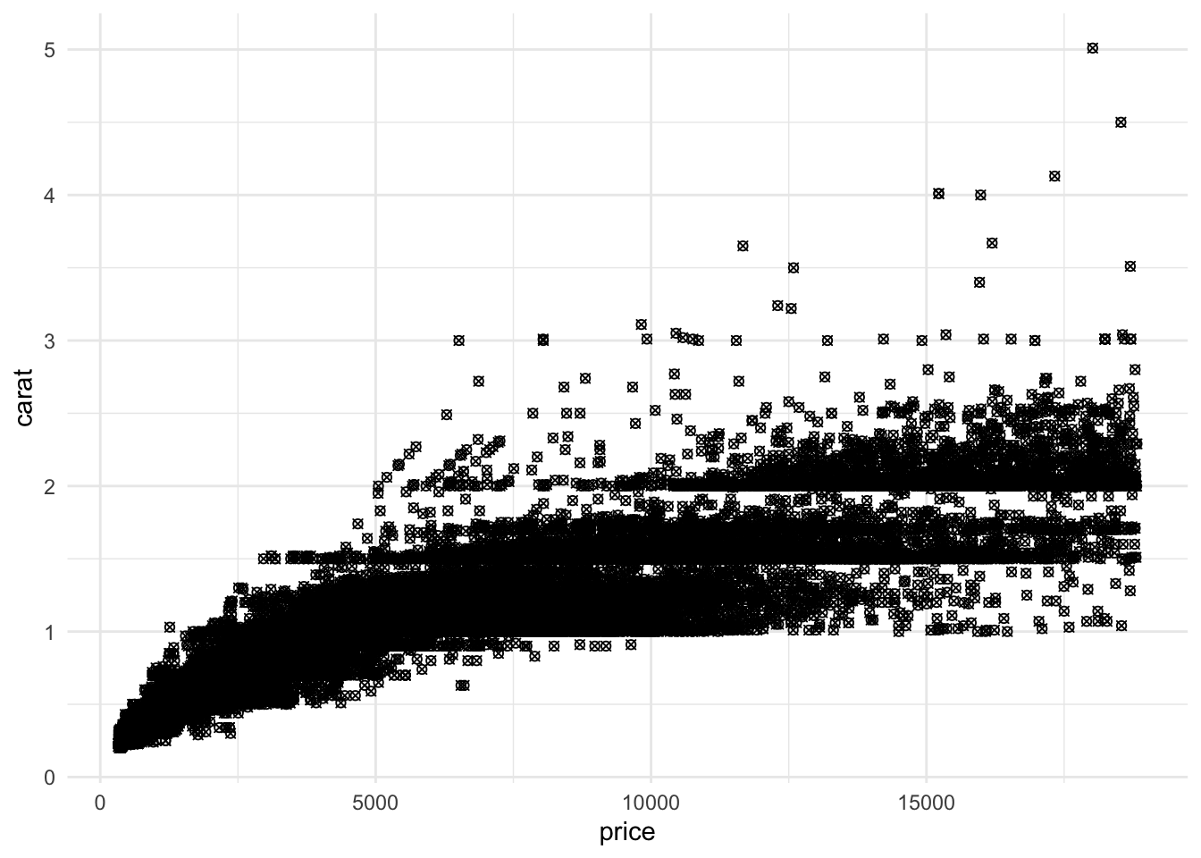
Setting the size as a variable, either continuous or discrete provides additional information.
ggplot(data = diamonds, mapping = aes(x = price, y = carat, size = y)) +
  geom_point() +
  theme_minimal() +
  labs(size = "Diamond Width")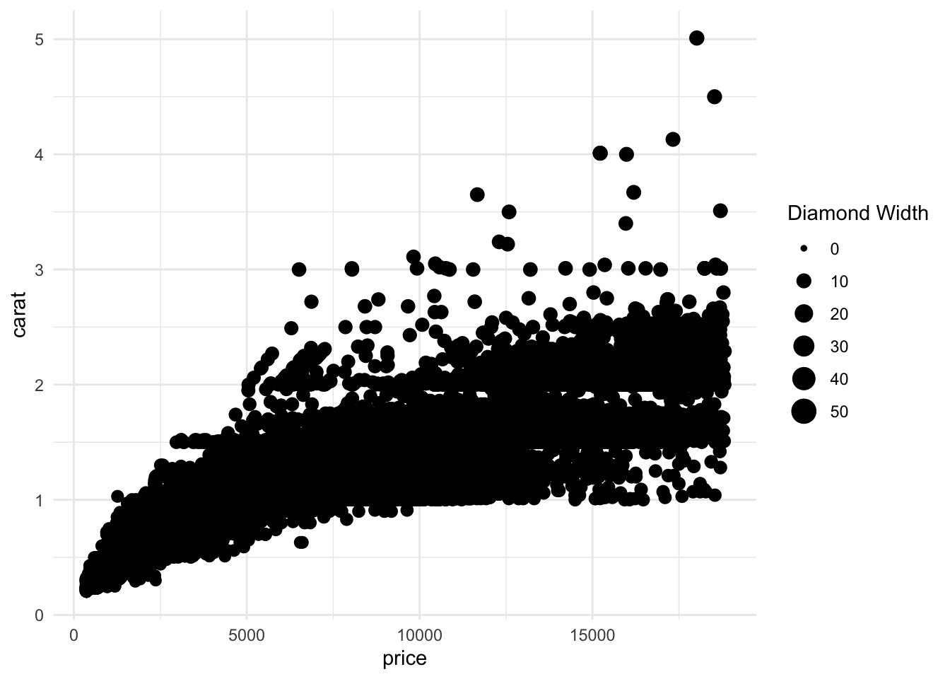
Setting the shape as a discrete variable (typically less than 7 categories within ggplot) provides additional information.
ggplot(data = diamonds, mapping = aes(x = price, y = carat, shape = cut)) +
  geom_point() +
  theme_minimal() +
  labs(shape = "Diamond Cut")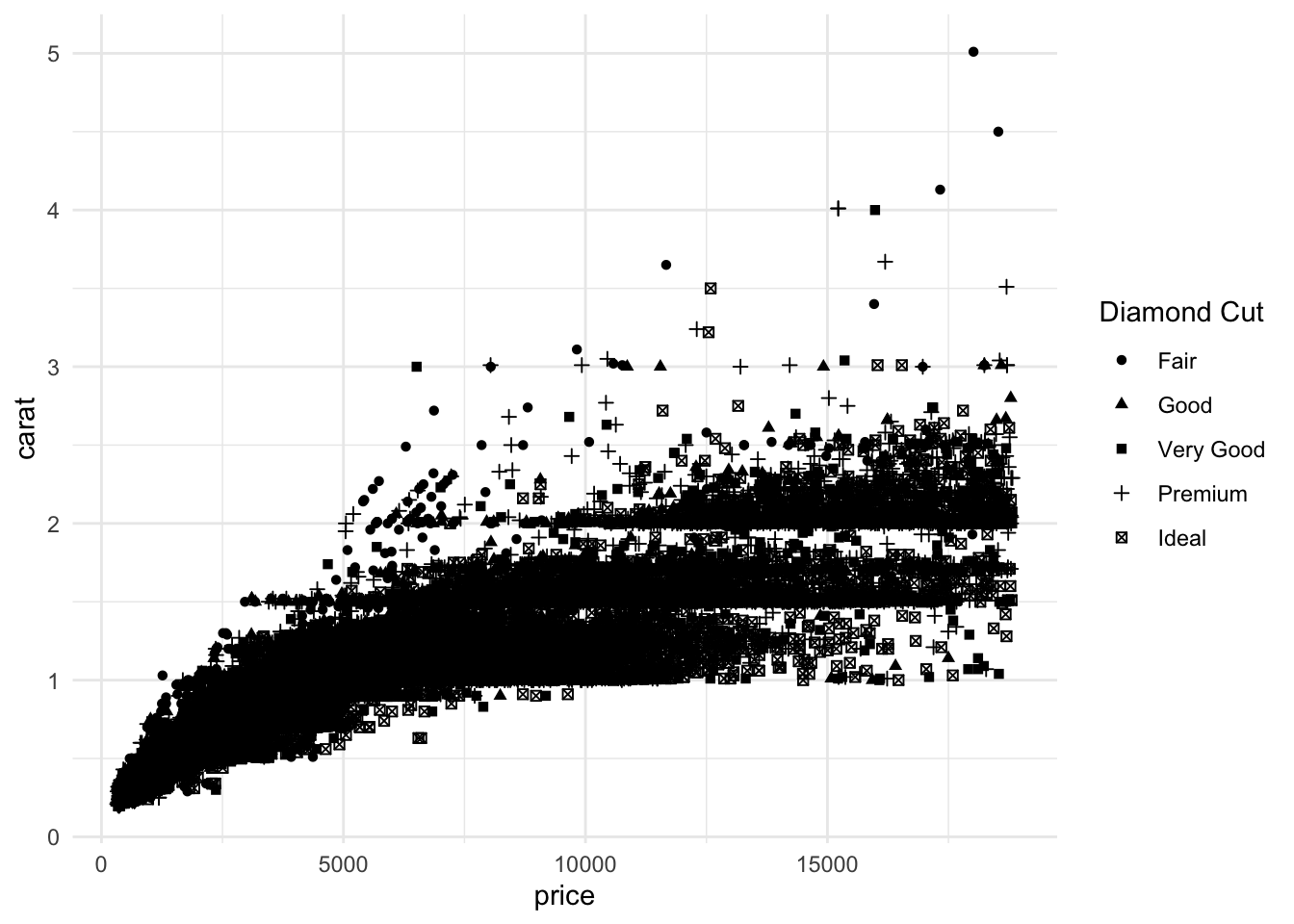
Question 8: Using the dataset msleep, plot sleep_rem against awake, including brainwt as the size and vore as the shape
Labels
Ensuring graphs are adequately labeled and scaled correctly is yet another core component in ensuring that graphs are clear. Thoughout the previous examples, labels have been frequently used to label the x-axis, y-axis as well as the titles and legends. Labeling any graph within ggplot, typically uses:
+ labs(x = ??,         # x-axis label
       y = ??,         # y-axis label
       shape = ??,     # shape legend label
       colour = ??,    # colour legend label
       title = ??,     # title label
)
Question 9a: Using the template provided and the dataset mpg, add in sufficient labels to all the data included
Remember to confirm which variables are used through querying mpg in the help tab
ggplot(data = mpg,
       mapping = aes(x = displ, y = cty, shape = drv, colour = fl)) +
  geom_point() +
  theme_minimal()
Alongside labelling the environment of a graph, it is also possible to label specific points or an area within the environment. Returning to the topic of stock data, let us consider highlighting a specific one month period, from a sixth month period.
Let us consider three different stocks: Starbuck (SBUX), Amazon (AMZN) and Tesla (TSLA). Repeating the same steps as used earlier.
# Import the data
sbux_stk <- read_csv(file = "data/HistoricalData_SBUX_6m.csv")
amzn_stk <- read_csv(file = "data/HistoricalData_AMZN_6m.csv")
tsla_stk <- read_csv(file = "data/HistoricalData_TSLA_6m.csv")

# Correct the data were appropriate
sbux_stk <- sbux_stk %>% mutate(`Close/Last` = as.numeric(str_replace(`Close/Last`,"\\$", "")),
                                Date       = mdy(Date))
amzn_stk <- amzn_stk %>% mutate(`Close/Last` = as.numeric(str_replace(`Close/Last`,"\\$", "")),
                                Date       = mdy(Date))
tsla_stk <- tsla_stk %>% mutate(`Close/Last` = as.numeric(str_replace(`Close/Last`,"\\$", "")),
                                 Date       = mdy(Date))

# comine into one data frame
stk2 <- bind_rows(sbux = sbux_stk, amzn = amzn_stk, tsla = tsla_stk, .id = "type")
stk2$type <- factor(stk2$type)
levels(stk2$type)
## [1] "amzn" "sbux" "tsla"# Plot the graph
ggplot(data = stk2, mapping = aes(x = Date, y = `Close/Last`, group = type, color = type)) +
geom_line() +
labs(x = "Date", y = "Price of Stock at Market Close ($)") +
scale_color_discrete(name = "Stock", labels = c("Starbucks (SBUX)", "Amazon (AMZN)", "Tesla (TSLA)")) +
theme_minimal()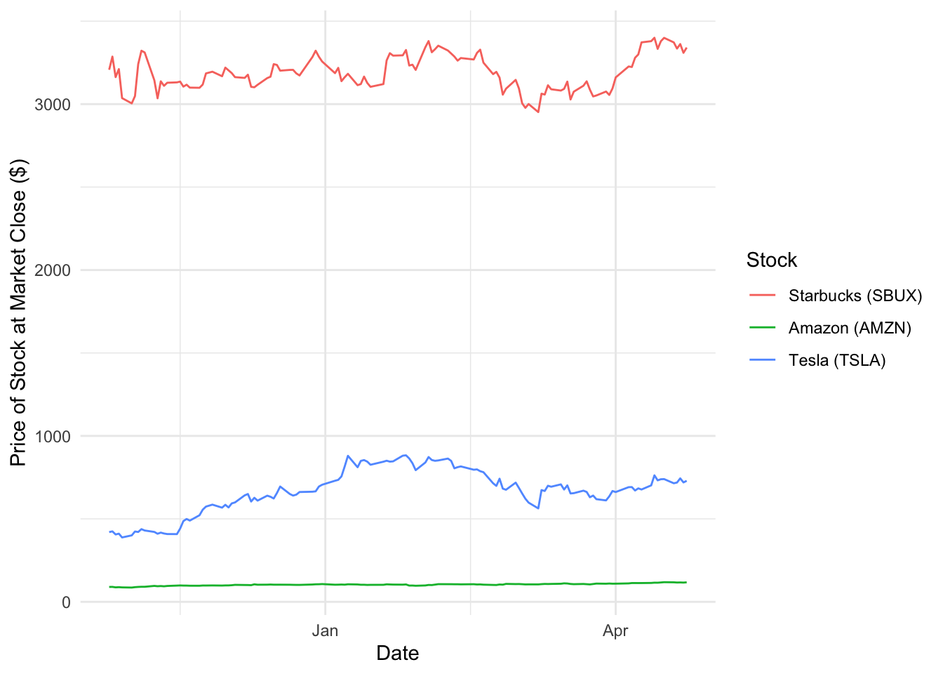
Furthermore, imagine we would like to specify a single month period, within the six displayed. This can done using the annotate() function within ggplot. Within this example provided let us examine between December - Janurary.
# Plot the graph
ggplot(data = stk2, mapping = aes(x = Date, y = `Close/Last`, group = type, color = type)) +
  geom_line() +
  labs(x = "Date", y = "Price of Stock at Market Close ($)") +
  scale_color_discrete(name = "Stock", labels =  c("Starbucks (SBUX)", "Amazon (AMZN)", "Tesla (TSLA)")) +
  annotate(geom = "rect", xmin = as.Date("2020-12-01"), xmax = as.Date("2021-01-01"), ymin = 0, ymax = 3500, fill = "cornflowerblue", alpha = 0.2) +
  annotate(geom = "text", x = as.Date("2020-12-17"), y = 3600, label = "Winter 2020", color = "cornflowerblue") +
  theme_minimal()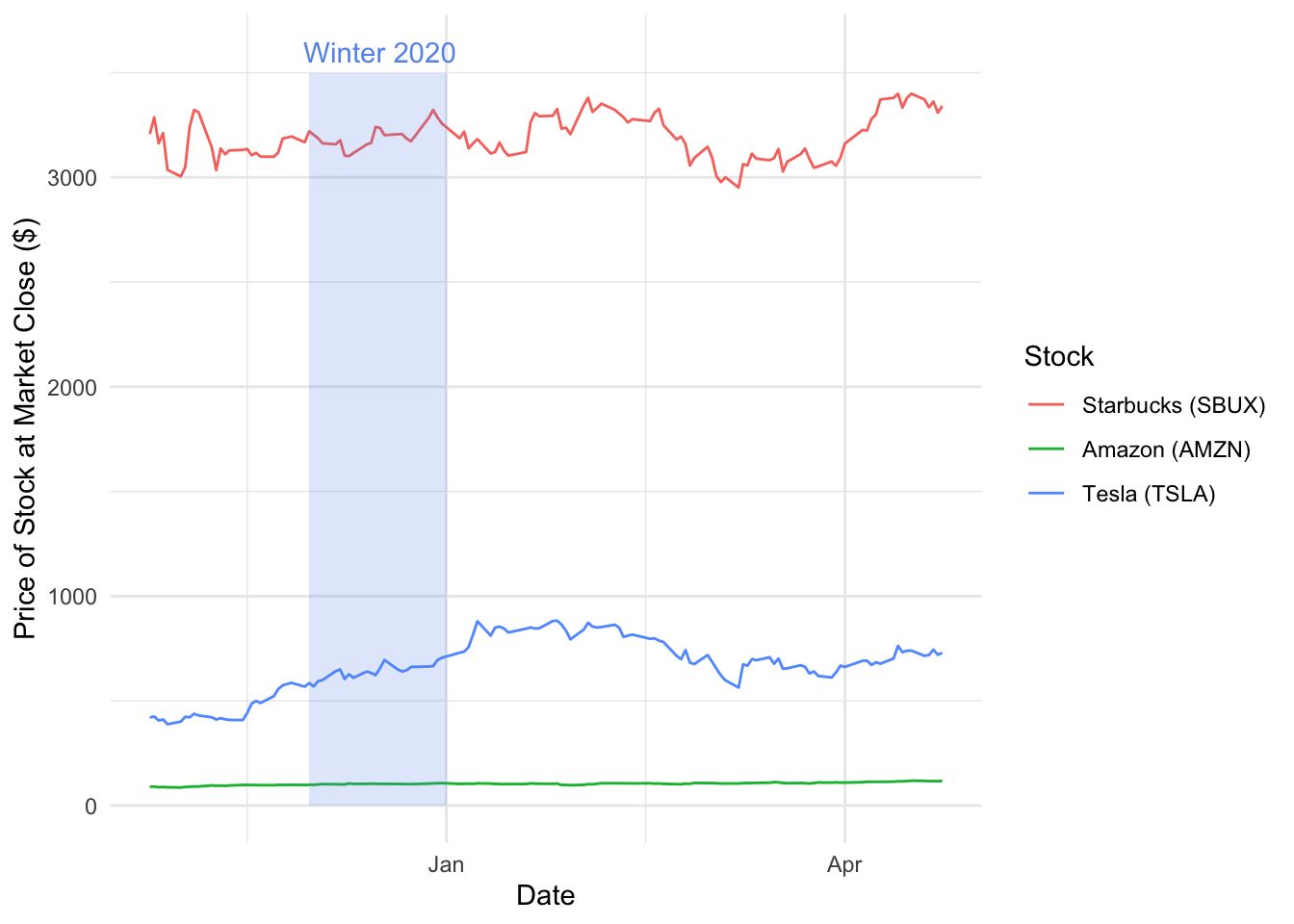
Breaking down the annotate() function we can consider the following elements:
- geom - typically this can be “text” to add text or “rect” to add a colour in a defined area
- x & y or xmin & xmax & ymin & ymax - this is where you define your parameters
- label or fill - when specify text you specify a label and fill when rect.
- alpha - this is the transparency of the text or parameter.
Question 9b: Using the stock graph you produced in Question 6, using annotate highlight a period of time (for example “2019-11-01” - “2020-01-01”) and a specific data (for example “2020-14-02”).
Remember to use two seperate annotate functions one for text and the other for rect
Recap (incl. bonus question)
This lab covered a large amount of diverse content within the ggplot universe. However, this is only the beginning! The lab has provided you with a foundation knowledge of visualization which will be used across the coming labs, in addition to the assignments. There is a final question to help you put all the thing you learned until now into practice:
Question 10: Using all of the skills, templates and materials covered, as well as your own knowledge, using one of the following datasets available within ggplot, produce your own graph expressing some of the information within it. In your file, you have also to mention the goal of the visualization and the principles of design that you use.
You should work with your group for this final question. We will accept only one submission per group. This final question will allow you to earn one point (out of the 10) for your individual assignment (homeworks) . What you need to do is to produce and submit a unique and positive graph reflecting the skills and techniques learnt within this practical.
To be eligible for this one point, please submit a .zip file on the Black Board hand-in portal, which contains a R project folder with a .rmd file that describes the goal of your visualization, the principles of design that you use, your code chunk which produces the graph and all other files (e.g., data) needed to produce the plot. You will be awarded the additional point, if you make a constructive, clear and unique graph. One submission per group is enough.
Please indicate in the beginning of your Rmd file the names of the students who worked for this question, the contribution of each student and whether you used an AI tool for this question and how.
Through engaging with this question it will help you test your skills and apply the different techniques, as well as learning the best ways to work on R-based projects. This is also a fantastic time to let your creativity within R and ggplot run wild, and see if you can create some beautiful looking plots.
The deadline for submission is Friday May 10th, 23:59pm.
Question 10: Datasets
Diamonds
Prices of over 50,000 round cut diamonds, call
diamondsto access the dataset. Contains information of over 53940 diamonds across 10 variables.
Economics
US economic time series data, call
economicsoreconommics_longto access the dataset. This contains information over 478 months across 6 variables.
Midwest
Midwest demographic data, call
midwestto access the dataset. This contains information from 437 midwest counties across 28 variables.
MPG
Fuel economy data from 1999 and 2008 for 38 popular models of car, call
mpgto access the dataset. This contains information from 234 different cars over 11 variables.
Sleep
Mammals sleep dataset, call
msleepto access the dataset. It contains data for 83 mammals across 11 variables.
Presidential
Presidential Term information from Eisenhower to Obama, call
presidentialto access the dataset. It contains data for all 11 presidents in this time, information across 4 variables.
Housing Sales
Information about housing sales made in Texas, call
txhousingto access the dataset. It contains 8602 sales across 9 variables.