Supervised learning: Classification
Part 1: to be completed at home before the lab
In this lab at home, two different classification methods will be covered: K-nearest neighbours and logistic regression. You can download the student zip including all needed files for practical 5 here.
Note: the completed homework has to be handed in on Black Board and will be graded (pass/fail, counting towards your grade for individual assignment). The deadline is two hours before the start of your lab. Hand-in should be a PDF file. If you know how to knit pdf files, you can hand in the knitted pdf file. However, if you have not done this before, you are advised to knit to a html file as specified below, and within the html browser, ‘print’ your file as a pdf file.
One of the packages we are going to use is class. For this, you will probably need to install.packages("class") before running the library() functions. In addition, you will again need the caret package to create a training and a validation split for the used dataset (note: to keep this at home lab compact, we will only use a training and validation split, and omit the test dataset to evaluate model fit). You can download the student zip including all needed files for practical 5 here.
library(MASS)
library(class)
library(caret)
library(ISLR)
library(tidyverse)
This practical will be mainly based around the default dataset which contains credit card loan data for 10 000 people. With the goal being to classify credit card cases as yes or no based on whether they will default on their loan.
- Create a scatterplot of the
Defaultdataset, wherebalanceis mapped to the x position,incomeis mapped to the y position, anddefaultis mapped to the colour. Can you see any interesting patterns already?
Default %>%
  arrange(default) %>% # so the yellow dots are plotted after the blue ones
  ggplot(aes(x = balance, y = income, colour = default)) +
  geom_point(size = 1.3) +
  theme_minimal() +
  scale_colour_viridis_d() # optional custom colour scale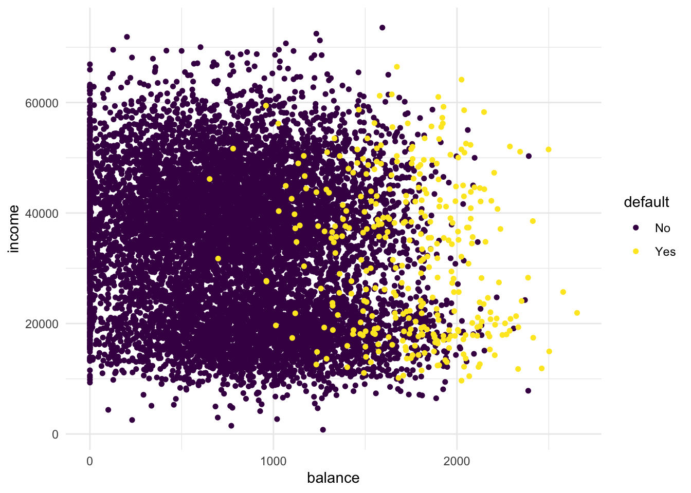
# People with high remaining balance are more likely to default.
# There seems to be a low-income group and a high-income group- Add
facet_grid(cols = vars(student))to the plot. What do you see?
Default %>%
  arrange(default) %>% # so the yellow dots are plotted after the blue ones
  ggplot(aes(x = balance, y = income, colour = default)) +
  geom_point(size = 1.3) +
  theme_minimal() +
  scale_colour_viridis_d() +
  facet_grid(cols = vars(student))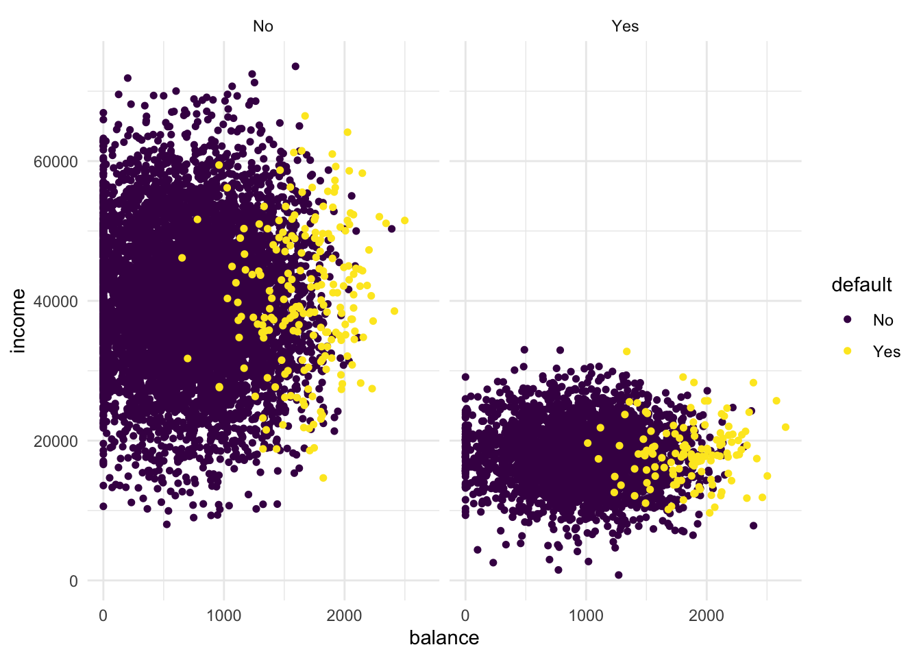
# The low-income group is students!- For use in the KNN algorithm, transform “student” into a dummy variable using
ifelse()(0 = not a student, 1 = student). Then, randomly split the Default dataset into a training setdefault_train(80%) and a validation setdefault_valid(20%) using thecreateDataPartition()function of thecaretpackage.
If you haven’t used the function ifelse() before, please feel free to review it in Chapter 5 Control Flow (particular section 5.2.2) in Hadley Wickham’s Book Advanced R, this provides a concise overview of choice functions (if()) and vectorised if (ifelse()).
default_df <-
  Default %>%
  mutate(student = ifelse(student == "Yes", 1, 0))

# define the training partition
train_index <- createDataPartition(default_df$default, p = .8,
                                  list = FALSE,
                                  times = 1)

default_train <- default_df[train_index,]
default_valid <- default_df[-train_index,]
K-Nearest Neighbours
Now that we have explored the dataset, we can start on the task of classification. We can imagine a credit card company wanting to predict whether a customer will default on the loan so they can take steps to prevent this from happening.
The first method we will be using is k-nearest neighbours (KNN). It classifies datapoints based on a majority vote of the k points closest to it. In R, the class package contains a knn() function to perform knn.
- Create class predictions on the default_valid data using the test parameter from the
knn()function. Usestudent,balance, andincome(but no basis functions of those variables) in thedefault_traindataset. Set k to 5. Store the predictions in a variable calledknn_5_pred.
Remember: make sure to review the knn() function through the help panel on the GUI or through typing “?knn” into the console. For further guidance on the knn() function, please see Section 4.7.6 in An introduction to Statistical Learning
knn_5_pred <- knn(
  train = default_train %>% select(-default),
  test  = default_valid  %>% select(-default),
  cl    = as_factor(default_train$default),
  k     = 5
)- Create two scatter plots with income and balance as in the first plot you made but now using only the default_valid data. One with the true class (
default) mapped to the colour aesthetic, and one with the predicted class (knn_5_pred) mapped to the colour aesthetic. Hint: Add the predicted classknn_5_predto thedefault_validdataset before starting yourggplot()call of the second plot. What do you see?
# first plot is the same as before
default_valid %>%
  arrange(default) %>%
  ggplot(aes(x = balance, y = income, colour = default)) +
  geom_point(size = 1.3) +
  scale_colour_viridis_d() +
  theme_minimal() +
  labs(title = "True class")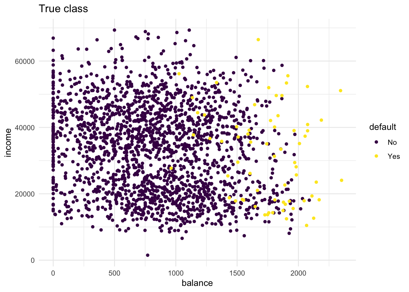
# second plot maps pred to colour
bind_cols(default_valid, pred = knn_5_pred) %>%
  arrange(default) %>%
  ggplot(aes(x = balance, y = income, colour = pred)) +
  geom_point(size = 1.3) +
  scale_colour_viridis_d() +
  theme_minimal() +
  labs(title = "Predicted class (5nn)")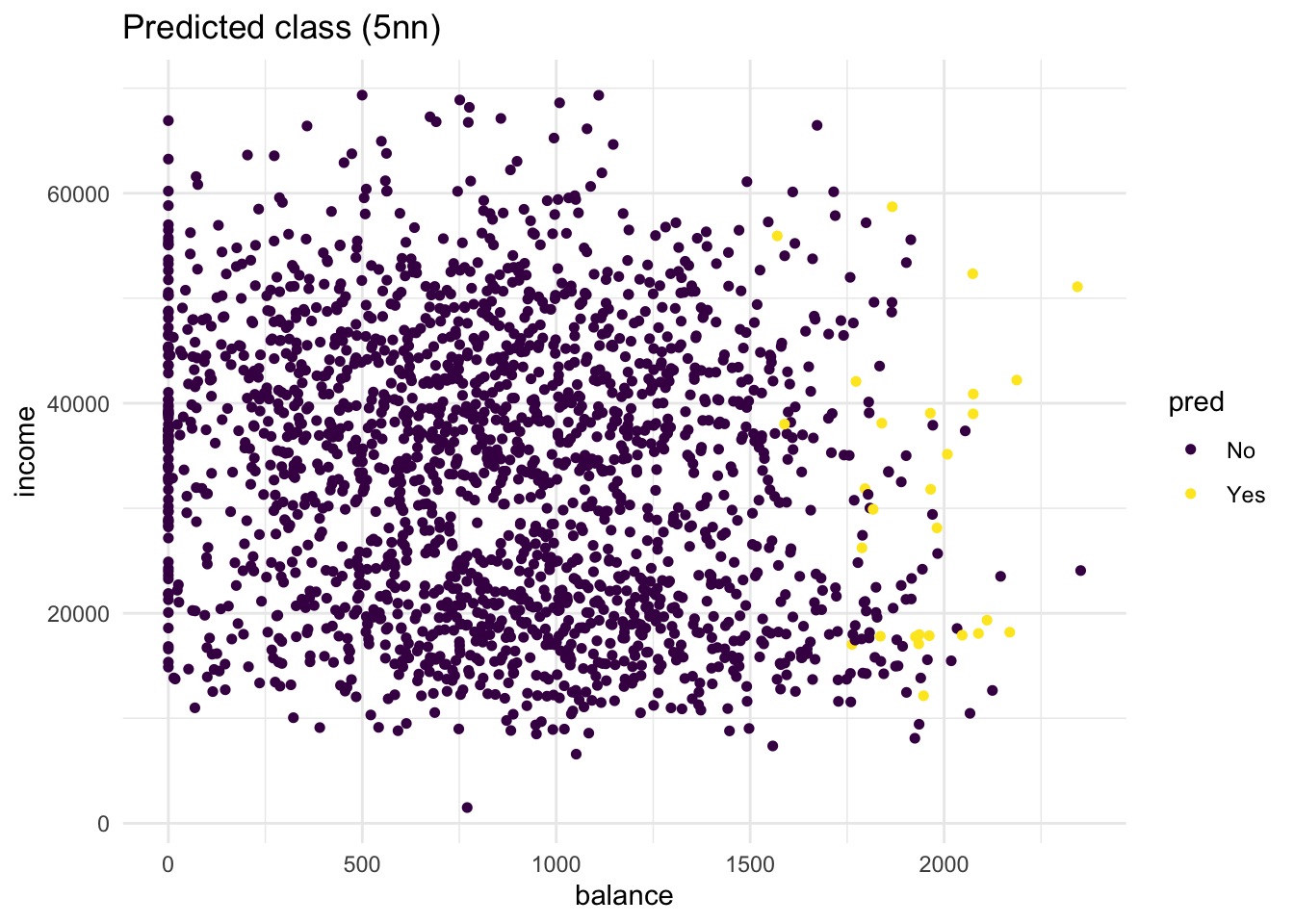
# there are quite some misclassifications: many "No" predictions
# with "Yes" true class and vice versa.- Repeat the same steps, but now with a
knn_2_predvector generated from a 2-nearest neighbours algorithm. Are there any differences?
knn_2_pred <- knn(
  train = default_train %>% select(-default),
  test  = default_valid  %>% select(-default),
  cl    = as_factor(default_train$default),
  k     = 2
)

# second plot maps pred to colour
bind_cols(default_valid, pred = knn_2_pred) %>%
  arrange(default) %>%
  ggplot(aes(x = balance, y = income, colour = pred)) +
  geom_point(size = 1.3) +
  scale_colour_viridis_d() +
  theme_minimal() +
  labs(title = "Predicted class (2nn)")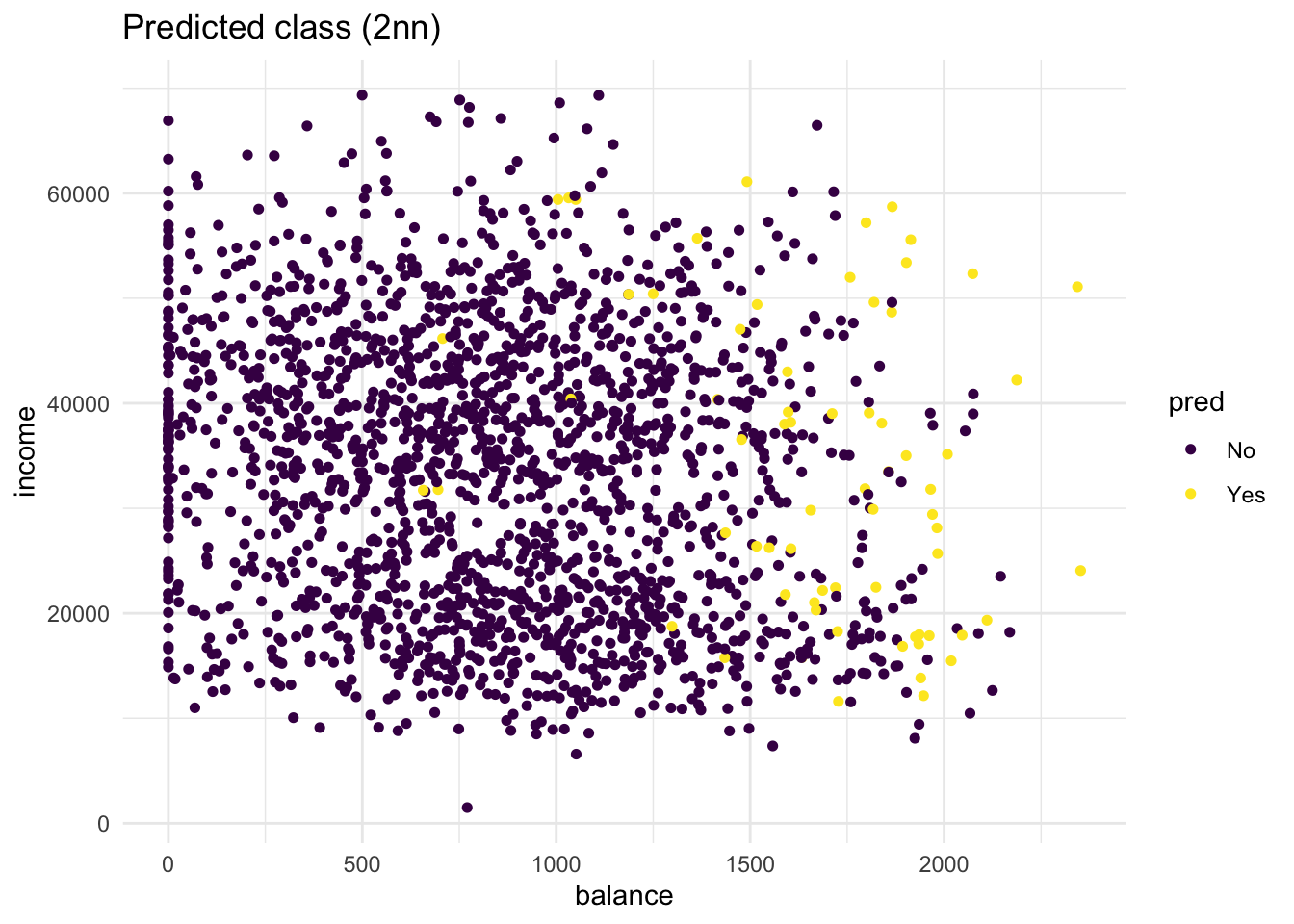
# compared to the 5-nn model, more people get classified as "Yes"
# Still, the method is not perfect
During this we have manually tested two different values for K, this although useful in exploring your data. To know the optimal value for K, you should use cross validation.
Part 2: to be completed during the lab
Assessing classification
The confusion matrix is an insightful summary of the plots we have made and the correct and incorrect classifications therein. A confusion matrix can be made in R with the table() function by entering two factors:
conf_2NN <- table(predicted = knn_2_pred, true = default_valid$default)
conf_2NN
## true
## predicted No Yes
## No 1885 46
## Yes 48 20To learn more these, please see Section 4.4.3 in An Introduction to Statistical Learning, where it discusses Confusion Matrices in the context of another classification method Linear Discriminant Analysis (LDA).
- What would this confusion matrix look like if the classification were perfect?
# All the observations would fall in the yes-yes or no-no categories;
# the off-diagonal elements would be 0 like so:

table(predicted = default_valid$default, true = default_valid$default)
## true
## predicted No Yes
## No 1933 0
## Yes 0 66- Make a confusion matrix for the 5-nn model and compare it to that of the 2-nn model. What do you conclude?
conf_5NN <- table(predicted = knn_5_pred, true = default_valid$default)
conf_5NN
## true
## predicted No Yes
## No 1919 52
## Yes 14 14# the 2nn model has more true positives (yes-yes) but also more false
# positives (truly no but predicted yes). Overall the 5nn method has
# slightly better accuracy (proportion of correct classifications).- Comparing performance becomes easier when obtaining more specific measures. Calculate the specificity, sensitivity, accuracy and the precision of the 2nn and 5nn model, and compare them. Which model would you choose? Keep the goal of our prediction in mind when answering this question.
spec_2NN <- conf_2NN[1,1] / (conf_2NN[1,1] + conf_2NN[2,1])
spec_2NN
## [1] 0.9751681spec_5NN <- conf_5NN[1,1] / (conf_5NN[1,1] + conf_5NN[2,1])
spec_5NN## [1] 0.9927574sens_2NN <- conf_2NN[2,2] / (conf_2NN[2,2] + conf_2NN[1,2])
sens_2NN## [1] 0.3030303sens_5NN <- conf_5NN[2,2] / (conf_5NN[2,2] + conf_5NN[1,2])
sens_5NN## [1] 0.2121212acc_2NN <- (conf_2NN[1,1] + conf_2NN[2,2]) / sum(conf_2NN)
acc_2NN## [1] 0.9529765acc_5NN <- (conf_5NN[1,1] + conf_5NN[2,2]) / sum(conf_5NN)
acc_5NN## [1] 0.9669835prec_2NN <- conf_2NN[2,2] / (conf_2NN[2,2] + conf_2NN[2,1])
prec_2NN## [1] 0.2941176prec_5NN <- conf_5NN[2,2] / (conf_5NN[2,2] + conf_5NN[2,1])
prec_5NN## [1] 0.5# The 5NN model has better specificity, but worse sensitivity. However, the overall accuracy of the 5NN model is (slightly) better. When we look at the precision, the 5NN model performs a lot better compared to the 2NN model. Logistic regression
KNN directly predicts the class of a new observation using a majority vote of the existing observations closest to it. In contrast to this, logistic regression predicts the log-odds of belonging to category 1. These log-odds can then be transformed to probabilities by performing an inverse logit transform:
\(p = \frac{1}{1 + e^{-\alpha}}\)
where \(\alpha\); indicates log-odds for being in class 1 and \(p\) is the probability.
Therefore, logistic regression is a probabilistic classifier as opposed to a direct classifier such as KNN: indirectly, it outputs a probability which can then be used in conjunction with a cutoff (usually 0.5) to classify new observations.
Logistic regression in R happens with the glm() function, which stands for generalized linear model. Here we have to indicate that the residuals are modeled not as a Gaussian (normal distribution), but as a binomial distribution.
- Use
glm()with argumentfamily = binomialto fit a logistic regression modellr_modto thedefault_traindata. Use student, income and balance as predictors.
lr_mod <- glm(default ~ ., family = binomial, data = default_train)Now we have generated a model, we can use the predict() method to output the estimated probabilities for each point in the training dataset. By default predict outputs the log-odds, but we can transform it back using the inverse logit function of before or setting the argument type = "response" within the predict function.
- Visualise the predicted probabilities versus observed class for the training dataset in
lr_mod. You can choose for yourself which type of visualisation you would like to make. Write down your interpretations along with your plot.
tibble(observed  = default_train$default,
       predicted = predict(lr_mod, type = "response")) %>%
  ggplot(aes(y = predicted, x = observed, colour = observed)) +
  geom_point(position = position_jitter(width = 0.2), alpha = .3) +
  scale_colour_manual(values = c("dark blue", "orange"), guide = "none") +
  theme_minimal() +
  labs(y = "Predicted probability to default")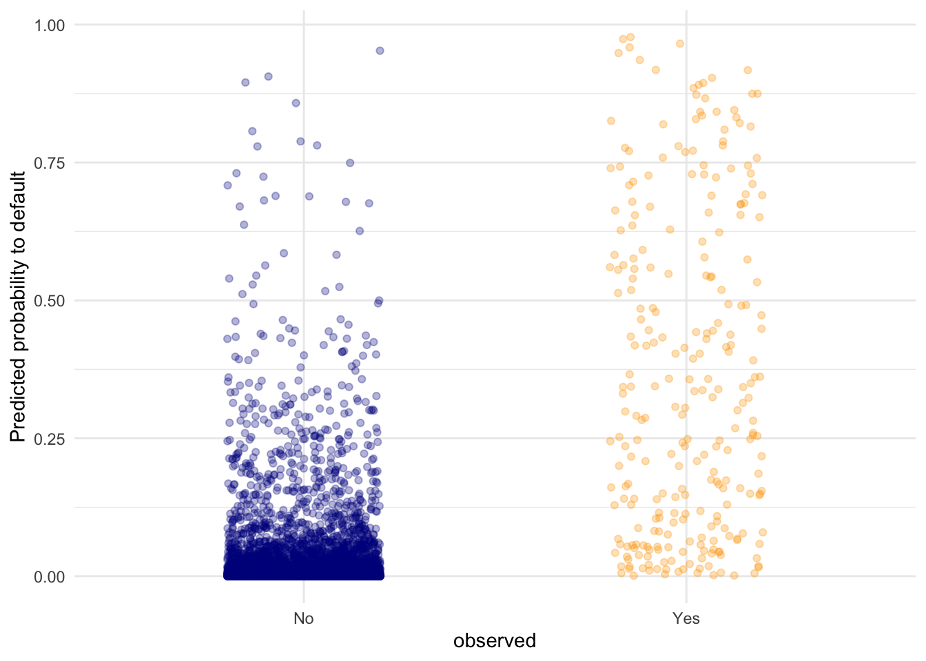
# I opted for a raw data display of all the points in the test set. Here,
# we can see that the defaulting category has a higher average probability
# for a default compared to the "No" category, but there are still data
# points in the "No" category with high predicted probability for defaulting.
Another advantage of logistic regression is that we get coefficients we can interpret.
- Look at the coefficients of the
lr_modmodel and interpret the coefficient forbalance. What would the probability of default be for a person who is not a student, has an income of 40000, and a balance of 3000 dollars at the end of each month? Is this what you expect based on the plots we’ve made before?
coefs <- coef(lr_mod)
coefs["balance"]
## balance
## 0.005728527# The higher the balance, the higher the log-odds of defaulting. Precisely:
# Each dollar increase in balance increases the log-odds by 0.0058.
# Let's calculate the log-odds for our person
logodds <- coefs[1] + 4e4*coefs[4] + 3e3*coefs[3]
# Let's convert this to a probability
1 / (1 + exp(-logodds))## (Intercept)
## 0.9985054# probability of .998 of defaulting. This is in line with the plots of before
# because this new data point would be all the way on the right.Let’s visualise the effect balance has on the predicted default probability.
- Create a data frame called
balance_dfwith 3 columns and 500 rows:studentalways 0,balanceranging from 0 to 3000, andincomealways the mean income in thedefault_traindataset.
balance_df <- tibble(
  student = rep(0, 500),
  balance = seq(0, 3000, length.out = 500),
  income  = rep(mean(default_train$income), 500)
)- Use this dataset as the
newdatain apredict()call usinglr_modto output the predicted probabilities for different values ofbalance. Then create a plot with thebalance_df$balancevariable mapped to x and the predicted probabilities mapped to y. Is this in line with what you expect?
balance_df$predprob <- predict(lr_mod, newdata = balance_df, type = "response")

balance_df %>%
  ggplot(aes(x = balance, y = predprob)) +
  geom_line(col = "dark blue", size = 1) +
  theme_minimal()
## Warning: Using `size` aesthetic for lines was deprecated in ggplot2 3.4.0.
## ℹ Please use `linewidth` instead.
## This warning is displayed once every 8 hours.
## Call `lifecycle::last_lifecycle_warnings()` to see where this warning was
## generated.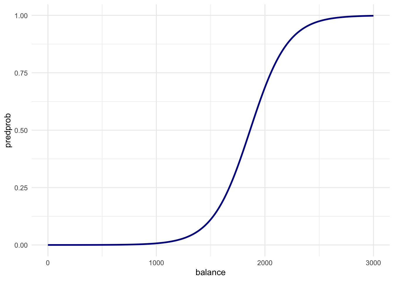
# Just before 2000 in the first plot is where the ratio of
# defaults to non-defaults is 50-50. So this line is exactly what we expect!- Use lr_mod to predict the probability of defaulting for the observations in the validation dataset. Use these to create a confusion matrix just as the one for the KNN models by using a cutoff predicted probability of 0.5. Does logistic regression perform better?
pred_prob <- predict(lr_mod, newdata = default_valid, type = "response")
pred_lr   <- factor(pred_prob > .5, labels = c("No", "Yes"))

conf_logreg <- table(predicted = pred_lr, true = default_valid$default)
conf_logreg
## true
## predicted No Yes
## No 1923 47
## Yes 10 19# logistic regression performs better in every way than knn. This depends on
# your random split so your mileage may vary- Calculate the specificity, sensitivity, accuracy and the precision for the logistic regression using the above confusion matrix. Again, compare the logistic regression to KNN.
spec_logreg <- conf_logreg[1,1] / (conf_logreg[1,1] + conf_logreg[2,1])
spec_logreg
## [1] 0.9948267sens_logreg <- conf_logreg[2,2] / (conf_logreg[2,2] + conf_logreg[1,2])
sens_logreg## [1] 0.2878788acc_logreg <- (conf_logreg[1,1] + conf_logreg[2,2]) / sum(conf_logreg)
acc_logreg## [1] 0.9714857prec_logreg <- conf_logreg[2,2] / (conf_logreg[2,2] + conf_logreg[2,1])
prec_logreg## [1] 0.6551724# Now we can very clearly see that logisitc regression performs a lot better compared to KNN, especially the increase in precision is impressive! Final Exercise
Now let’s do another - slightly less guided - round of KNN and/or logistic regression on a new dataset in order to predict the outcome for a specific case. We will use the Titanic dataset also discussed in the lecture. The data can be found in the /data folder of your project. Before creating a model, explore the data, for example by using summary().
- Create a model (using knn or logistic regression) to predict whether a 14 year old boy from the 3rd class would have survived the Titanic disaster.
- Would the passenger have survived if they were a 14 year old girl in 2nd class?
titanic <- read_csv("data/Titanic.csv")## Rows: 1313 Columns: 5
## ── Column specification ────────────────────────────────────────────────────────
## Delimiter: ","
## chr (3): Name, PClass, Sex
## dbl (2): Age, Survived
##
## ℹ Use `spec()` to retrieve the full column specification for this data.
## ℹ Specify the column types or set `show_col_types = FALSE` to quiet this message.# I'll do a logistic regression with all interactions
lr_mod_titanic <- glm(Survived ~ PClass * Sex * Age, data = titanic)
predict(lr_mod_titanic,
newdata = tibble(
PClass = c( "3rd", "2nd"),
Age = c( 14, 14),
Sex = c("male", "female")
),
type = "response"
)## 1 2
## 0.2215689 0.9230483# So our hypothetical passenger does not have a large survival probability:
# our model would classify the boy as not surviving. The girl would likely
# survive however. This is due to the women and children getting preferred
# access to the lifeboats. Also 3rd class was way below deck.