Network Analysis
Part 1: to be completed at home before the lab
During this practical, we will cover an introduction to network analysis. We cover the following topics:
- metrics to describe network,
- centrality indices,
- community detection,
- network visualization.
We will mainly use the igraph package.
You can download the student zip including all needed files for this lab here.
Note: the completed homework has to be handed in on BlackBoard and will be graded (pass/fail, counting towards your grade for individual assignment). The deadline is two hours before the start of your lab. Hand-in should be a PDF file. If you know how to knit pdf files, you can hand in the knitted pdf file. However, if you have not done this before, you are advised to knit to a html file as specified below, and within the html browser, ‘print’ your file as a pdf file.
For this practical, you will need the following packages:
#install.packages("tidyverse")
library(readr)
library(tidyverse)
library(ggplot2)

#install.packages("igraph")
library(igraph)

#install.packages("RColorBrewer")
library(RColorBrewer)

#install.packages("sbm")
library(sbm)

#install.packages("fossil")
library(fossil)

set.seed(42)
We are going to use the high school temporal contacts dataset, created in the context of the SocioPatterns project.
The dataset is publicly available in the repository Netzschleuder and it corresponds to the contacts and friendship relations between students in a high school in Marseilles, France, in December 2013. The contacts are measured in four different ways:
- with proximity devices (see folder
data/proximity), - through contact diaries (see folder
data/diaries), - from reported friendships in a survey (see folder
data/survey), - from Facebook friendships (see folder
data/facebook).
Each folder contains the edgelist (edges.csv), with the source node, target node, and additional properties (interaction strength or time at which the interaction happened). The nodes.csv file contains the node’s (students) IDs, the class they belong to, and their gender. In this lab, we will use the proximity data, but the same analysis can be repeated for the other three datasets in a similar way.
Reading a network file
1a. Read the edgelist file (edges.csv in the data/proximity folder) and store it in the variable edge_list. The csv file contains an edge list with two columns: source node (one student), target node (the other student), and the time at which the interaction happened. To load it, use the function read_csv from the readr package. What is the advantage of storing the network using an edge list, rather than in an adjacency matrix? Is the difference more relevant in the case of sparse or dense networks?
edge_list <- read_csv('./data/proximity/edges.csv')## Rows: 188508 Columns: 3
## ── Column specification ────────────────────────────────────────────────────────
## Delimiter: ","
## dbl (3): source, target, time
##
## ℹ Use `spec()` to retrieve the full column specification for this data.
## ℹ Specify the column types or set `show_col_types = FALSE` to quiet this message.head(edge_list)## # A tibble: 6 × 3
## source target time
## <dbl> <dbl> <dbl>
## 1 0 277 1385982020
## 2 0 277 1385982040
## 3 0 277 1385982060
## 4 0 21 1385982060
## 5 0 277 1385982080
## 6 0 21 1385982080Answer:
# The advantage of using an edgelist is that the size of the table is much smaller.
# The adjacency matrix will have size n*n, where n is the number of nodes,
# no matter how sparse the network is. On the other side, the edgelist will have
# size m, where m is the number of edges, which is way smaller in case
# of sparse networks.
1b. Read also the node properties file (nodes.csv in the data/proximity folder) and store it in the variable node_prop. What information is in this file?
node_prop <- read_csv('./data/proximity/nodes.csv')## Rows: 329 Columns: 5
## ── Column specification ────────────────────────────────────────────────────────
## Delimiter: ","
## chr (3): class, gender, _pos
## dbl (2): index, id
##
## ℹ Use `spec()` to retrieve the full column specification for this data.
## ℹ Specify the column types or set `show_col_types = FALSE` to quiet this message.head(node_prop)## # A tibble: 6 × 5
## index id class gender `_pos`
## <dbl> <dbl> <chr> <chr> <chr>
## 1 0 1 2BIO3 M array([-0.26325303, 0.33099884])
## 2 1 2 PC* M array([-1.05164111, 0.05127502])
## 3 2 3 2BIO2 M array([-0.25987021, 0.2733351 ])
## 4 3 4 PSI* M array([-0.10653457, 0.31683176])
## 5 4 9 PC M array([-0.16007418, 0.3548344 ])
## 6 5 14 PC* M array([-0.19247253, 0.35858682])Answer:
#The student id, classroom, gender and position of each node- Network creation: Create the network using the
edge_listand the functiongraph_from_data_framefrom theigraphpackage. Store the graph in the variableg. If you look for?graph_from_data_frameyou can find all the arguments of this function. Your graph will be anundirectedgraph, and you can add the node properties by setting theverticesargument to thenode_propvariable
g <- graph_from_data_frame(edge_list, vertices = node_prop, directed = FALSE)
g
## IGRAPH 7cdf2f7 UN-- 329 188508 --
## + attr: name (v/c), id (v/n), class (v/c), gender (v/c), _pos (v/c),
## | time (e/n)
## + edges from 7cdf2f7 (vertex names):
## [1] 0--277 0--277 0--277 0--21 0--277 0--21 0--277 0--241 0--277 0--241
## [11] 0--277 0--241 0--277 0--241 0--277 0--241 0--277 0--241 0--277 0--241
## [21] 0--277 0--241 0--277 0--277 0--277 0--242 0--264 0--219 0--76 0--264
## [31] 0--98 0--43 0--21 0--180 0--77 0--180 0--77 0--214 0--292 0--180
## [41] 0--180 0--180 0--43 0--180 0--72 0--180 0--72 0--72 0--180 0--72
## [51] 0--180 0--180 0--180 0--180 0--180 0--180 0--180 0--72 0--72 0--180
## [61] 0--180 0--72 0--180 0--72 0--72 0--43 0--180 0--72 0--180 0--72
## + ... omitted several edgesNetwork description I
3a. Descriptive statistics: count how many students are there per class (using group_by), using the node_prop variable
# Count the number of nodes per class
node_prop |>
    group_by(class) |>
    summarise(count = n())
## # A tibble: 9 × 2
## class count
## <chr> <int>
## 1 2BIO1 36
## 2 2BIO2 35
## 3 2BIO3 40
## 4 MP 33
## 5 MP*1 29
## 6 MP*2 38
## 7 PC 44
## 8 PC* 40
## 9 PSI* 343b. Descriptive statistics: print (a) the number of nodes (function vcount) and (b) the number of edges (function ecount) (c) the longest path on the network (diameter, setting the variable unconnected to false), (d) the average path length (mean_distance, setting the variable unconnected to false), (e) the global clustering coefficient (transitivity).
# Number of vertices
num_vertices <- vcount(g)
cat("Number of vertices:", num_vertices, "\n")
## Number of vertices: 329# Number of edges
num_edges <- ecount(g)
cat("Number of edges:", num_edges, "\n")## Number of edges: 188508# Diameter (maximum eccentricity)
diameter <- diameter(g, unconnected=FALSE)
cat("Diameter:", diameter, "\n")## Diameter: Inf# Average path length
avg_path_length <- mean_distance(g, unconnected=FALSE)
cat("Average path length:", avg_path_length, "\n")## Average path length: Inf# Clustering coefficient
clustering_coef <- transitivity(g, type="global")
cat("Clustering coefficient:", clustering_coef, "\n")## Clustering coefficient: 0.44442143c. How do you interpret the results of the diameter and the average path length? How do you interpret the clustering coefficient?
## ANSWER:
## It is infinity because when there are isolated nodes that cannot be reached.
## The diameter and average path length are only defined if all nodes are connected in one component
## 44% of students who are connected with a person are also connected themselves.
Part 2: during the lab
Network manipulaton
4a. Simplify network: the current network has isolated components (some students do not interact with anybody, maybe because they were sick). Print the number of components (function components). Identify the isolated nodes with (V(g)$name[degree(g) == 0]) and remove (delete_vertices) those nodes from the network. Check again the number of connected components in the new network.
cat("How many connected components?", components(g)$no, "\n")
## How many connected components? 3
# Find nodes with zero degree
nodes_to_remove <- V(g)$name[degree(g) == 0]
cat("Are there nodes without contacts? Id.", nodes_to_remove, "\n")
## Are there nodes without contacts? Id. 1 171

# Remove nodes with zero degree
g_simple <- delete_vertices(g, nodes_to_remove)
cat("How many connected components?", components(g_simple)$no, "\n")
## How many connected components? 1
4b. Simplify network: the current network has self-loops (i.e. if there is a record of a student’s proximity with themselves) and duplicated edges (because students interact several times). Print if there are self-loops (function any_multiple), and the number of duplicated edges (function which_multiple). Then remove self-loops (function simplify) and collapse all duplicated edges into one weighted edge (simplify(g, edge.attr.comb = "sum"). Store the new graph to the variable g_simple
cat("Are there self loops?", any_multiple(g_simple), "\n")
## Are there self loops? TRUE
cat("Number of duplicated edges?", sum(which_multiple(g_simple)), "\n")
## Number of duplicated edges? 182690
g_simple <- simplify(g_simple, edge.attr.comb = "sum")
4c. Check again the number of connected components in the new network. Compute the descriptive statistics for the new network. Did the values change? Why? Is it always a good choice to focus on the largest connected component? Provide an example of research question when this is not the case.
# Number of vertices
num_vertices <- vcount(g_simple)
cat("Number of vertices:", num_vertices, "\n")
## Number of vertices: 327# Number of edges
num_edges <- ecount(g_simple)
cat("Number of edges:", num_edges, "\n")## Number of edges: 5818# Diameter (maximum eccentricity)
diameter <- diameter(g_simple)
cat("Diameter:", diameter, "\n")## Diameter: 4# Average path length
avg_path_length <- mean_distance(g_simple)
cat("Average path length:", avg_path_length, "\n")## Average path length: 2.159434# Clustering coefficient
clustering_coef <- transitivity(g_simple, type="global")
cat("Clustering coefficient:", clustering_coef, "\n")## Clustering coefficient: 0.4444214Answer:
## ANSWER: Now the diameter and average path length have finite values,
# because the network is connected. Depending on the research question,
# it is not always a good choice to focus on the largest connected component.
# For example, given this dataset, you may want to investigate if there are
# students that have difficulties in socializing. In that case, removing nodes
# (students) with zero connections could lead to misleading results.
Network description II
5a. Degree distribution: use function degree to store the degree of each node in the network in the variable degree_dist. What’s the mean degree and its standard deviation? Plot the degree_dist as a histogram with ggplot (geom_histogram).
# Calculate the degree distribution
degree_dist <- degree(g_simple)

# Calculate mean and standard deviation
mean_degree <- mean(degree_dist)
std_degree <- sd(degree_dist)

# Create a data frame for the degree distribution
degree_df <- data.frame(degree = degree_dist)

# Plot the degree distribution using ggplot2
ggplot(degree_df, aes(x = degree)) +
  geom_histogram(binwidth = 10) +
  labs(title = paste("Degree Distribution (Mean:", round(mean_degree, 2), ", SD:", round(std_degree, 2), ")"),
       x = "Degree", y = "Frequency") +
  theme_minimal()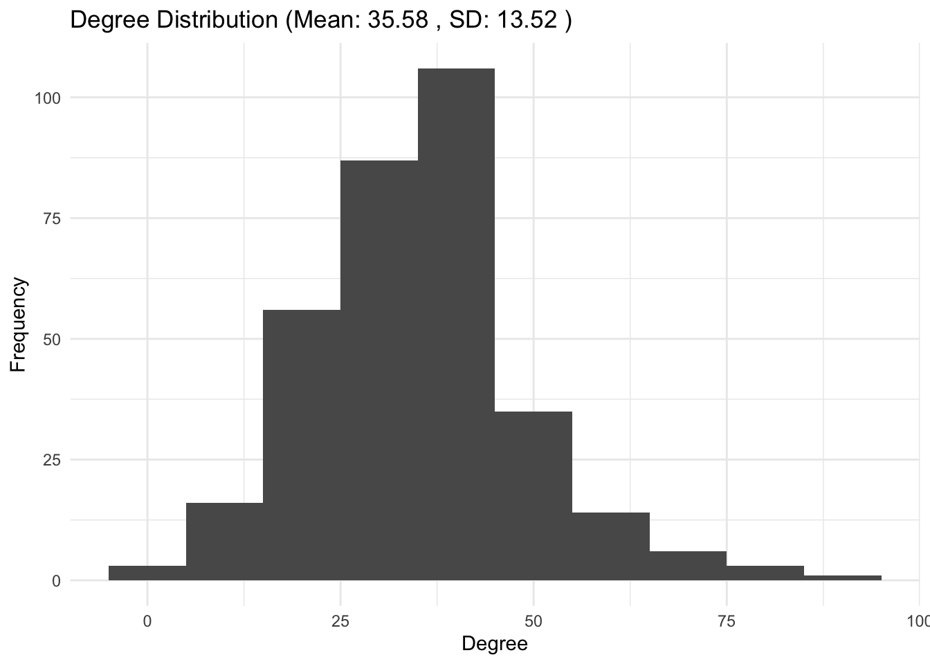
5b. Degree distribution: compare the degree distribution to the class sizes. How do you interpret these results?
Answer:
## ANSWER: the class sizes and the mean of the degree distribution are similar.
# Likely, the number of interactions is influenced by the number of people
# students share the class with.
Network visualization
6a. Network Visualization: visualize the simplified network using the function plot.
plot(g_simple)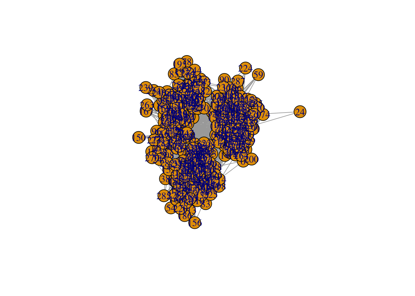
6b. This is a bit ugly, let’s assign different colors to school classes. You can use the following code for this
# Color palette
palette <- rainbow(length(unique(V(g_simple)$class)))

# Create a color mapping for each node to their class
color_mapping <- setNames(palette, unique(V(g_simple)$class))

# Map the node colors based on the class
node_colors <- color_mapping[V(g_simple)$class]

plot(g_simple, vertex.color = node_colors)

# Adding a legend
legend("topright", legend = names(color_mapping), fill = palette, title = "Class")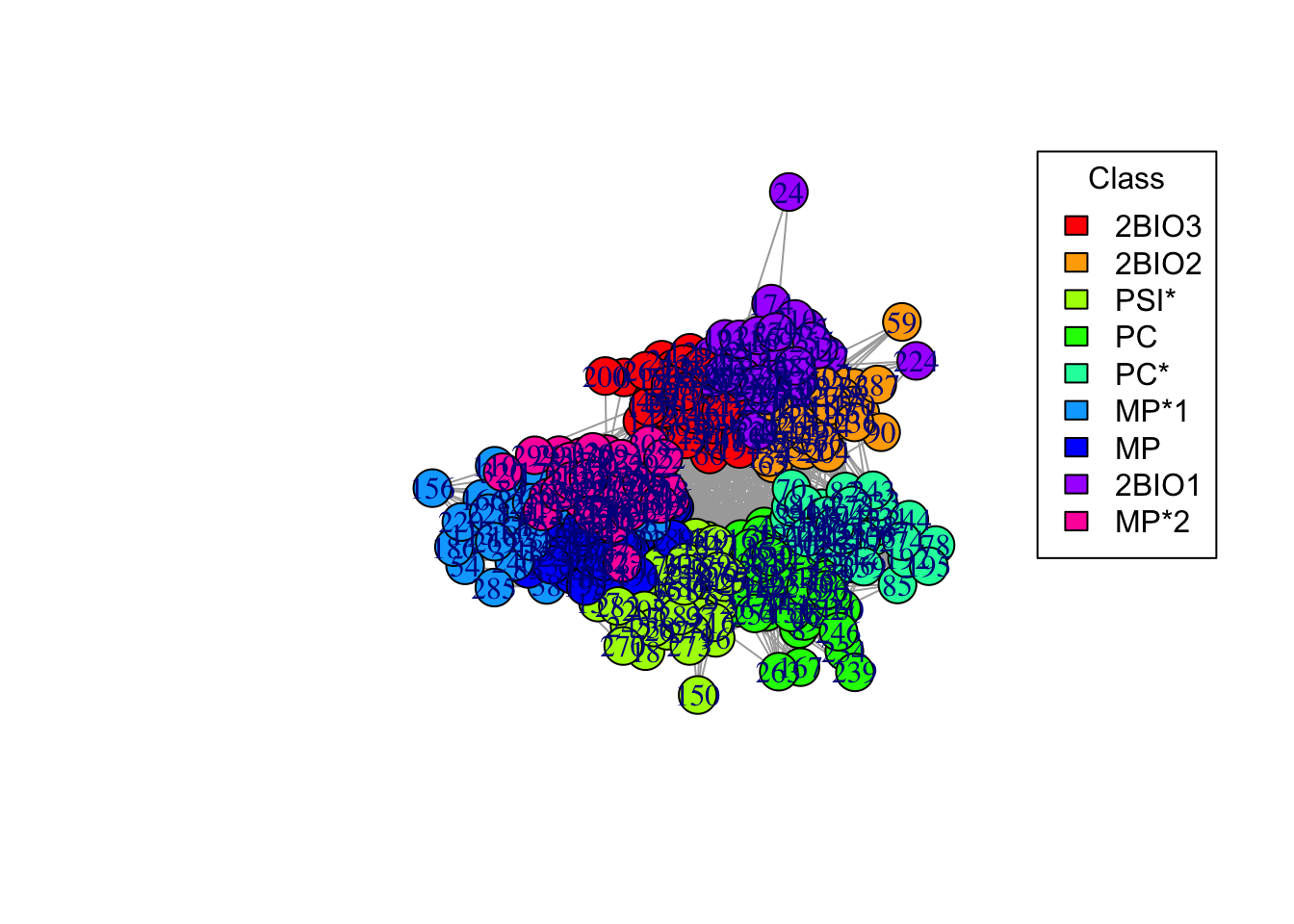
6c. Now, add a layout. Use a “spring” algorithm for visualization, where nodes that are connected get pushed together, and nodes that are not connected get pushed apart. Store the coordinates of each node (coords = layout_with_fr(g_simple)), to plot them in the same position in the next plots (you can experiment with different layout algorithms, see ?layout_).
# Add a layout
coords = layout_with_fr(g_simple)

# Plot
plot(g_simple, layout = coords, vertex.color = node_colors)

# Adding a legend
legend("topright", legend = names(color_mapping), fill = palette, title = "Class")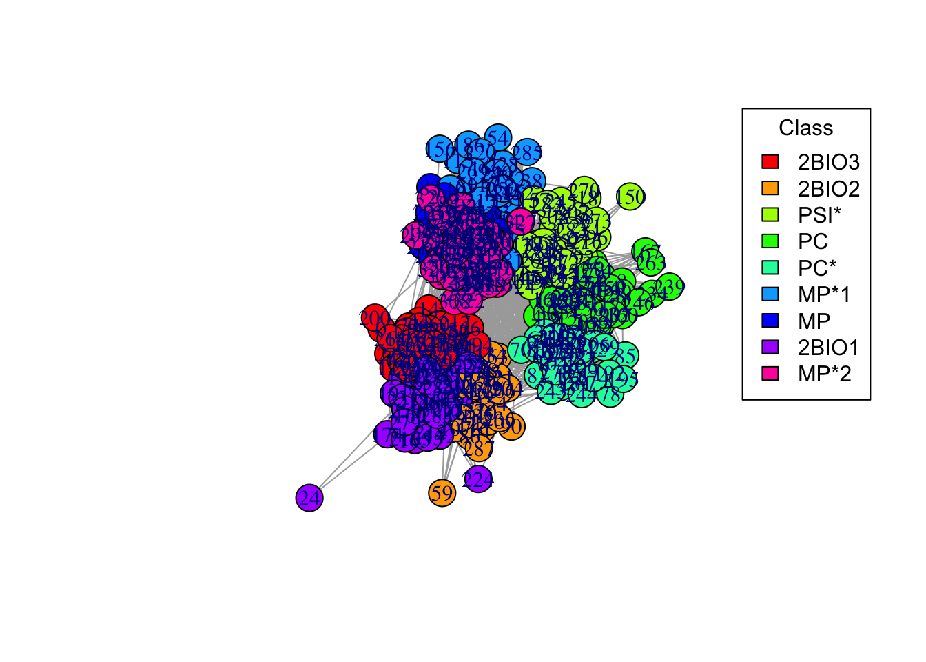
6d. Make the plot prettier! Play with the plot function options (e.g., vertex.size = 5, vertex.label = NA, edge.width = 0.1, edge.arrow.size = 0) until you are happy with the results. Make sure you have a legend
plot(g_simple, vertex.color = node_colors, layout=coords,  edge.arrow.size=0, edge.width=0.1, vertex.size = 5, vertex.label = NA)

# Adding a legend
legend("topright", legend = names(color_mapping), fill = palette, title = "Class")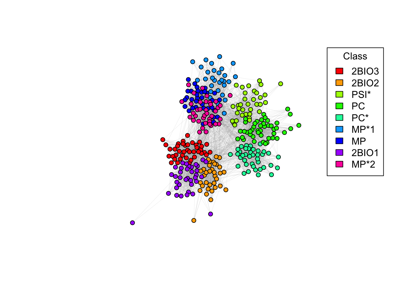
6e. Do students in the same class interact more? Why are there so many connections between different classes? Do you notice any pattern?
Answer:
## ANSWER: students in the same class interact very frequently.
# Students in different classes but in the same program (e.g. BIO, MP, PC) also
# interact frequently.
Centrality measures
7a. Centrality measures: during the lecture we discussed different types of centrality measures, that are useful to quantify the importance of nodes in the network. The most widely used ones are: degree, betweenness, closeness, and pagerank centrality. Explain each measure and how it differs from the others. Compute all the centrality measures (with functions degree, betweenness, closeness, and page_rank). Find the most central nodes according to these measures (which(centrality == max(centrality))). You can use the pre-made function calculate_and_print_max_centrality below. Is the same node the most central node by all definitions?
- Degree:
- Betweenness:
- Closeness:
- Pagerank:
# adapted from https://en.wikipedia.org/wiki/Centrality
# - Degree: number of edges incident upon node i (normalized by the maximum degree). Measures the local influence of a node.
# - Betweenness: quantifies the number of times a node acts as a bridge along the shortest path between two other nodes. Measures brokerage in the network.
# - Closeness: average length of the shortest path between the node and all other nodes in the graph. Thus the more central a node is, the closer it is to all other nodes.
# - Pagerank: evaluates the significance of a node based on the quantity and quality of incoming links, where links from highly connected nodes contribute more to the score, reflecting its overall influence in the network.
calculate_and_print_max_centrality <- function(graph, centrality_type) {
# Calculate the specified centrality based on the type provided
centrality <- switch(centrality_type,
"degree" = degree(graph),
"betweenness" = betweenness(graph),
"closeness" = closeness(graph),
"pagerank" = page_rank(graph)$vector,
stop("Invalid centrality type"))
# Find the node(s) with the highest centrality
max_value <- max(centrality)
highest_nodes <- which(centrality == max_value)
# Print results
cat(sprintf("Node id(s) with highest %s centrality: %s\n", centrality_type, toString(highest_nodes)))
}calculate_and_print_max_centrality(g_simple, "degree")
## Node id(s) with highest degree centrality: 39
calculate_and_print_max_centrality(g_simple, "betweenness")
## Node id(s) with highest betweenness centrality: 318
calculate_and_print_max_centrality(g_simple, "closeness")
## Node id(s) with highest closeness centrality: 318
calculate_and_print_max_centrality(g_simple, "pagerank")
## Node id(s) with highest pagerank centrality: 3187b. Let’s label those nodes. You can again use the plot function to create the plot and set vertex.label = labels. Also, set vertex.label.size=1000 to be able to see the labels
# Conditional labeling of nodes remove the comment
# labels <- ifelse(V(g_simple)$name %in% c("39", "318"), V(g_simple)$name, NA)

# Plot the graph with selective labeling
plot(g_simple, vertex.color = node_colors, layout = coords, edge.arrow.size = 0, edge.width = 0.3, vertex.size = 5, vertex.label = labels, vertex.label.color = "white", vertex.label.size=1000)

# Adding a legend
legend("topright", legend = names(color_mapping), fill = palette, title = "Class")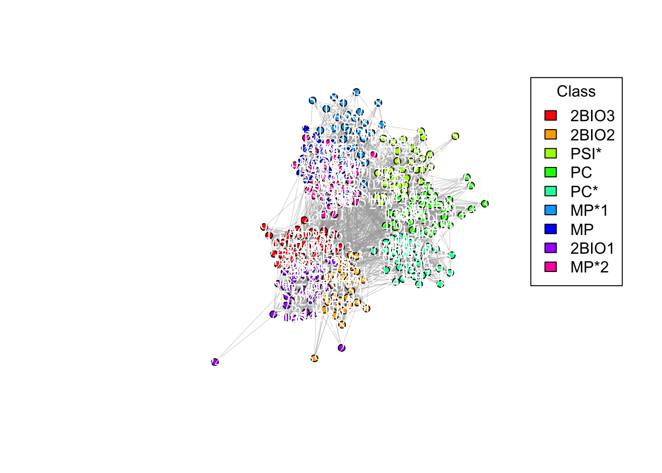
Community detection
8a. Community detection: we would like to detect communities in the network. Let’s start with the cluster_leiden function, which creates communities that maximize a metric (either CPM or modularity). Create the communities using modularity (see ?cluster_leiden) and store the results in a variable (e.g. modularity).
modularity <- cluster_leiden(g_simple, objective_function = 'modularity')
modularity
## IGRAPH clustering leiden, groups: 7, mod: NA
## + groups:
## $`1`
## [1] "0" "14" "21" "25" "27" "37" "39" "43" "44" "46" "50" "60"
## [13] "66" "72" "73" "76" "77" "91" "98" "101" "105" "109" "111" "129"
## [25] "132" "135" "147" "158" "180" "194" "200" "209" "217" "219" "241" "242"
## [37] "261" "264" "268" "277"
##
## $`2`
## [1] "2" "9" "10" "17" "23" "24" "26" "29" "40" "47" "52" "53"
## [13] "58" "59" "61" "63" "65" "68" "86" "90" "103" "107" "118" "121"
## [25] "124" "127" "130" "134" "142" "143" "148" "149" "154" "155" "164" "165"
## + ... omitted several groups/vertices8b. Now, plot the network with the communities. You can just visualize the network using the function plot(commdet, g_simple), where commdet may be substituted with the variable name where you stored the community detection results. Remember to fix layout = coords to plot the nodes always in the same position.
plot(modularity, g_simple, layout = coords, vertex.size = 5, vertex.label = NA, edge.arrow.size = 0, edge.width = 0.1, edge.color = "grey")
title(main = "Modularity")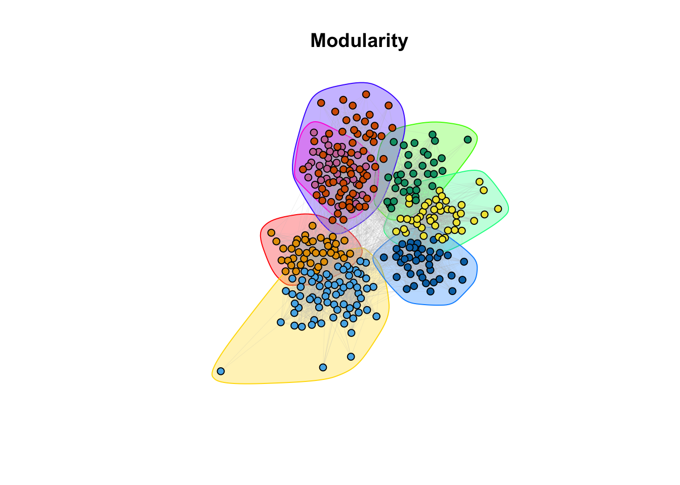
8c. How do the communities align with the classrooms (question 6)?
Answer:
## ANSWER: Visually, it seems that the communities are overlapping with the
# classroom subdivision.
9a. Community detection: There are other methods implemented in igraph: cluster_spinglass, based on the spinglass model from statistical mechanics; cluster_walktrap, based on random walks; and cluster_label_prop, based on labeling all nodes and then updating the labels by majority voting. We will also employ the SBM (Stochastic Block Model) from the homonym package. Use these methods to find communities (e.g. cluster_spinglass(g_simple)). Store the results for each method in different variables. There are more methods available in igraph, feel free to try others. For the SBM we provide the code below. It may take a few minutes.
spinglass <- cluster_spinglass(g_simple)
walktrap <- cluster_walktrap(g_simple)
label_prop <- cluster_label_prop(g_simple)
adj <- as_adjacency_matrix(g_simple, sparse=FALSE)
simple_sbm <- estimateSimpleSBM(adj, 'bernoulli', estimOptions = list(verbose = 0, plot = FALSE))9b. Compare communities visually: let’s visualize the network as in the modularity case above. For SBM we provide code below.
plot(spinglass,  g_simple, layout = coords, vertex.size = 5, vertex.label = NA, edge.arrow.size = 0, edge.width = 0.1, edge.color = "grey")
title(main = "Spinglass")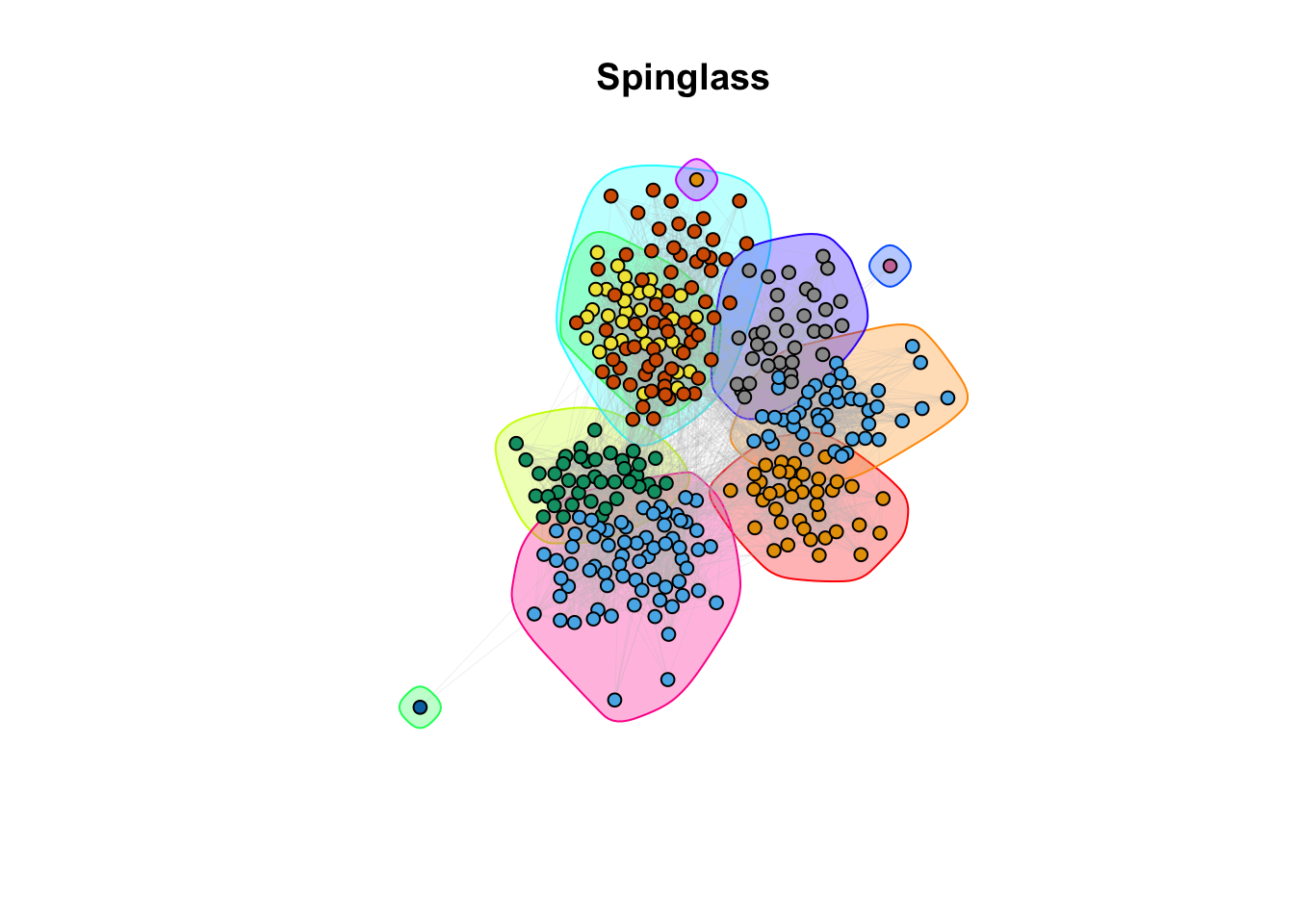
plot(walktrap,  g_simple, layout = coords, vertex.size = 5, vertex.label = NA, edge.arrow.size = 0, edge.width = 0.1, edge.color = "grey")
title(main = "Walktrap")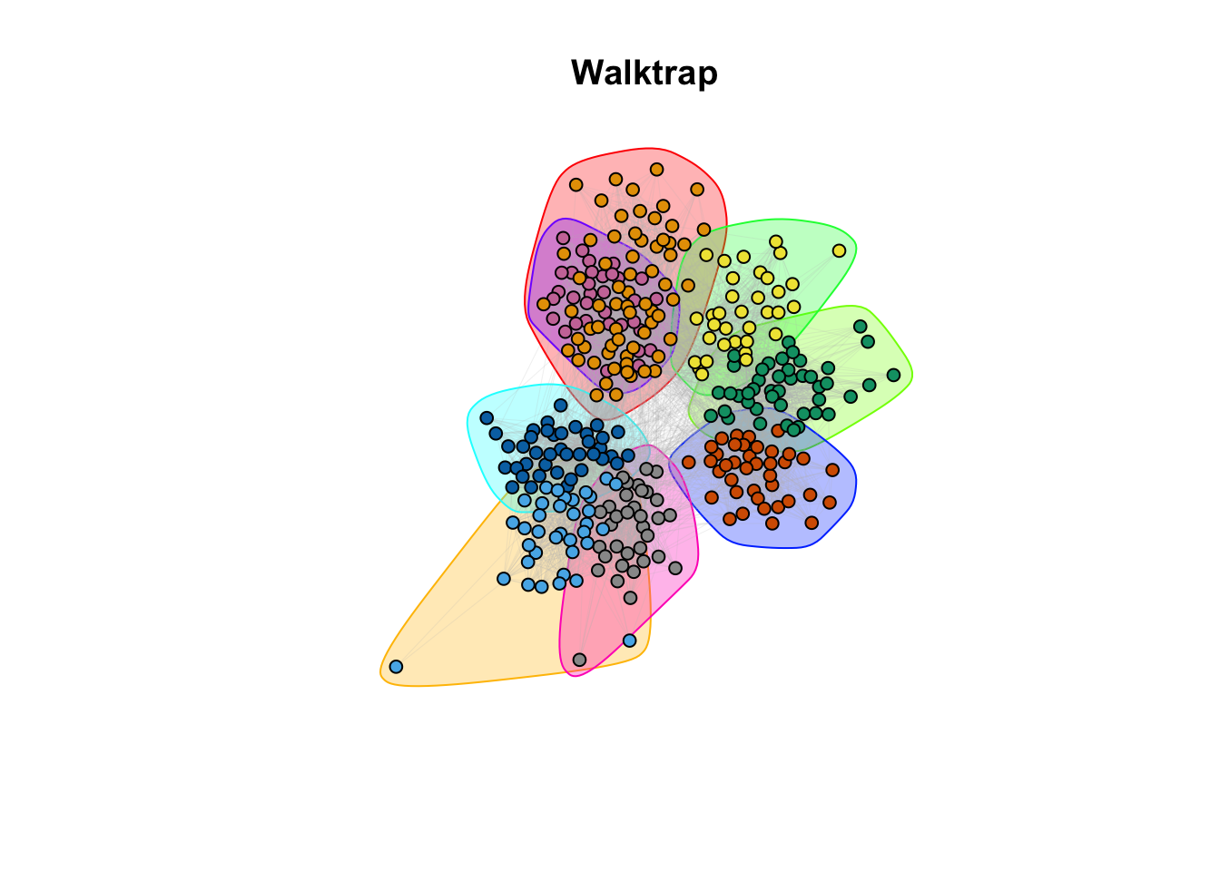
plot(label_prop,  g_simple, layout = coords, vertex.size = 5, vertex.label = NA, edge.arrow.size = 0, edge.width = 0.1, edge.color = "grey")
title(main = "Label Propagation")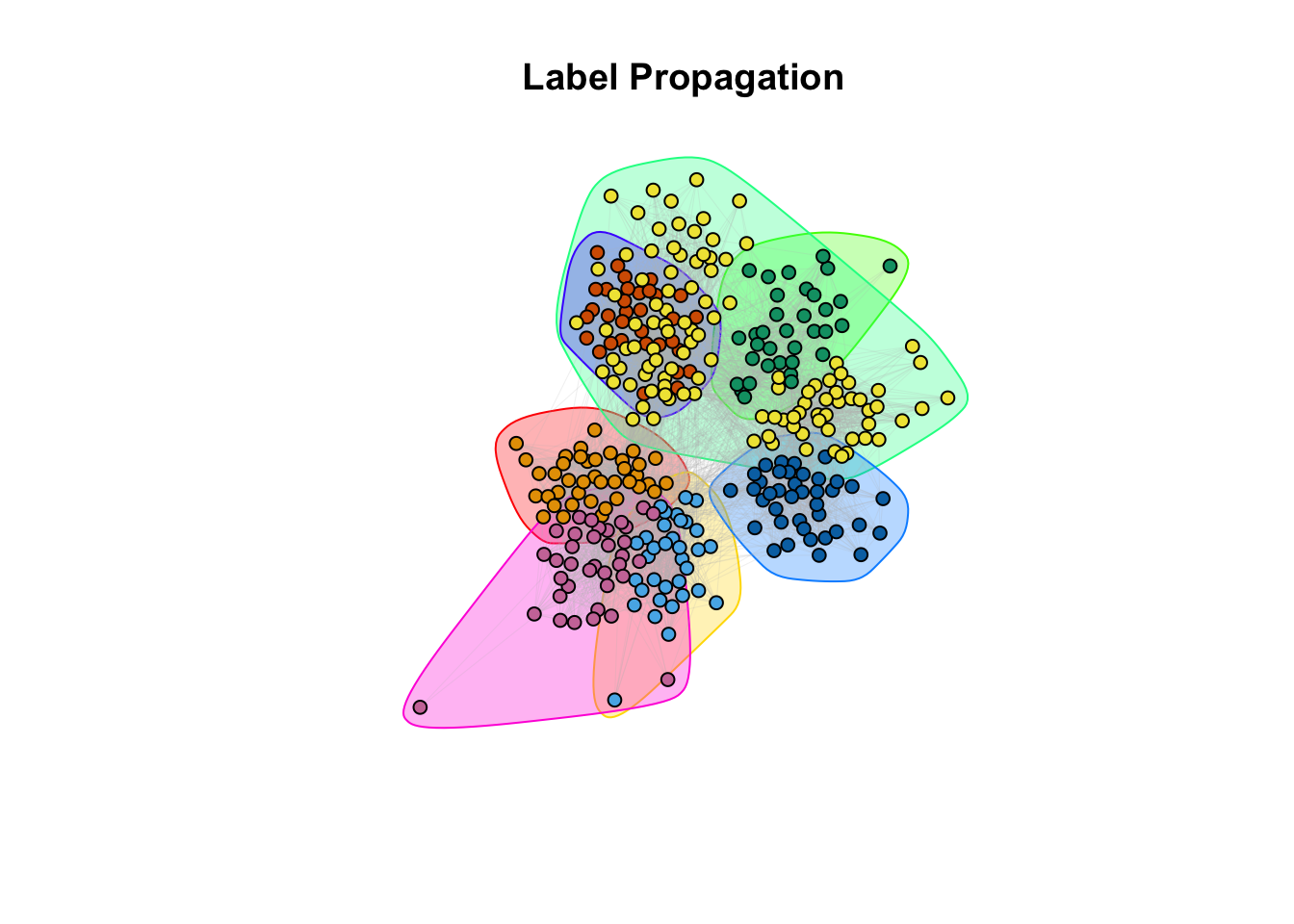
#Color palette
palette <- rainbow(length(unique(simple_sbm$memberships)))

#Create a color mapping for each node to their class
color_mapping <- setNames(palette, unique(simple_sbm$memberships))

#Map the node colors based on the class
node_colors <- color_mapping[simple_sbm$memberships]

plot(g_simple, layout=coords, vertex.color = node_colors, vertex.size=5, vertex.label=NA, edge.arrow.size=0, edge.width=0.1, edge.color="grey")
title(main ="SBM")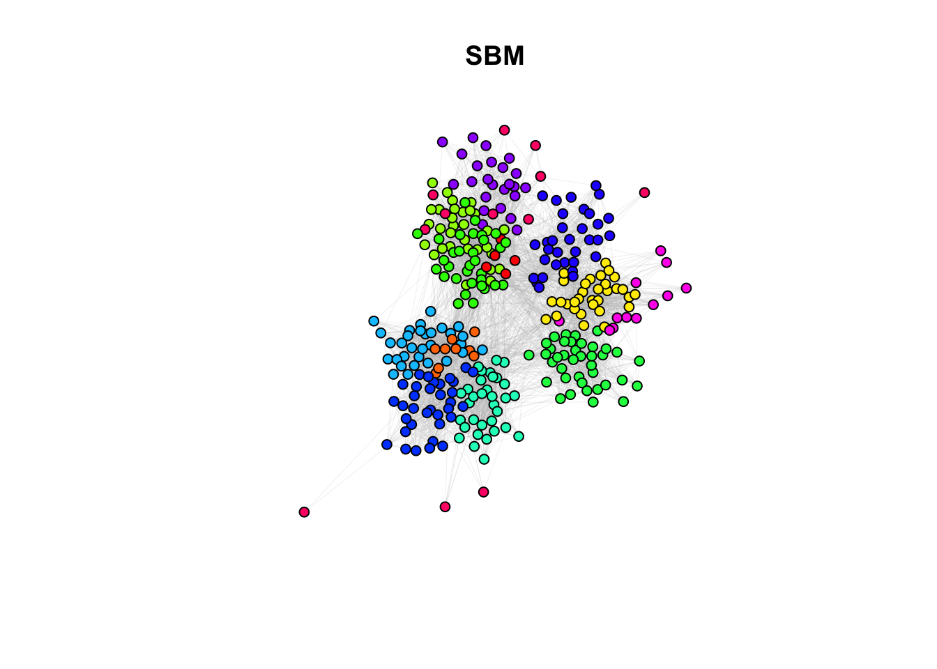
9c. How do the community assignments produced by the algorithms comparing to the division of students in classrooms (question 6)?
Answer:
## ANSWER:
# Different methods seem to capture different properties. However, with different
# level of granularity, they recover the classroom/discipline subdivision overall.
10a. EXTRA QUESTION: Compare the similarity between the communities detected and the classrooms. Use the Rand Index, a measure that quantifies the similarity between two data clusterings by considering all pairs of elements and checking whether the pair is either assigned to the same or different clusters in both clusterings. Compute the Rand Index between the classroom assignment (as.integer(factor(V(g_simple)$class))), which we consider now as ground truth, and the community assignment (commdet$membership) for each method. Use the function rand.index from the fossil package. Give a formal definition of the Rand Index. Which method(s) is better capturing the “true” subdivision?
ground_truth <- as.integer(factor(V(g_simple)$class))

# Compute Rand Index for each method
rand_index_method1 <- rand.index(ground_truth, spinglass$membership)
rand_index_method2 <- rand.index(ground_truth, walktrap$membership)
rand_index_method3 <- rand.index(ground_truth, label_prop$membership)
rand_index_method4 <- rand.index(ground_truth, modularity$membership)
rand_index_method5 <- rand.index(ground_truth, simple_sbm$memberships)

# Combine the Rand Indices into a single data frame
rand_indices <- data.frame(Method = c("Spinglass", "Walktrap", "Label Propagation", "Modularity", "SBM"),
                           Rand_Index = c(rand_index_method1, rand_index_method2, rand_index_method3, rand_index_method4, rand_index_method5))

# Plotting with ggplot2
ggplot(rand_indices, aes(x = Method, y = Rand_Index)) +
  geom_bar(stat = "identity") +
  labs(title = "Rand Index", x = "Method", y = "Rand Index") +
  theme_minimal() +
theme(axis.text.x = element_text(angle = 45, hjust = 1))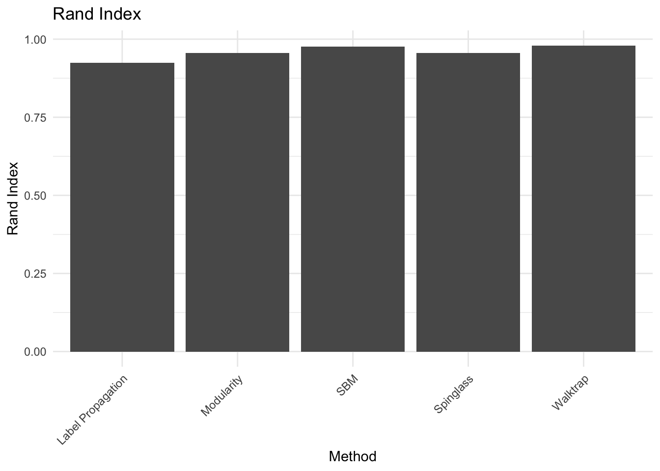 Answer:
## ANSWER:
# Definition: (TP+TN)/(TP+TN+FP+FN) fraction of true positive and negatives
# among the pair of nodes.
# Accordingly to what we noticed visually, the algorithms generally recover
# the class subdivision, i.e. the Rand Index between the class subdivision and
# each algorithm subdivision is generally high. However the algorithm that better
# performs in this task is the SBM.
10b. There is a corrected-by-chance version of the Rand Index called Adjusted Rand Index (adj.rand.index(group1, group2)). Give the definition and repeat the same done for the RI. Are the results different? Which method is best?
ground_truth <- as.integer(factor(V(g_simple)$class))

# Compute Rand Index for each method
adj_rand_index_method1 <- adj.rand.index(ground_truth, spinglass$membership)
adj_rand_index_method2 <- adj.rand.index(ground_truth, walktrap$membership)
adj_rand_index_method3 <- adj.rand.index(ground_truth, label_prop$membership)
adj_rand_index_method4 <- adj.rand.index(ground_truth, modularity$membership)
adj_rand_index_method5 <- adj.rand.index(ground_truth, simple_sbm$memberships)

# Combine the Rand Indices into a single data frame
adj_rand_indices <- data.frame(Method = c("Spinglass", "Walktrap", "Label Propagation", "Modularity", "SBM"),
                           Adj_Rand_Index = c(adj_rand_index_method1, adj_rand_index_method2, adj_rand_index_method3, adj_rand_index_method4, adj_rand_index_method5))


# Plotting with ggplot2
ggplot(adj_rand_indices, aes(x = Method, y = Adj_Rand_Index)) +
  geom_bar(stat = "identity") +
  labs(title = "Adjusted Rand Index", x = "Method", y = "Adjusted Rand Index") +
  theme_minimal() +
  theme(axis.text.x = element_text(angle = 45, hjust = 1))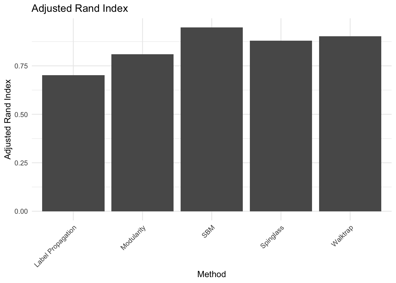
Answer:
## ANSWER:
# Definition: (RI - E[RI]) / (max(RI) - E[RI]), where E is the expectation
# value,i.e. what we would expect by random assignment of nodes to each community.
# Even with this correction, the best method remains the SBM,
# while modularity and spinglass seem to be the least robust.